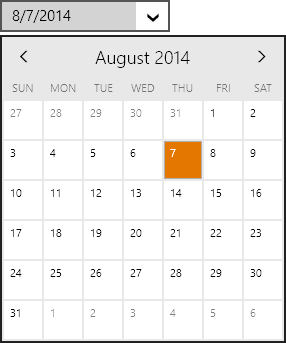
In the last post of this series, we introduced the EnumEditBox control, which is part of the new WinRT/XAML Editors product. In today's post, we'll take a look at the DateEditBox and MonthCalendar controls, which make it easy to select date values.
Windows Store Variant
The DateEditBox control is used to input a DateTime value, and uses a DatePicker control in its popup.
Edit boxes work great with a keyboard. When the edit box is focused, values can be directly typed in. Type in "8/7", "8/7/14", "8/7/2014", etc. and press Enter. Any of those will commit the same date value. You can also move the caret to one of the date components (month, day, year) and use keyboard arrow keys, PgUp/PgDn, or the mouse wheel to increment values. Best of all, pressing the left/right arrow keys will instantly jump between the various "parts" (components) of the edit box value and select the part's text.
In this screen, the caret was on the month part and then the right arrow was pressed. The day part was auto-selected. A new day value could then be typed in.
The date value can be displayed in any desired standard or custom format. By default it will use the current culture's default date format.
If the user doesn't have a keyboard, mouse or touch can be used to display the popup. The popup contains a DatePicker control, which defaults to wrapping a MonthCalendar control. The MonthCalendar control displays a single-month at a time. The arrows in the header can be used to navigate backward and forward with appealing animated transitions.
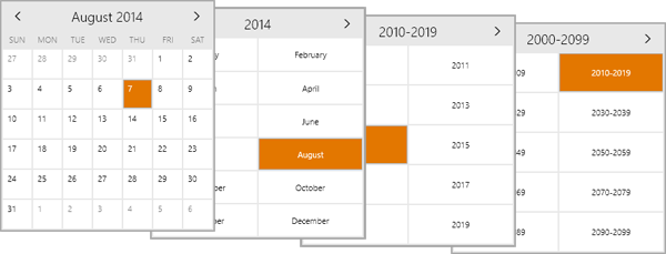
Pressing the title in the header will zoom out to the year. Pressing it again zooms out to the decade, and then century. Here's the views:
Compare to Native WinRT DatePicker
Most competitors have either made date pickers that show a large Windows Phone-like spinning date selector, or have gone with the three ComboBox approach like the native WinRT DatePicker control does:
Neither of those control types are ideal for WinRT apps that can potentially be run on large desktops with keyboards. Compare the design to ours:
Windows Phone Variant
Just like our other edit boxes, this edit box will render itself like a button when used on Windows Phone. Tapping the button shows a full screen picker (same as above) where the date value can be selected.
Summary
This post shows how an DateEditBox control can make it simple for an end user to select a date value within a Windows Store or Windows Phone app. Download our WinRT/XAML Controls to check it out, along with our other beautiful and functional editor controls!


