Actipro Avalonia Controls v26.1.1 is now available with a number of quality-of-life improvements.
See the related announcement post for the detailed list of enhancements and updates.
Actipro Avalonia Controls v26.1.1 is now available with a number of quality-of-life improvements.
See the related announcement post for the detailed list of enhancements and updates.
Actipro Avalonia Controls v26.1 is here, and it is one of our biggest updates yet. The headline is the new Data Visualization product, which introduces a comprehensive barcode generation feature set for modern Avalonia apps, from branded QR experiences to production-ready linear codes used in retail, logistics, and packaging. Alongside that major addition, v26.1 also delivers meaningful enhancements across Bars, Docking/MDI, Fundamentals, Themes, and Shared, making the entire suite more capable, polished, and ready for real-world application workflows. Other key updates include Avalonia v12 compatibility and .NET 8 and .NET 10 support.
See the related announcement post for the detailed list of enhancements and updates.
Here’s a look at some of the new features.
Data Visualization brings a complete barcode toolbox with 15 built-in symbologies, including QR Code, Micro QR Code, Code 128, GS1-128, EAN-13, EAN-8, UPC-A, UPC-E, Interleaved 2 of 5, ITF-14, Code 39, Code 39 Extended, Code 93, Code 93 Extended, and Codabar. This breadth lets teams standardize on a single API surface while covering the broad set of barcode formats commonly needed across consumer, business, and industrial scenarios. It is designed to be both developer-friendly and flexible enough for demanding production use.
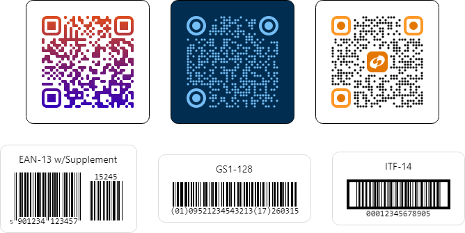
For teams focused on branding, v26.1 adds advanced QR Code and Micro QR Code appearance options such as module shape customization, finder pattern shape customization, primary and secondary accent brushes, and gradient brush support. These features let you produce visually distinctive codes while still preserving reliable scanning behavior. It is a strong balance between brand expression and practical usability.
Data integrity and scan reliability were also core goals. The release includes robust encoding and validation behavior across symbologies, including automatic check-digit calculation and verification where applicable, optional EAN and UPC supplements, configurable quiet zones, and error-correction controls for QR variants. For linear barcode scenarios, you can fine-tune bar height, minimum height-to-width ratio, bearer bars for supported formats, and value alignment modes to better match printing and scanning requirements.
Outside of Data Visualization, v26.1 continues the momentum from recent previews with valuable suite-wide updates.
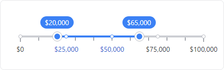
The new RangeSlider control elevates the Fundamentals suite with a sleek, modern way to select and fine‑tune numeric ranges.
We've added a StandaloneToolBarSeparatorMode setting to BarSeparator that allows separators to act as spacers, making it easy to introduce flexible gaps or right-align items in standalone toolbars.
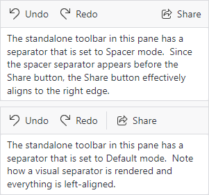
With a single spacer separator, items after the spacer will be right-aligned. When using two spacer separators, three groups of items will be created: left-aligned, center-aligned, and right-aligned. Use spacer separators to creatively position groups of items.
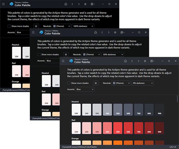
A new customization option now lets you dial in the darkness of the neutral color ramp in generated themes, making it easy to shape your dark theme anywhere from refined dark gray to rich, immersive black.
For Actipro Avalonia Pro customers, we’ve introduced support for overriding AvaloniaUI OÜ's Avalonia Pro theme resources, allowing their Markdown, TreeDataGrid, and VirtualKeyboard controls to visually blend seamlessly with Actipro themes.
This release advances platform support by aligning dependencies with the recently-released Avalonia v12, with all control themes updated to support v12's new controls and features.

The NuGet package targets now include both .NET 8 and .NET 10. The result is a stronger foundation for teams planning new development as well as those modernizing existing applications.
Actipro Avalonia Controls v26.1 is built to help you deliver more capable interfaces, better user experiences, and faster implementation across your Avalonia projects.
 Bill Henning (Actipro)
We're pleased to announce the availability of Actipro Avalonia Controls v26.1.0‑rc.1, a prerelease build that delivers full compatibility with the newly launched Avalonia v12.
Avalonia v12 introduces substantial updates across styling, native control behavior, and platform architecture, and this release ensures that Actipro's control suite integrates smoothly with those changes. Developers adopting Avalonia v12 can now take advantage of our updated themes, revised resource structures, and improved alignment with the platform's new conventions.

This build also includes several standout enhancements across our product line. The new RangeSlider control expands the Fundamentals offering with a flexible, modern slider for selecting numeric ranges.
Our theme system got a big update, with refreshed native control themes for Avalonia v12 and new themes for the latest v12 controls like the command bar, pages, pips pager, and more.

A new option was added for adjusting the darkness of the neutral color ramp, making it easier to fine‑tune dark theme aesthetics. Make your dark theme appearance anywhere from a dark gray to very black.
For Actipro Avalonia Pro customers, we've added the ability to override AvaloniaUI OÜ's Avalonia Pro theme resources so those third‑party controls (Markdown, TreeDataGrid, VirtualKeyboard) can visually blend with Actipro themes.
We've also raised the minimum Avalonia dependency to v12.0.0 and added a .NET 10 target to all NuGet packages.
There are other updates in this build to discuss later, and even more coming before final v26.1 release.
Since this is a prerelease build, here are the steps to move to it:
1) Update your project to Avalonia v12.
2) Update your Actipro Avalonia Controls NuGet package references to the "26.1.0-rc.1" prerelease version.
3) We have updated our "develop" branch in our public Actipro/Avalona-Controls GitHub repo with samples and documentation for v26.1 and Avalonia v12 compatibility. The "develop" branch may get additional updates as we make adjustments prior to a final release. Review the v26.1 breaking change notes in the documentation.
4) For customers with active subscriptions, since this is prerelease, our web site does not issue v26.1 license keys just yet. You can use the steps in the license popup to add code to temporarily hide the license popup until the final v26.1 release.
We're excited to support Avalonia v12 immediately after its release, and look forward to hearing how the new platform and our updated controls improve your development experience.
A new Avalonia Controls release is now available, containing many small feature enhancements and quality of life improvements.
See the related announcement post for the detailed list of enhancements and updates.
A new Avalonia Controls release is now available. This new version makes improvements across the entire product line. One particularly nice new feature is the ability to now use SVG images with our ImageProvider infrastructure and DynamicImage control.
See the related announcement post for the detailed list of enhancements and updates.
Here’s a look at some of the new features.
SVG images are not natively supported in Avalonia but can be used in Avalonia via a third-party "Svg.Controls.Skia.Avalonia" NuGet package. Since SVG images are external to Avalonia itself, the default implementation of our ImageProvider does not support their adaptation.
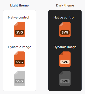
For this version, we have enhanced our ImageProvider API to support extensibility for unknown image types and created an open source implementation in our sample project's "Shared Library / Dynamic Image" sample that works with SVG images. It can easily be copied to your own apps, allowing you to use SVG images in Actipro controls and themes with full adaptation support for things like adapting for dark themes, appearing in grayscale when in a disabled control, and much more.