WPF Controls v24.1.3 Maintenance Release

by Avatar Bill Henning (Actipro)
Tuesday, September 10, 2024 at 3:27pm

This version contains an enormous number of updates across the WPF control product line.

See the related announcement post for the detailed list of enhancements and updates.

Download Buy Now


Here’s a look at some of the major new features.

Bar Code

QR Code ECI Support

The QR Code symbology has been updated to support Extended Channel Interpretation (ECI), which allows encoding of all UTF-8 characters.

Bars

Ribbon Group Labels

Ribbon group labels are always visible in Classic layout mode and in the past have always been hidden in Simplified layout mode.  A new option allows for keeping group labels visible in Simplified layout mode, which provides an interesting new appearance option.
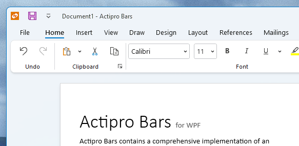
A ribbon in Simplified layout mode, but still displaying group labels

Hiding Ribbon Tabs

For small ribbons with a single tab and no need of an application button, tabs and the app button can be hidden, saving a row of space.

Single tab ribbons can hide the tab header row

ComboBox Inline Images

The combobox control can now optionally show inline images next to the text.
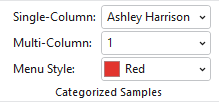
Several combobox examples, with the last showing an inline color swatch image

Many Other Enhancements

A massive number of updates have been made to various Bars controls and features.

Docking/MDI

Bars Integration Sample

A new Bars Integration sample shows how Ribbon and StandaloneToolBar can be used on a main Window without changing the active docking window when there are floating docking windows.
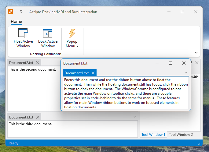
The new Bars Integration sample

MDI Always On Top

A new option allows for any floating windows with MDI to always remain on top of the main window.

Open Documents Menu Path Tips

The tabbed MDI open documents menu now includes the document’s path as a tooltip on menu items.

A tooltip for the highlighted open document menu item

SyntaxEditor .NET Languages Add-on

Doc Comment Remarks

IntelliPrompt tips now include documentation comment remarks sections, if available.

Themes

WindowChrome Mouse Activation Over Toolbars

A new WindowChrome option can prevent the containing Window from being activated on click over any toolbar control.
WinForms Controls v24.1.1 Maintenance Release

by Avatar Bill Henning (Actipro)
Tuesday, September 10, 2024 at 1:58pm

This version makes numerous minor updates across the WinForms control product line, including the ability for holding Ctrl key to make SyntaxEditor IntelliPrompt popups semi-transparent.

The Ctrl key is held down, making the SyntaxEditor completion list semi-transparent

See the related announcement post for the detailed list of enhancements and updates.

Download Buy Now

Avalonia UI Controls v24.2 Released

by Avatar Bill Henning (Actipro)
Tuesday, July 23, 2024 at 8:13pm

This version upgrades all the Actipro controls and themes to target the recently-released Avalonia 11.1 version.

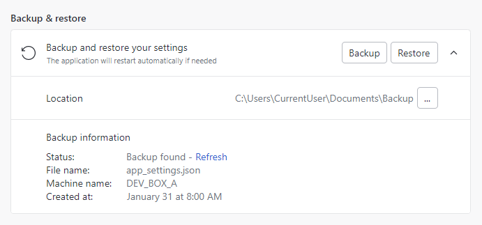
An example of using the recently-added Actipro Settings controls

For customers who wish to continue targeting their applications with Avalonia v11.0 for now, please use the Actipro Avalonia UI Controls 24.1 version, as that targets Avalonia v11.0.

See the related announcement post for the detailed list of enhancements and updates.

Download Buy Now

Avalonia UI Controls v24.1.1 Maintenance Release

by Avatar Bill Henning (Actipro)
Monday, July 22, 2024 at 5:53pm

A new Avalonia UI Controls release is now available that makes some minor updates to the 24.1 version of our controls, which targets Avalonia v11.0. 

With today's release of Avalonia v11.1, a new 24.2 version will be published soon that targets Avalonia v11.1.

See the related announcement post for the detailed list of enhancements and updates.

Download Buy Now

Avalonia UI Controls v24.1 Released

by Avatar Bill Henning (Actipro)
Tuesday, May 7, 2024 at 1:12pm

This version adds several great new controls and makes many updates across the Avalonia UI control product line.

See the related announcement post for the detailed list of enhancements and updates.

Download Buy Now

Here’s a look at some of the new features.

Fundamentals

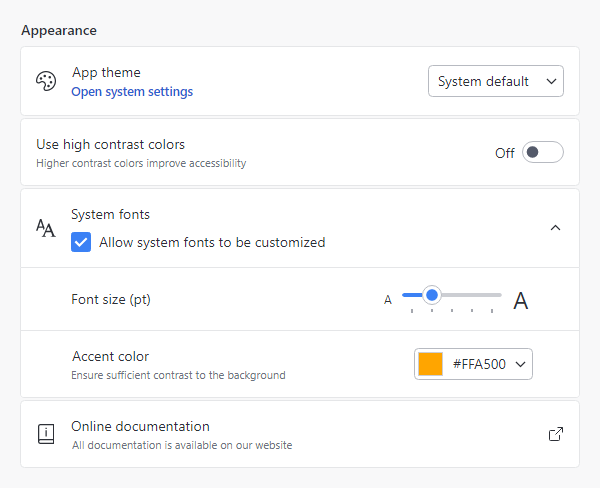
Settings

Settings groups, expanders, and cards used for application settings UI

Most applications contain a window or view where end users can configure settings. Actipro now provides several controls for displaying grouped and optionally expandable card-based editors for settings that are presented in a consistent, easy-to-use way.

  • Consistent Appearance - Cards have a uniform design, and related cards can be grouped together. Each setting card can optionally have an icon, header, description, and content.
  • Card Contents - A setting card's content is generally an editor for the setting. The content may be left blank, and the card itself can be made into a clickable button.
  • Flexible Editors - Each setting card can contain any kind of editor control. Switches, sliders, combo boxes, and text boxes are commonly-used editor controls.
  • Expandable Sections - Some settings have numerous child settings. These indented settings may be hidden under expandable cards that animate the contents when opened.

Application settings have never looked so good!

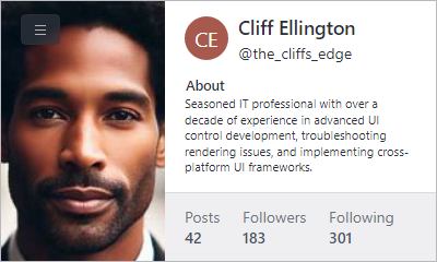
Card

The new card control presents visually grouped information for a single subject, using optional cover, thumbnail, header, and footer sections.

A profile card with multiple sections

Cards can optionally be actionable as well.

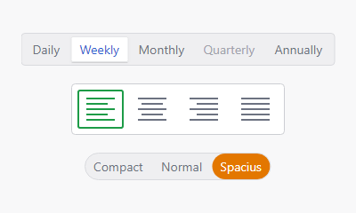
Segmented Bar

The new segmented bar control allows a user to select a single item with support for fluent animations when changing selection.

Several theme variants

It can arrange items horizontally or vertically.

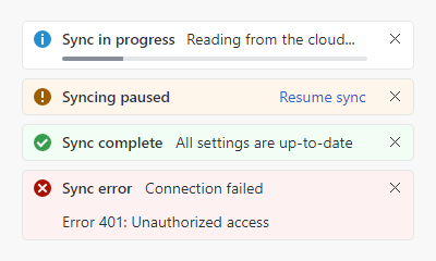
Info Bar

The new info bar control displays essential information to a user without disrupting the user flow.

Various kinds of info bar severities

Messages can display with optional severity, action, and more.

Circular Progressbar

The new circular progressbar control displays a ranged progress value using fluent animations. It is similar to a native linear progressbar, except that it renders the progress in a ring shape and shows the progress text within the ring.

Circular progressbars can be an integral part of a dashboard display

An indeterminate state is supported for scenarios where no specific progress value can yet be determined.

Shared Library

Scrollable Overflow Presenter

The new scrollable overflow presenter control can be oriented horizontally or vertically and displays scroll buttons when its content overflows the available space.

A horizontal scrollable overflow presenter with overflow button displayed

Clicking a scroll button smoothly scrolls the content.

Themes

Toggle Switch Affinity

Toggle switches can now optionally arrange the knob/track on the right side of the control instead of the left, which is ideal when used in the new settings-related controls.

Avalonia

The minimum Avalonia UI dependency is updated from v11.0.5 to v11.0.7 and all native control themes should now be consistent with Avalonia UI’s theme updates through v11.0.10.