Our next 2012.1 builds of SyntaxEditor for WPF and Silverlight will be adding a new ancillary control to the SyntaxEditor product: NavigableSymbolSelector.
Navigable Symbols
Navigable symbols are symbols declared within a document to which the end user may wish to move their caret. For instance in a language such as C#, navigable symbols would be things like type and member declarations.
A new language service has been added that can optionally be implemented. Its only task is to return navigable symbols for a document that uses the language. It's implemented in such a way that a multi-level hierarchy of navigable symbols can be created.
This sort of feature can be used to help drive the UI of external controls such as a type/member drop-down or even a document outline treeview. These sort of external controls can help the end user visualize a document's structure, and the content for each item in the controls can fully utilize rich markup (images, colors, etc.).
NavigableSymbolSelector Control
The new NavigableSymbolSelector control is our implementation of a control similar to Visual Studio's type/member drop-downs. It attaches to a SyntaxEditor instance and checks to see if the language supports the new INavigableSymbolProvider service. If so, it uses that service to populate its drop-down(s).
A "Simple" Language Sample
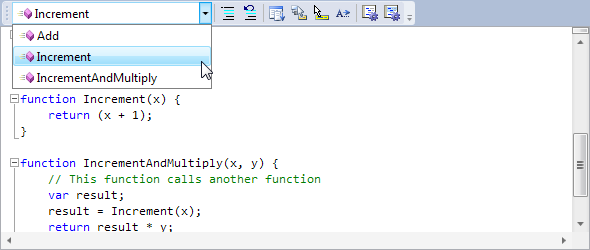
Let's see how this looks in our "Simple" language sample. We've updated one of our Getting Started series samples to implement this new service and show drop-down UI (via NavigableSymbolSelector) within a toolbar:
For our "Simple" language, we've told the NavigableSymbolSelector to show a single drop-down, which will render the list of functions declared in the editor.
Run-Time Functionality
Basically if we do these simple tasks:
- Add a NavigableSymbolSelector control to the UI.
- Bind it to a SyntaxEditor instance.
- Implement the INavigableSymbolProvider language service on the current language.
We get all this functionality for free from the NavigableSymbolSelector control:
- Automatic display of all symbols defined in the current document, that updates as document changes occur.
- Symbols are sorted alphabetically within the drop-down.
- As the editor caret moves, the selected symbol in the drop-down is automatically updated to be the closest enclosing or nearby symbol.
- When the end user clicks on a different symbol in the drop-down, the caret navigates to that symbol declaration.
- When the caret is not directly within a symbol's declaration but is near one, it will appear grayed out. This helps the end user visualize whether they are actually in a valid symbol declaration or not. (WPF only)
We've designed this control to work directly with the new INavigableSymbolProvider language service. This allows any custom language to fully support the control.
Summary
These new features will be in the next 2012.1 builds of our WPF and Silverlight controls.
By default the control displays two drop-downs, and we'll show this in our next blog post, where we demonstrate the implementation of the INavigableSymbolProvider language service and usage of the new NavigableSymbolSelector control with our .NET Languages Add-on's languages.


