WPF/WinForms Beta Testers Wanted for v24.1

by Avatar Bill Henning (Actipro)
Thursday, February 8, 2024 at 4:30pm

We’ve been hard at work with several new features for v24.1 of our WPF and WinForms products and are asking for beta testers to work with preview builds of what is coming to help ensure a smooth transition.

Beta testers will get an early look at the new features and can give us valuable feedback to influence any necessary development and/or bug fixes prior to the final release.  See the notes at the end of this post for details on signing up as a beta tester.

SyntaxEditor Native Dark Theme

SyntaxEditor now has built-in support for switching between light and dark themes. Previously, only UI element brushes were updated for dark themes, but the highlighting styles and icon sets had to be manually transitioned.

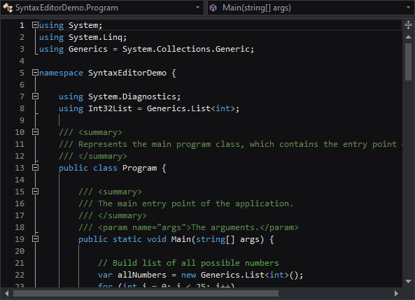
Now, a new SyntaxEditorThemeManager class and individual light/dark color palettes for a highlighting style registry allow for any change in the global theme to be automatically reflected in SyntaxEditor.

All Actipro-provided languages have been updated, as appropriate, with both light and dark highlighting styles, and we automatically convert many popular light-themed colors to appropriate dark-themed colors for custom languages that have yet to be updated with explicit dark styles.

SyntaxEditor Highlighting Style Updates

A new feature enables the current line number to be highlighted in a different style than the other line numbers, so the default line number colors have been updated to coordinate with this new feature.

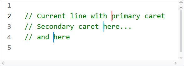
When editing with multiple carets, distinct colors can now be defined for the primary and secondary carets.

Several other highlighting styles have also had their default values tweaked.

Theme Updates (WinForms Only)

A new Visual Studio Blue theme is available that mimics the Visual Studio 2022 Blue theme.

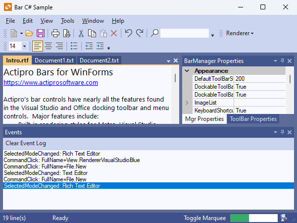
The renderers for Metro Light and Dark have been updated with a more modern gripper for the status bar and more subtle checked icons for checkable menu items that do not provide their own icon. Several classic renderers have also been renamed for clarity.

Beta Testers

We are looking for beta testers who:

  • Will actively use supplied preview builds to help ensure the beta is stable.
  • Will report suggestions for improvement of new features.
  • Will report confusion or missing information from conversion notes.
  • Will report any bugs that are encountered.
  • Ideally are signed up in our Slack workspace, as it’s easiest to communicate through that during testing phases.

Please contact our support team privately via a ticket to sign up for beta testing:

Contact Our Support Team to Sign Up

Please indicate the following in your message:

  • Your name and e-mail address.
  • If you are already an existing customer, and if so, your license key.
  • The platform(s) you’d like to test.
  • If you are already signed up in our Slack workspace.

Thanks for your help and we look forward to working with our testers.

Avalonia UI Controls v23.1.3 Maintenance Release

by Avatar Bill Henning (Actipro)
Wednesday, February 7, 2024 at 4:56pm

A new Avalonia UI Controls release is now available the adds several great new controls.

See the related announcement post for the detailed list of enhancements and updates.

Download Buy Now

Fundamentals

Avatar

Avatar controls are used to represent people or objects. They can render a full-size image, a centered glyph, a person's initials, or text.

Empty, initials, and image avatars

When text is provided, initials can automatically be derived. Large text-based content will scale down to try and fit within the circle as needed. A generic "empty" glyph will be displayed when no avatar content is provided.

Solid and soft appearances, showing how different initials derive various color combinations

An avatar is most distinctive when using image-based content, so text-based content can be harder to differentiate. While an avatar's foreground and background can be manually specified, there is built-in logic to automatically select color combinations based on the avatar's content and using either a solid or soft appearance.

Avatar derives from Button and supports the standard button command model and click events.

AvatarGroup

Use an AvatarGroup to render multiple Avatar controls. Avatars in a group can overlap with each other by a given size percentage, and you can expand the avatars on mouse hover. When the avatars don't fit in the available space, they can overflow to a popup.

An avatar group with an overflow button that when clicked, shows overflowed avatars

Wrap the group in a chromeless button to make an actionable avatar group that executes a task when clicked.

Badge

Badges can add contextual information to target elements, or even used on their own. Badges can display small content like text, counts, icons, or can render as a dot.

Various kinds of badges

When a badge adorns an element, it shows and hides using an animated "pop" effect. It can be easily aligned to any anchor position on the target element.

NumericBadge

NumericBadge inherits Badge and supports binding to a numeric value, such as a count value. The badge automatically displays when the count increments to a positive number and hides when decrementing to zero.

Badge and NumericBadge adorning elements

The displayed numeric value has overflow support, meaning that a large value can be restricted to only show "99+" for example.

RingSpinner

The RingSpinner control renders an animated ring where the two ring segment ends chase each other around the circle.

A couple RingSpinner controls

It is used when some form of processing is occurring to tell the end user that something is happening.

Shared Library

RingSlice

The RingSlice shape renders a portion (or the entire circle) of a ring shape. Its start/end angles, radius, thickness, and other stroke properties can be set.

A circular progress bar

Ring slice shapes can be combined in many interesting ways within UI, primarily used to create progress indicators.