In the previous Heat Maps post, we introduced the MicroHeatMapPresenter control and talked about its color changing abilities. In today's post, we'll look at the MicroHeatMapPresenter's ability to change size to display data values.
Size-Based Heat Maps
As discussed in the previous post, the MicroHeatMapPresenter control is designed to be a single cell in a larger heat map. Heat maps, in addition to cells that change color, can also use cells that change size to represent data. MicroHeatMapPresenter controls can be customized to have a different shape and render at varying sizes in order to display smaller and larger values in a data set.

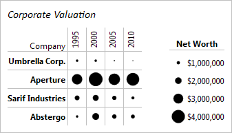
In the example above 16 separate MicroHeatMapPresenter controls have been customized to render as circles and change size in order to display the net worth of four companies over time. Each control has been customized to be given the same maximum size, minimum, and maximum values. Each control also has a unique value that it uses with the minimum and maximum values to find what percentage of the maximum size it should render as.
Summary
The size changing behavior provides a very intuitive way to display data values. Larger values displayed with larger markers creates a chart that gets the information to the audience as fast and with as little confusion as possible. In addition, many different built-in shapes are available for customization, giving even more options to specialize the chart to make it easier to understand and/or better display the data.
UPDATE: Heat maps are now available as of the latest WPF and Silverlight maintenance releases.
In our next blog post, we'll take a look at combining color and size changing effects to render two sets of data.


