The Actipro WinRT XAML Controls 2013.2 have been released and are now ready for download. This version adds a complete port of our SyntaxEditor control and related add-ons, and also adds a number of new controls to existing products.
Major new features are described below. See the announcement post for the detailed list of enhancements and updates.
A new WinRT XAML Studio bundle option is available that includes SyntaxEditor, Charts, Micro Charts, and our Shared Library. The pricing saves you 40% over purchasing those products individually! Best of all, once you have an active WinRT XAML Studio subscription, you will receive any new control products added to the bundle for free while your subscription is active.
If you are an existing customer of our individual WinRT/XAML controls and would like to switch to studio bundle at a discounted price, please contact our sales team.
SyntaxEditor Control
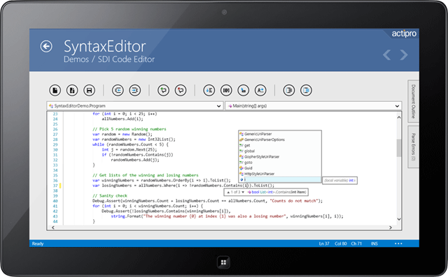
Our SyntaxEditor control is fully ported and now is available for use in WinRT/XAML apps! This code editor control lets you make any sort of IDE, script, or expression editor app.
SyntaxEditor is a powerful text editing control that is packed with features for efficient code editing, including syntax highlighting, code outlining, parsing, line numbers, block selection, IntelliPrompt UI, zooming, adornments, single-line mode, and much more. It is built on top of our next-generation extensible text/parsing framework and has many of the same code editing features found in the Visual Studio code editor. The WinRT/XAML version shares a codebase with the WPF and Silverlight versions of SyntaxEditor, making it easy to transition code between platforms.
Now you can build your own apps, just like our free Code Writer app in the Windows Store.
LL(*) Parser Framework
The LL(*) Parser Framework is Actipro's own framework for constructing robust text parsers that work standalone or with code editor controls like SyntaxEditor. The framework features grammars that are written in C#/VB using EBNF-like notation, customizable AST construction, advanced error handling/reporting, easy code injection, a complete debugger UI, and much more.
The framework is included with the SyntaxEditor control for WinRT/XAML.
.NET Languages Add-on
The SyntaxEditor .NET Languages Add-on is an optional add-on that provides automated IntelliPrompt completion lists, parameter info, quick info, code snippets, code outlining, parsing, AST construction, syntax error reporting, a resolver, formatting, and more for C# and Visual Basic documents.
Web Languages Add-on
The SyntaxEditor Web Languages Add-on is an optional add-on that provides automated IntelliPrompt quick info, code outlining, parsing, AST construction, syntax error reporting, end tag auto-complete, formatting, and more for XML documents. It also includes advanced JavaScript editing with code outlining, parsing, syntax error reporting, formatting and more.
PieChart
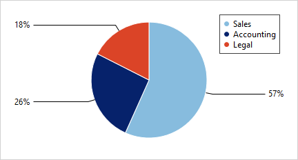
A new pie chart control has been added to complement our other bar, line, area, and scatter chart offerings.
The pie chart supports advanced features like multiple label positioning and display options, legend display, nesting of multiple series, hierarchical data, and more.
DonutChart
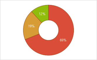
Donut charts have been added as well. All the same features found in pie charts are found in donut charts, and the hole radius is fully configurable.
Axis Tick Labels for Percentage Stacked Charts
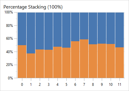
When using stacking bar or area charts with the percentage axis option, the percentage value labels now display on the axis.
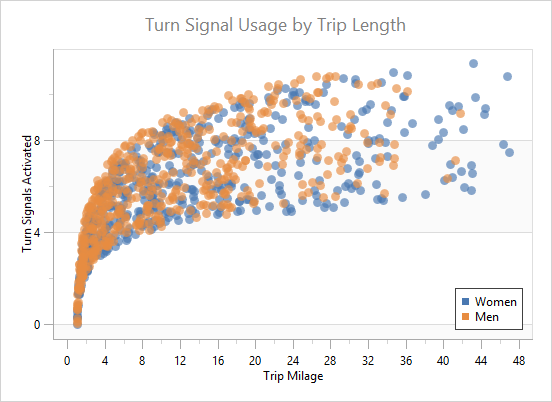
Improved Scatter Chart Samples
A new and improved scatter sample has been added.
Dark Theme Support
Dark themes are now fully supported out-of-the-box.
Multiple Part Property Paths in XPath and YPath
The XY charts now allow multi-part property paths to be specified in their XPath and YPath binding values.
Dark Theme Support
Dark themes are now fully supported out-of-the-box for controls like box plot and candlestick.
RadialSlider Control
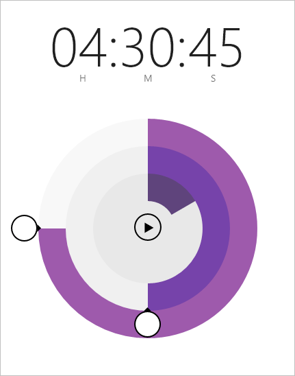
RadialSlider is a circular slider that can be used to input any scalar value.
In the example above, a couple RadialSlider and RingSlice controls are combined to build a timer app.
RingSlice Control
RingSlice renders a portion of a ring at designated angles and radius.
The slice's start and end angles can be bound to any data and its appearance can be fully customized. Make dotted lines, add different end cap styles, etc.
CircularThumb Control
CircularThumb is a thumb gripper with a circular shape and arrow adornment. It is what the end user interacts with in a RadialSlider, as seen in the screenshot above.

