 Bill Henning (Actipro)
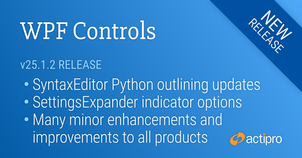
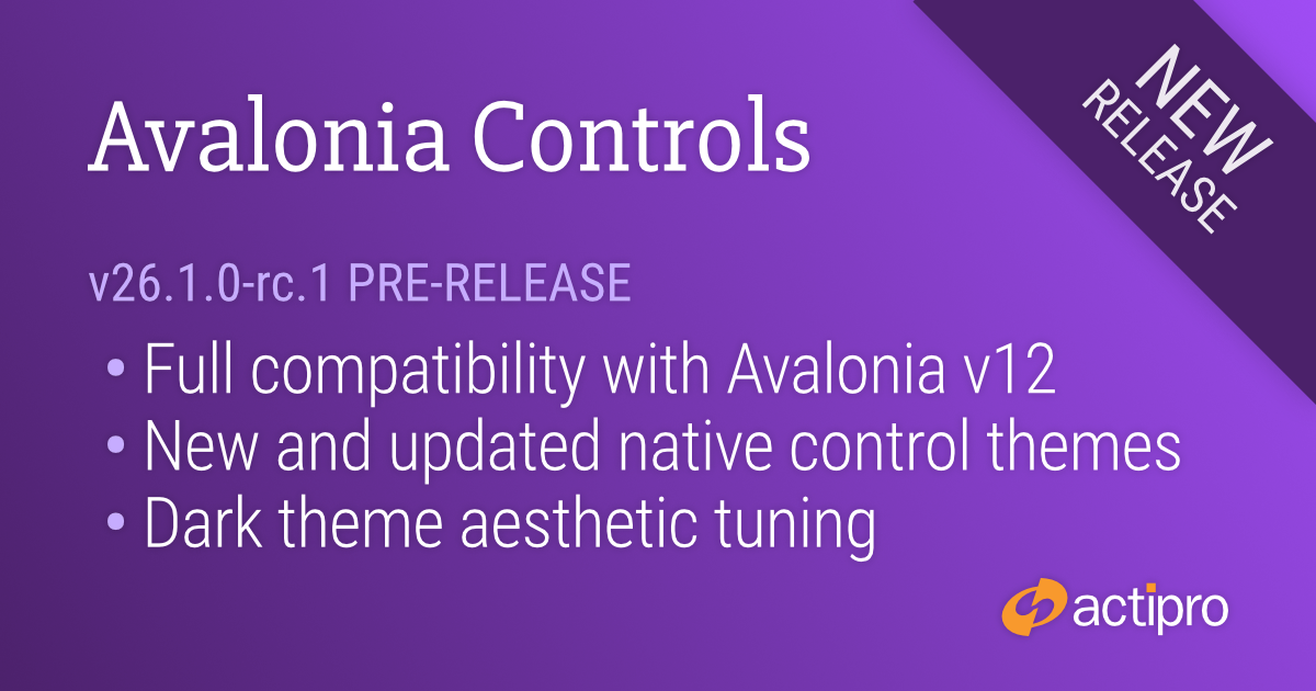
We're pleased to announce the availability of Actipro Avalonia Controls v26.1.0‑rc.1, a prerelease build that delivers full compatibility with the newly launched Avalonia v12.
Overview
Avalonia v12 introduces substantial updates across styling, native control behavior, and platform architecture, and this release ensures that Actipro's control suite integrates smoothly with those changes. Developers adopting Avalonia v12 can now take advantage of our updated themes, revised resource structures, and improved alignment with the platform's new conventions.
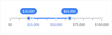
This build also includes several standout enhancements across our product line. The new RangeSlider control expands the Fundamentals offering with a flexible, modern slider for selecting numeric ranges.
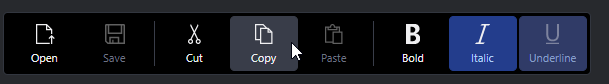
Our theme system got a big update, with refreshed native control themes for Avalonia v12 and new themes for the latest v12 controls like the command bar, pages, pips pager, and more.
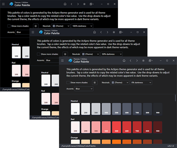
A new option was added for adjusting the darkness of the neutral color ramp, making it easier to fine‑tune dark theme aesthetics. Make your dark theme appearance anywhere from a dark gray to very black.
For Actipro Avalonia Pro customers, we've added the ability to override AvaloniaUI OÜ's Avalonia Pro theme resources so those third‑party controls (Markdown, TreeDataGrid, VirtualKeyboard) can visually blend with Actipro themes.
We've also raised the minimum Avalonia dependency to v12.0.0 and added a .NET 10 target to all NuGet packages.
There are other updates in this build to discuss later, and even more coming before final v26.1 release.
Updating to the v26.1 RC1 Build
Since this is a prerelease build, here are the steps to move to it:
1) Update your project to Avalonia v12.
2) Update your Actipro Avalonia Controls NuGet package references to the "26.1.0-rc.1" prerelease version.
3) We have updated our "develop" branch in our public Actipro/Avalona-Controls GitHub repo with samples and documentation for v26.1 and Avalonia v12 compatibility. The "develop" branch may get additional updates as we make adjustments prior to a final release. Review the v26.1 breaking change notes in the documentation.
4) For customers with active subscriptions, since this is prerelease, our web site does not issue v26.1 license keys just yet. You can use the steps in the license popup to add code to temporarily hide the license popup until the final v26.1 release.
Summary
We're excited to support Avalonia v12 immediately after its release, and look forward to hearing how the new platform and our updated controls improve your development experience.