The 2014.1 versions of our WPF, Silverlight, and WinRT/XAML controls were released last week and all contain several handy components in them, such as the RingSlice control we talked about several days ago.
In today's post, I'd like to show off the new RadialSlider control.
What is RadialSlider?
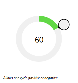
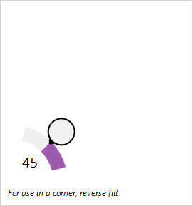
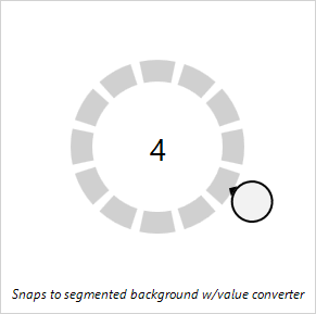
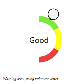
The RadialSlider control allows for quick selection of a degree value, which can easily be converted to some form of scalar value. The control uses an embedded CircularThumb control, but is otherwise transparent. It is meant to be used in conjunction with the RingSlice control and have that control render the slider's value UI.
Radial sliders function just like normal linear sliders however instead of moving the slider thumb in a straight line, the thumb can move in a circular fashion around the slider's center point. This sort of UI allows for additional precision when compared to linear sliders, especially with touch interaction.
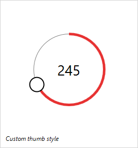
RadialSlider supports minimum/maximum ranges, infinite wrapping mode, customizable thumb styles, and more.
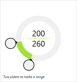
Combine two RadialSlider controls on top of each other to enable range-based selection.
Real World Usage Scenario
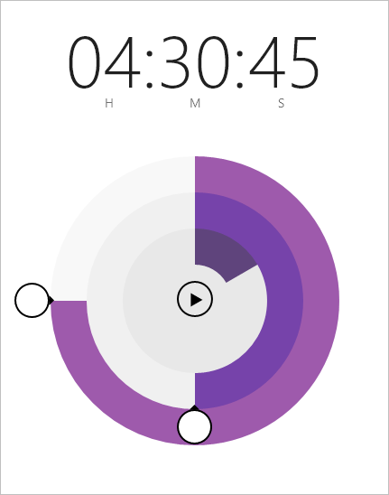
RadialSlider and RingSlice controls can be used to create radial input controls such as in this sample (included in our download), which mimics a countdown timer in the Windows Alarms app:
The end user simply grabs the thumbs, either via touch or mouse, and drags in a circular fashion to alter the values. The RingSlice controls that render the current values track with the dragged thumb.
Summary
The RadialSlider control is available in our WPF, Silverlight, and WinRT/XAML Shared Libraries and is licensed for use by any of our customers of those control platforms. Download v2014.1 and check it out!

