A new Avalonia UI Controls release is now available that adds an exciting new feature named user interface density. Best of all, this feature is part of Actipro Themes and completely free to use!
See the related announcement post for the detailed list of enhancements and updates.
What is User Interface Density?
User interface density describes how tightly controls are packed together. A simple setting on an Actipro theme definition sets the application-wide user interface density, which can adjust appearance features such as:
- Margin
- Padding
- Corner radius
- Width, height, and related minimum and maximums
- Panel spacing
- Grid length
- Other various scalar values
These appearance features can be controlled anywhere in XAML via the use of theme resources and special XAML markup extensions.
UI Density Options
User interface density is a theme definition setting you can set at app startup and even change dynamically at run-time.

There are three UI density options:
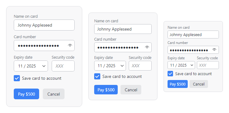
- Spacious - Most touch-friendly, and what our first Avalonia UI Controls version used.
- Normal - A balance between touch-friendly and fitting more controls in available space. This is the new default.
- Compact - Intended more for desktop apps that want to maximize the number of controls fit in available space.
The screenshot above shows how the exact same XAML snippet that uses our theme resources and special XAML markup extensions can auto-adjust its appearance based on the current UI density setting.
Summary
We think that offering UI density features in a theme is extremely important, and we are excited to see how customers make use of this new capability. These features allow you to tailor your app's view's to fit your end user's needs and can be adjusted based on the amount of data your app needs to display.
Give it a try by downloading our samples project and when running the samples app, use the View menu to adjust the user interface density. You'll see how the entire application adjusts its appearance.
