This version adds several great new controls and makes a number of updates across the WPF control product line.
See the related announcement post for the detailed list of enhancements and updates.
Here’s a look at some of the major new features.
Views
Settings
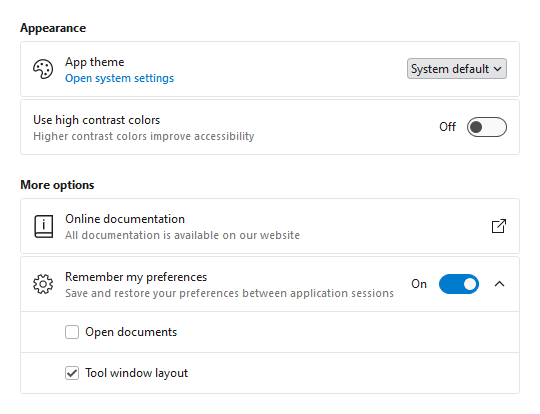
- Consistent Appearance - Cards have a uniform design, and related cards can be grouped together. Each setting card can optionally have an icon, header, description, and content.
- Card Contents - A setting card's content is generally an editor for the setting. The content may be left blank, and the card itself can be made into a clickable button.
- Flexible Editors - Each setting card can contain any kind of editor control. Switches, sliders, combo boxes, and text boxes are commonly-used editor controls.
- Expandable Sections - Some settings have numerous child settings. These indented settings may be hidden under expandable cards that animate the contents when opened.
Application settings have never looked so good!
Shared Library
Card
The new Card control presents visually grouped information for a single subject, using optional cover, thumbnail, header, and footer sections.

Cards can optionally be actionable and even support built-in integration with badges.
InfoBar
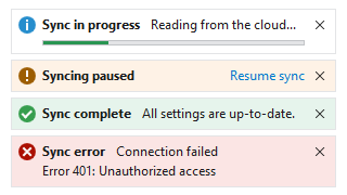
The new InfoBar control displays essential information to a user without disrupting the user flow. Messages can display with optional severity, action, and more.
Bars
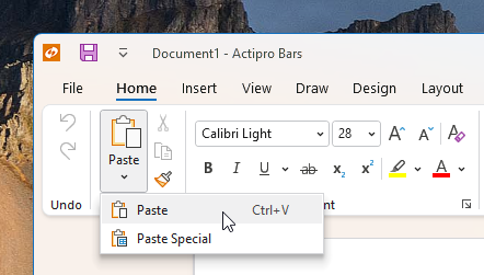
Many updates have been made to the Bars controls to further improve features and functionality.
