WPF, Silverlight, and WinRT/XAML Controls v2014.1 Maintenance Releases

by Avatar Bill Henning (Actipro)
Monday, June 2, 2014 at 9:19am

20141MaintBlogPostBanner

New maintenance of the 2014.1 versions of our WPF, Silverlight, and WinRT/XAML controls have been released and are now available for download.

Major new features are described below.  See the announcement posts for the detailed list of enhancements and updates, including many items not listed below:

ProductHeadingGenericCharts

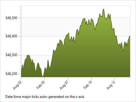
Auto-Calculation of Tick Mark Intervals

ChartTickCalculation2

XYDoubleAxis, XYDecimalAxis, and XYDateTimeAxis have been updated to auto-calculate tick mark intervals when they aren't specifically set.  A new Axis Ticks QuickStart has been added that shows off automatic tick mark interval calculation.

Rendering Improvements

We've improved the rendering speed of data point labels, improved the rendering logic of bar charts, and updated data point labels to use a subtle border so that they don't blend in with surrounding chart objects of the same color.

Label Performance Improvements

Data point labels in pointer visibility mode now delay layouts until a pointer event occurs, thereby speeding up initial chart display.

Numeric Type Data Upconversion

XYChart now will automatically upconvert non-Double numeric type data to Double type so it can display.

ProductHeadingGenericDataGrid

Child Control Styles Applied to Some Auto-Generated Columns (WPF only)

ThemedDataGrid has been updated to style the child controls of auto-generated ComboBox and CheckBox columns.

ProductHeadingGenericDocking

Disabling Rafting Window Snap-to-Screen (WPF only)

Added the DockSite.IsRaftingWindowSnapToScreenEnabled, which can be set to false to prevent rafting windows from snapping to the closest screen when being displayed.

More Tabbed MDI Tile Options (WPF only)

Overloads to the TabbedMdiHost.TileHorizontally and TileVertically methods have been added that allow for a maximum number of columns/rows.  This permits additional tile configurations, such as a single row of tiles.

ProductHeadingGenericPropertyGrid

Double-Clicks Cycle Values (WPF only)

PropertyGridDoubleClick2

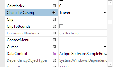
Updated double-clicks on property names to cycle through standard values if available.

CommitPendingChanges Helper Method (WPF only)

A PropertyGrid.CommitPendingChanges method has been added that forces any pending LostFocus bindings within property editors to update and ensure the data model is current.

ProductHeadingGenericSyntaxEditor

Navigable Symbols Hierarchy Support

Navigable symbols now support hierarchy levels and item indentation.  This feature was added to allow XML element hierarchies to be displayed in the NavigableSymbolSelector.

Numerous Minor Enhancements

Many minor enhancements have been made, which can be seen in the detailed update list.

LL(*) Parser Framework

A Grammar.AddChildFrom overload was added that allows for specification of a desired child index.

Web Languages Add-on

XmlNavigableSymbolProvider2

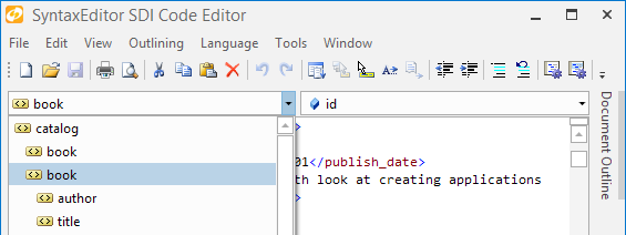
The XML grammar was reimplemented using type-specific AST nodes, thereby reducing overall AST memory usage by an average of 40%.  A XmlNavigableSymbolProvider service was added to the XML language that provides contextual element and attribute display in a NavigableSymbolSelector control.  The XML and HTML editor demos were updated to showcase the new navigable symbol provider features.

ProductHeadingGenericShared

Horizontal ListBox Control

HorizontalListBoxWinRT

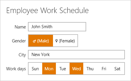
The HorizontalListBox control was added, which allows for selection of items that are arranged horizontally with a uniform width.

UniformGrid Control (WinRT / Silverlight only)

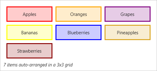
UniformGrid3x3

The UniformGrid control was added, which is a Panel that can arrange content in a grid where all the cells in the grid have the same size.

RadialSlider Improvements

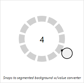
RadialSliderSegmented

The RadialSlider class logic for snapping values has been improved.

DelegateCommand (WinRT only)

The DelegateCommand class has been added, which is an implementation of ICommand that uses delegates.

TaskDownload TaskLiveDemo TaskBuyNow

SyntaxEditor XML Add-on - Navigable Symbols

by Avatar Bill Henning (Actipro)
Thursday, May 8, 2014 at 10:00am

PostBannerSyntaxEditorDevNotes

Today I'd like announce a great new feature coming to the SyntaxEditor Web Languages Add-on (WPF, Silverlight, and WinRT/XAML versions): a XML navigable symbol provider

Features

If you are new to SyntaxEditor, you may be wondering what is a navigable symbol provider.  Navigable symbol providers allow SyntaxEditor to provide a set of drop-downs above it that indicate the current context of the caret.  They also allow an end user to select items in the drop-downs to move the caret directly to the related definition.

Our .NET Languages Add-on's C# and VB languages already support this feature and the two drop-downs above the editor show the current type and member context.

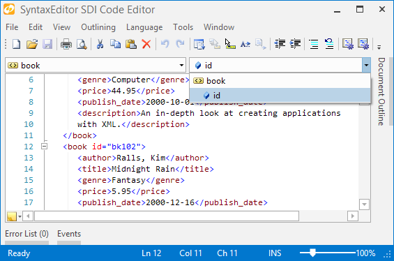
With the addition of this feature to XML, two drop-downs above the editor can show the current element and attribute context.  Let's see a screenshot:

XmlNavigableSymbolProvider1

In the screen above, the caret is on line 12 in the "id" attribute.  The attribute drop-down (top right) properly shows the "id" attribute as context.  If we would click the "book" element in that drop-down, the caret would move to the "book" tag's name.

XmlNavigableSymbolProvider2

In this screenshot, we have displayed the element drop-down while still on the "book" start tag.  It has selected the current element for us and also shows the hierarchy of elements up to the root element ("catalog").  It also shows us the elements that are direct children of the current element.  In this case, elements like "author", "title", etc. are the direct children of "book".  Any of the items in the drop-down can be clicked and the caret will jump right to that element.  In this sense, it provides somewhat of a mini-document outline.

Summary

This great new feature will roll out in the upcoming 2014.1 WPF, Silverlight, and WinRT/XAML controls maintenance releases.

TaskDownload TaskLiveDemo TaskBuyNow

Windows Workflow Designer SyntaxEditor Integration Updates

by Avatar Bill Henning (Actipro)
Tuesday, April 22, 2014 at 7:07pm

WpfControlsTipsBlogPostBanner

Last year, we created a sample for showing how a hosted Windows Workflow Designer instance could be integrated with Actipro WPF controls within a custom WPF application to provide a very elegant interface for end users. 

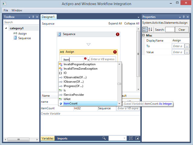
We have continued enhancing it and here's what it currently looks like:

WorkflowDesigner

Our Docking/MDI product is used to provide the tool window and multiple document interface.  Our SyntaxEditor code editor control, in single line edit mode, is injected as a custom expression editor.  When you combine SyntaxEditor with our .NET Languages Add-on, you are able to have it support powerful IntelliPrompt completion lists.  For instance, in the screenshot above, you can see the itemCount variable is showing up in the completion list since it was declared below.

In recent updates, we've:

  • Updated App.OnStartup code to theme native WPF controls using Actipro themes.
  • Added a Menu above the designer with options for closing the window, and toggling the tool window visibility.
  • Added a custom completion ListBox implementation to work around issue where ListBoxItem would steal focus on click and Workflow Designer thought that it then had to close the expression editor.

When you put it all together, it's very easy to integrate Actipro WPF controls with rehosted Windows Workflow Designer instances in your applications.  It only takes a few minutes to get up and running, and once you do, the result is well worth the time.

Summary

If you rehost the Windows Workflow Designer in your WPF apps and would like our example, please contact us and we'll be happy to share it with you!

For those customers who downloaded either of the prior versions, this update is at the same URL as before.

TaskDownload TaskLiveDemo TaskBuyNow

JSON Language Coming to WinForms SyntaxEditor

by Avatar Bill Henning (Actipro)
Tuesday, April 8, 2014 at 2:07pm

PostBannerSyntaxEditorDevNotes

We are adding a JSON language implementation to the WinForms SyntaxEditor samples for the next maintenance release.

Features

JSON is a lightweight data-interchange format that is a subset of JavaScript syntax, and is commonly used with many web technologies.  With the new syntax language, you'll be able to provide a great editor/viewer for JSON data.  Here's a screenshot:

JSONWinForms

The JSON syntax language has these features:

  • Syntax highlighting
  • Automatic code outlining
  • Smart indent
  • Delimiter (bracket) highlighting

Summary

This new syntax language example will be included in the next WinForms Controls maintenance release.

TaskDownload TaskLiveDemo TaskBuyNow

WPF, Silverlight, and WinRT/XAML v2014.1 Released

by Avatar Bill Henning (Actipro)
Wednesday, March 12, 2014 at 10:37am

BlogPostBanner

The 2014.1 versions of our WPF, Silverlight, and WinRT/XAML controls have been released and are now available for download.

Major new features are described below.  See the announcement posts for the detailed list of enhancements and updates, including many items not listed below:

ProductHeadingWPFDocking

Metro themes have been dramatically refined and updated in this version, mostly in the area of Docking/MDI.  Updated UI includes subtle border lines, new auto-hide tab appearance, title bar gripper decorations, and more.

DockingMetro

Metro themes will now not show images on tabs by default, and have changed auto-hide tabs to require a click (instead of hover) to open.  These updates match Visual Studio 2013 behavior.

We've added new events for the auto-hide popup (flyout) that fire when it is opened or closed.  The popup is also now displayed using a faster default animation speed.

When the DockSite.AutoHidePopupOpensOnMouseHover property is false, clicks on auto-hide tabs are required to toggle the auto-hide popup opened and closed.

ProductHeadingWPFPropertyGrid

New built-in property editors for FontFamily, FontStretch, FontStyle, and FontWeight type properties have been added.

PropertyGridFontFamily

ProductHeadingWPFRibbon

New key tip specific theme resources have been added and key tips in Metro themes now render more like Office 2013.

CheckBox-based menu items now are capable of supporting tri-state display.

ProductHeadingGenericSyntaxEditor

Delimiter auto-completion logic for insertion and subsequent scope tracking has been greatly improved.  Delimiter indent provider can now optionally support square braces.

Added a new property that allows SyntaxEditor to measure itself based on text contents.  This works great for smaller documents in both multi-line and single-line modes.

SyntaxEditorAutoSize

Updated single-line mode to support word wrap, which is very useful when combined with the new view line measuring option.

SyntaxEditorSingleLineWrapped

Bookmark indicators now support an IsEnabled state.

LipsumGenerator class added to support generation of "lorem ipsum" placeholder text.

Changed block indent mode to retain whitespace after the caret when Enter is pressed.

.NET Languages Add-on

Numerous improvements to the VB language's handling of identifiers and variable declarations that don't include a type.

Web Languages Add-on

Added IntelliPrompt completion for keywords and symbols to the JavaScript language.

JavaScriptCompletion

Added a new advanced JSON language that can be used to view/edit JSON files, along with a new related QuickStart.

JsonLanguage

Updated JavaScript language to support multi-line strings via backslash continuation.

ProductHeadingWPFThemes

Many improvements to Metro themes (mostly in the Docking/MDI area described above), and improved WindowChrome (and RibbonWindow) rendering when maximized.

ProductHeadingGenericShared

WPF/Silverlight Only

Added the RadialSlider control, which is a circular slider that can be used to input any scalar value.

RadialSliderIntro

Added the RingSlice control, which renders a portion of a ring at designated angles and radius.

RingSliceProgressIndicator

Added the CircularThumb control, which is a thumb gripper with a circular shape and arrow adornment.

Added three samples for new Shared Library controls.

WinRT/XAML Only

Added the AppBarHint control, which is a visual hint to users that app bars exist on a page, and can be tapped to toggle them open. 

AppBarHint

Added a related QuickStart.

ProductHeadingMisc

Sample Browser (WPF/Silverlight only)

Added the ability to toggle description sidebar on some samples.

TaskDownload TaskLiveDemo TaskBuyNow