SyntaxEditor - Code Block Selection

by Avatar Bill Henning (Actipro)
Wednesday, April 17, 2013 at 2:52pm

PostBannerSyntaxEditorDevNotes

We've been hard at work on new features, many of which relate to SyntaxEditor, for the upcoming 2013.1 maintenance releases of our WPF and Silverlight products.

A new feature coming to SyntaxEditor that is already in our WinForms version is called code block selection.

What It Does

Code block selection is a feature where the view's selection can be expanded to include containing code blocks, and then later contracted all the way back down to the caret as appropriate.

For instance, in C# the first time you expand the selection (via Ctrl+Num+), it may select the containing identifier.  By expanding it again, it may select the containing expression, then the containing statement, then the containing method.  And so on up the compilation unit.

By contracting the selection (via Ctrl+Num-), it goes back and selects the previously selected block.  Contracting can occur recursively to go back to the original selection.

This feature can be implemented in any language (very easily so if your custom language uses our LL(*) Parser Framework), and we've done just that for the advanced C#, VB, and XML languages we provide.

A C# Example

Let's see how this works in the C# language from our .NET Languages Add-on.

CSharp1

The cursor starts in WriteLine.

CSharp2

The containing identifier is first selected.

CSharp3

Then the containing expression. 

CSharp4

Then the containing statement, which in this case was the expression plus the semi-colon.  Next, the containing block is selected.

CSharp5

Finally the containing for statement of that block is selected.  If we would continue on, the method, class, etc. would be selected.

A XML Example

Now let's see how the XML language in the Web Languages Add-on works with this feature.

Xml1

First the caret is in an attribute name.

Xml2

Then the attribute is fully selected.

Xml3

Then all attributes in the tag are selected.

Xml4

Next, the entire tag is selected.

Xml5

Then the containing element's content is selected.  This is great if you want to quickly press Del and replace the content of the element.

Xml6

Finally, the entire tag block is selected.  If we would continue on, the parser element's content would be selected, then the parser tag block, etc.

Summary

You can see how this great feature can help with quick selection of containing code blocks.

This and some other exciting unannounced features are ready to go for the upcoming 2013.1 maintenance release, due soon.

TaskDownload TaskLiveDemo TaskBuyNow

WPF Controls 2013.1 Released

by Avatar Bill Henning (Actipro) - 2 comments
Wednesday, March 20, 2013 at 12:04pm

BlogPostBanner

Actipro WPF Controls 2013.1 have been released and is now available for download. This version adds a new full-size Charts product, a Metro Dark theme, a complete reimagining of the Sample Browser's UI, and some great new SyntaxEditor functionality.

Major new features are described below.  See the announcement post for the detailed list of enhancements and updates.

ProductHeadingWPFCharts

Our new full-size Charts product has been added, allowing you to create stunning charts for your apps.  See this announcement post and this first look post for a couple other chart screenshots.

Line Charts

LineChartType_thumb[1]

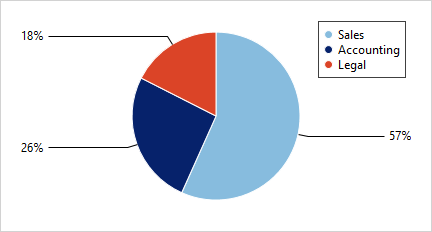
A line chart renders quantitative data as a series of points connected by line segments. Lines can be straight, curved, or stepped. Markers can optionally be displayed based on type (such as first/last, high/low, negative, etc.).

Scatter Charts

ScatterChartType_thumb[1]

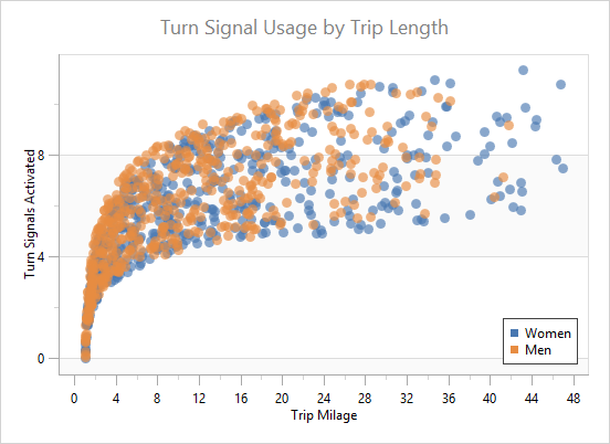
Scatter charts render data points where each point is represented by a marker. Markers can use numerous built-in shapes or can be set to use custom shapes.

Area Charts

AreaStackedChartType_thumb[1]

An area chart is a derivative of a line chart, where the area between the line and axis is filled in. As with line charts, areas can also be rendered using straight, curved, or stepped lines

Bar Charts

BarStackedChartType_thumb[1]

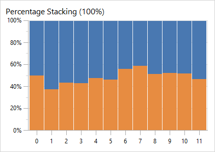
A bar chart displays rectangular bars with lengths proportional to the values they represent. Bar spacing can be set and the bars can be changed to render horizontally instead.

ProductHeadingWPFSyntaxEditor

Indicators

IndicatorsBreakpoints_thumb

A rich object model for supporting indicators has been added.  Indicators are special "tagged" regions of text that optionally display a glyph in the indicator margin and optionally highlight the text range with special styles.  Built-in indicators include bookmarks, breakpoints, and current statement indicators.  Custom indicators can easily be created as well.

See this bookmark indictors post and this debugging indicators post for much more detail on indicators and examples of functionality.

Line Terminator Backgrounds

When a style that has a background encompasses a line terminator, it now will render the background of the line terminator's virtual character.

A new property BackgroundSpansVirtualSpace property has been added to highlighting styles that when set to true, will extend the background over a line terminator to cover all the way to the right edge of the view.

Trim All Trailing Whitespace

A new edit action has been added to trim all trailing whitespace in the entire document, regardless of the current selection.

CollectionTagger<T> Enhancements

The CollectionTagger<T> class has received a large number of new methods that make it easier than ever to manage a collection of tagged regions.

.NET Languages Add-on - Text Formatting

Text formatters have been added to the C# and VB languages in the .NET Languages Add-on, which beautify code by adjusting whitespace and making it more readable.

TextFormatting_thumb

See this C# text formatter post and this VB text formatter post for more information and examples of the formatting results.

.NET Languages Add-on - Attribute IntelliPrompt

AttributeIntelliPrompt_thumb[1]

Full automated IntelliPrompt while editing C# and VB attributes is now included.

.NET Languages Add-on - Implicit Variable Type IntelliPrompt

Automated IntelliPrompt quick info now displays when hovering over var in C# or Dim in VB.

ImplicitTypes_thumb

See this blog post for some more information and screenshots.

ProductHeadingWPFThemes

Metro Dark Theme

A Metro Dark theme has been implemented that renders similar to Visual Studio 2012's dark theme.  This new theme affects all controls and even can apply to native WPF controls.

MetroDark

Actipro Themes for WPF now provides implementations of all system themes, three Office themes, and three Metro themes!

See this blog post showing several screenshots of the new Metro Dark theme in action.

TaskDownload TaskLiveDemo TaskBuyNow

Silverlight Controls 2013.1 Released

by Avatar Bill Henning (Actipro)
Wednesday, March 20, 2013 at 11:54am

BlogPostBanner

Actipro Silverlight Controls 2013.1 has been released and is now available for download. This version adds a new full-size Charts product, a complete reimagining of the Sample Browser's UI, and some great new SyntaxEditor functionality.

Major new features are described below.  See the announcement post for the detailed list of enhancements and updates.

Note:  Version 2013.1 updates the Silverlight controls to target the Silverlight 5 platform.

ProductHeadingSilverlightCharts

Our new full-size Charts product has been added, allowing you to create stunning charts for your apps.  See this announcement post and this first look post for a couple other chart screenshots.

Line Charts

LineChartType

A line chart renders quantitative data as a series of points connected by line segments. Lines can be straight, curved, or stepped. Markers can optionally be displayed based on type (such as first/last, high/low, negative, etc.).

Scatter Charts

ScatterChartType

Scatter charts render data points where each point is represented by a marker. Markers can use numerous built-in shapes or can be set to use custom shapes.

Area Charts

AreaStackedChartType

An area chart is a derivative of a line chart, where the area between the line and axis is filled in. As with line charts, areas can also be rendered using straight, curved, or stepped lines

Bar Charts

BarStackedChartType

A bar chart displays rectangular bars with lengths proportional to the values they represent. Bar spacing can be set and the bars can be changed to render horizontally instead.

ProductHeadingSilverlightSyntaxEditor

Indicators

IndicatorsBreakpoints

A rich object model for supporting indicators has been added.  Indicators are special "tagged" regions of text that optionally display a glyph in the indicator margin and optionally highlight the text range with special styles.  Built-in indicators include bookmarks, breakpoints, and current statement indicators.  Custom indicators can easily be created as well.

See this bookmark indictors post and this debugging indicators post for much more detail on indicators and examples of functionality.

TextFormattingMode Support

SyntaxEditor's text rendering has been updated to support Silverlight 5's TextOptions.TextFormattingMode property setting.  This feature allows for improved text clarity.

Line Terminator Backgrounds

When a style that has a background encompasses a line terminator, it now will render the background of the line terminator's virtual character.

A new property BackgroundSpansVirtualSpace property has been added to highlighting styles that when set to true, will extend the background over a line terminator to cover all the way to the right edge of the view.

Trim All Trailing Whitespace

A new edit action has been added to trim all trailing whitespace in the entire document, regardless of the current selection.

CollectionTagger<T> Enhancements

The CollectionTagger<T> class has received a large number of new methods that make it easier than ever to manage a collection of tagged regions.

.NET Languages Add-on - Text Formatting

Text formatters have been added to the C# and VB languages in the .NET Languages Add-on, which beautify code by adjusting whitespace and making it more readable.

TextFormatting

See this C# text formatter post and this VB text formatter post for more information and examples of the formatting results.

.NET Languages Add-on - Attribute IntelliPrompt

AttributeIntelliPrompt

Full automated IntelliPrompt while editing C# and VB attributes is now included.

.NET Languages Add-on - Implicit Variable Type IntelliPrompt

Automated IntelliPrompt quick info now displays when hovering over var in C# or Dim in VB.

ImplicitTypes

See this blog post for some more information and screenshots.

TaskDownload TaskLiveDemo TaskBuyNow

SyntaxEditor - Debugging Indicators

by Avatar Bill Henning (Actipro)
Wednesday, March 13, 2013 at 1:42pm

BlogPostBanner

Last week we blogged about how indicators are coming to the WPF and Silverlight SyntaxEditor controls in their 2013.1 versions.  Indicators are special "tagged" regions of text that optionally display a glyph in the indicator margin or highlight the text range with special styles.

In that previous post, we showed off bookmark indicators.  Today, I'd like to show off the other two built-in kinds:  breakpoints and current statement indicators.

Visual Debugging

A new QuickStart we are adding is a simulated debugging experience.  It allows you to set breakpoint indicators on various C# lines and then enter a debugger break state when executing the code.

Debugging1

You can see how three breakpoint indicators have been added.  Our implementation of breakpoint indicators includes an IsEnabled property.  When set to false, the indicator renders differently to reflect its disabled state.

Breakpoints in this sample can be added via the Toggle Breakpoint toolbar button.  Or alternatively, you can click the indicator margin (where the glyphs appear) to toggle a breakpoint.  We include the full source code for showing how to interact with that margin by intercepting mouse events.

Let's click the Run button.

Debugging2

The first breakpoint is located and we set a current statement indicator.  This kind of indicator uses a yellow arrow glyph and renders the background of its contained text in yellow.  It is set up to be higher in z-order than breakpoints.

This screenshot also shows how content providers for quick info can be set up for when the mouse hovers over a glyph.  The displayed quick info content can be generated on-demand.

Let's click the Run button again.

Debugging3

The current statement indicator uses the built-in indicator search API to locate the next enabled breakpoint.  It skips over the one in the middle that is disabled and lands on the third breakpoint.

Summary

Although the debugging experience here is simulated, by hooking up these indicator features to a debugger for your language, you can easily implement a full debugging UI for your code editor.

These new features and sample will be in the 2013.1 version.

TaskDownload TaskLiveDemo TaskBuyNow

SyntaxEditor - Bookmark Indicators

by Avatar Bill Henning (Actipro) - 2 comments
Thursday, March 7, 2013 at 1:40pm

BlogPostBanner

One of the feature areas we're adding to WPF and Silverlight SyntaxEditor controls is the ability to create indicators, which are special "tagged" regions of text that optionally display a glyph in the indicator margin or highlight the text range with special styles.

Several built-in indicator types will come with SyntaxEditor, one of them being bookmarks.

Bookmark Indicators

Bookmarks are line-based indicators, meaning they associate themselves with a single line of text.  Even as the line gets edited, they remain associated with a single full line.  They move around with the same logic found in Visual Studio's code editor.

Let's see what they look like:

Bookmarks

In this screenshot, we show three bookmarks rendered in the indicator margin on the left.  Our default implementation of bookmarks only renders glyphs in the margin, and doesn't highlight the marked line in the text area in any way (but you could optionally do this too if you wanted).

The toggle bookmark button checks to see if a bookmark is already on the caret's line.  If there is one, it removes it.  If there isn't one, it adds a new bookmark.  Clear all bookmarks removes them all from the document.

The previous and next bookmark buttons use our indicator search API to find another indicator based on an initial line.  In this case, we pass in the line that contains the caret and find the previous/next indicator.  If one is found, we move the caret to that line.

Summary

These features will be in the 2013.1 versions of the WPF and Silverlight SyntaxEditor controls.

We are still working on the design and implementation of indicators.  If you have any feature suggestions, now is the time to contact us!  Please comment here or e-mail us with your ideas and questions.

TaskDownload TaskLiveDemo TaskBuyNow