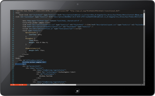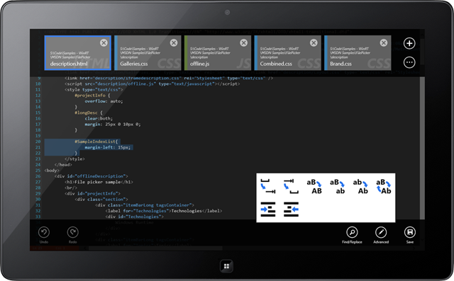
Today we published v1.3 of Code Writer, our free text/code editor app, to the Windows Store.
Code Writer was first released last week but has already gained a tremendous following and is rapidly climbing up the daily rank charts. Yesterday we hit #23 in the "Productivity, Free" category! Please continue to help it grow in popularity by spreading the word to your colleagues.
We've been watching the posts in our forums and in the Store reviews and have delivered on the top requests. This is a very exciting release so let's take a peek at what's new.
Major New Features
File Associations
File associations have been added to all the built-in file types. This allows Code Writer to be registered as a possible default application for the various supported file types when you open files in the Windows desktop or other apps.
We've also added some very nice looking icons for the file types when you choose to register them with Code Writer as the default application.
Custom File Extensions
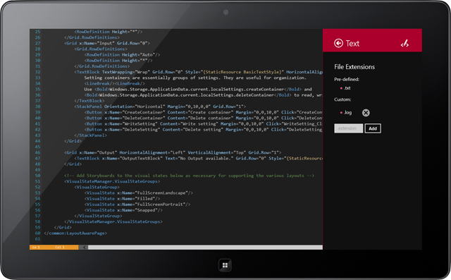
A new detail flyout for each file type has been added that lists all the pre-defined file extensions. It also provides the ability to add custom file extensions for the file type.

In the screenshot above, we've added ".log" as a new custom file extension for text files. This lets the Browse picker open .log files.
Select Multiple Documents in the Browse Picker
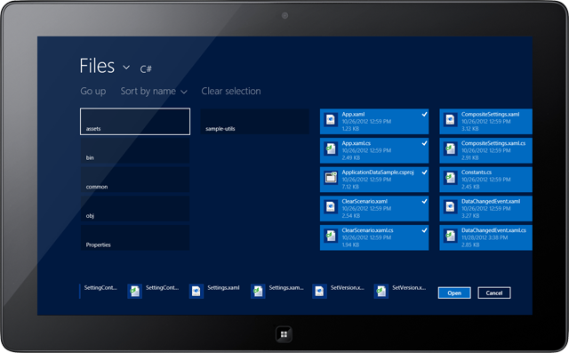
Speaking of the Browse picker, now you can select multiple files to open.

Navigate to a folder, hit the Select All button and open every file in the folder.
Document Properties Pane
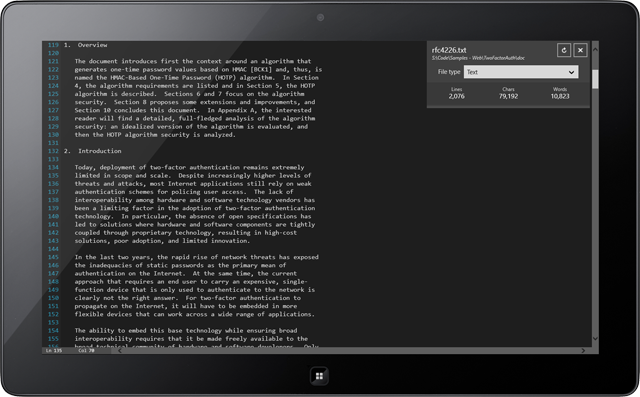
A new Document Properties pane has been added that shows a larger view of the filename and path.

It contains a drop-down that allows you to change the file type associated with the current document only, which normally defaults to a file type based on the file's extension.
The pane also displays some helpful statistics like total line, character, and word counts.
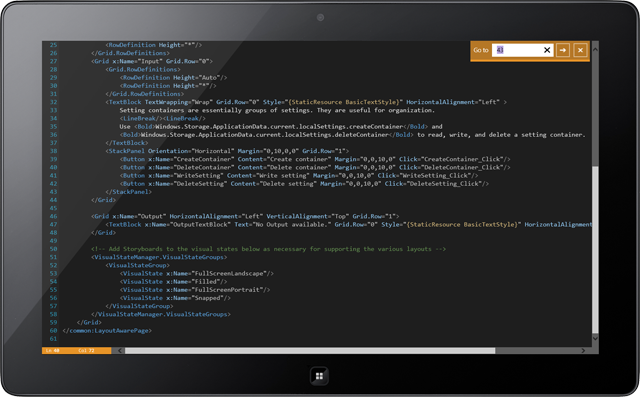
Go To Pane
The Go To pane allows you to enter a line number and jump directly to it in the editor.

New Settings Options
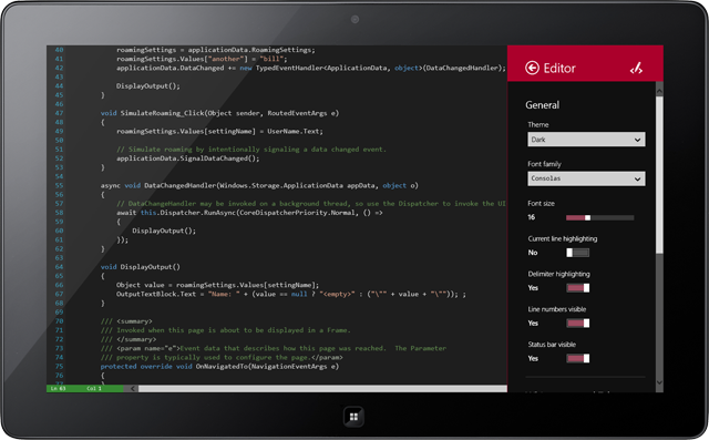
Code Writer has a large Settings area where you can customize things to your liking.

New in this version is the option to change font family, with built-in font preview.
Summary
This new version adds some very nice enhancements to the app. If you like what you see, please click the button below to go download it and write some code on your devices.


