We are pleased to announce the release of the 2020.1 version of our UWP Controls.
This announcement post contains the detailed list of updates in the 2020.1 version. Please be aware that Windows 10 Fall Creators Update (version 1709) or later and usage of the Microsoft's free 'Win2D.uwp' NuGet package are required.
While the version includes a wide number of small updates and bug fixes, let’s take a look at a handful of the larger updates.
Editors
AutoCompleteBox
AutoCompleteBox now has a SelectedItemChanged event and an InputMode property, that alters input behavior. Search mode is the default and is intended for usage when the control is providing search-like functionality, commonly seen in application title bars. ComboBox mode is an alternate mode intended for use when the control should be used in more traditional ComboBox-like scenarios. When in ComboBox mode, the popup list filter turns off when not typing in the control, allowing the entire list to be browsed when interacting with the control purely via the popup.
Swatch-Only Display
BrushEditBox and ColorEditBox now have a HasText property that allows you to hide the text portion of the edit box for a swatch-only display.
Dates and Times
DateEditBox and TimeEditBox now accept delimiter-less input for several additional custom formats.
Large Incremental Changes
Numeric edit boxes now support large incremental changes when holding Shift while pressing Up/Down or rotating the mouse wheel.
Custom Format Strings
Several numeric edit boxes now support custom format strings with semi-colon conditional format specifiers.
Grids
We've added a PropertyGrid.RequestRefresh method that can be called to tell the PropertyGrid to refresh its contents.
SyntaxEditor
Search Overlay Pane
A new background renders the search range when the search overlay pane is in Selection scope mode.
A new property allows you to disable key bindings that would activate the search overlay pane, which is useful if you have an external search UI.
Logic related the selection scope searching has been improved.
Ctrl+Enter can be pressed to execute a Find All search operation when the Find textbox has focus and the find all button is visible.
IntelliPrompt
New methods allow completion list items to be added much faster, dramatically improving performance.
Actipro WPF Controls v2020.1 development is in progress, and the new version’s main goals are to modernize our UI control features/themes, and make theme customization much easier.
In the previous post, we saw how the window’s title bar header can be customized. In today’s post, we’ll look at how the window’s system menu can be customized.
WPF Windows and Win32 System Menus
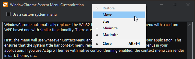
WPF Windows have always used Win32 to provide their system menus, which are menus displayed when clicking the window’s title bar icon, or when right-clicking on the window title bar.
The Win32 system menu is not rendered by WPF, and therefore never matches the style of a WPF application. This is especially evident when using dark themes in your app.
An example of a default Win32 system menu in a dark-themed app
This light Win32 menu looks awful compared to dark-themed menus in the same application.
Customizing the System Menu
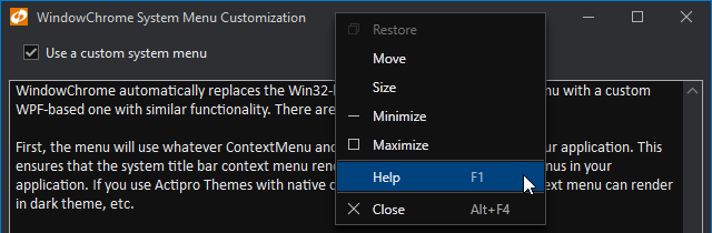
The latest WindowChrome updates automatically replace the Win32-based system title bar context menu with a custom WPF-based one with similar functionality. There are several benefit to this.
First, the menu will use whatever ContextMenu and MenuItem styles are active in your application. This ensures that the system title bar context menu renders in the same style as other menus in your application. If you use Actipro Themes with native control theming enabled, the context menu can render in dark theme, etc.
The same system menu, rendered in WPF and with a custom menu item added
Second, since a custom WPF context menu is being created, the menu can be fully-customized via an event prior to being opened. This sample shows how a 'Help' menu item can be injected into the system title bar context menu.
Summary
Using WPF menus for the system menu ensures theme consistency and easily allows for complete customization of the menu’s contents.
Post in the comments below if you have any feedback or questions about WindowChrome system menu customization.
Actipro WPF Controls v2020.1 development is in progress, and the new version’s main goals are to modernize our UI control features/themes, and make theme customization much easier.
In the previous post, we saw how the window’s content area can optionally be merged into the title bar area. In today’s post, we’ll look at how the header portion of the title bar (where the text title normally is) can be customized and replaced if desired.
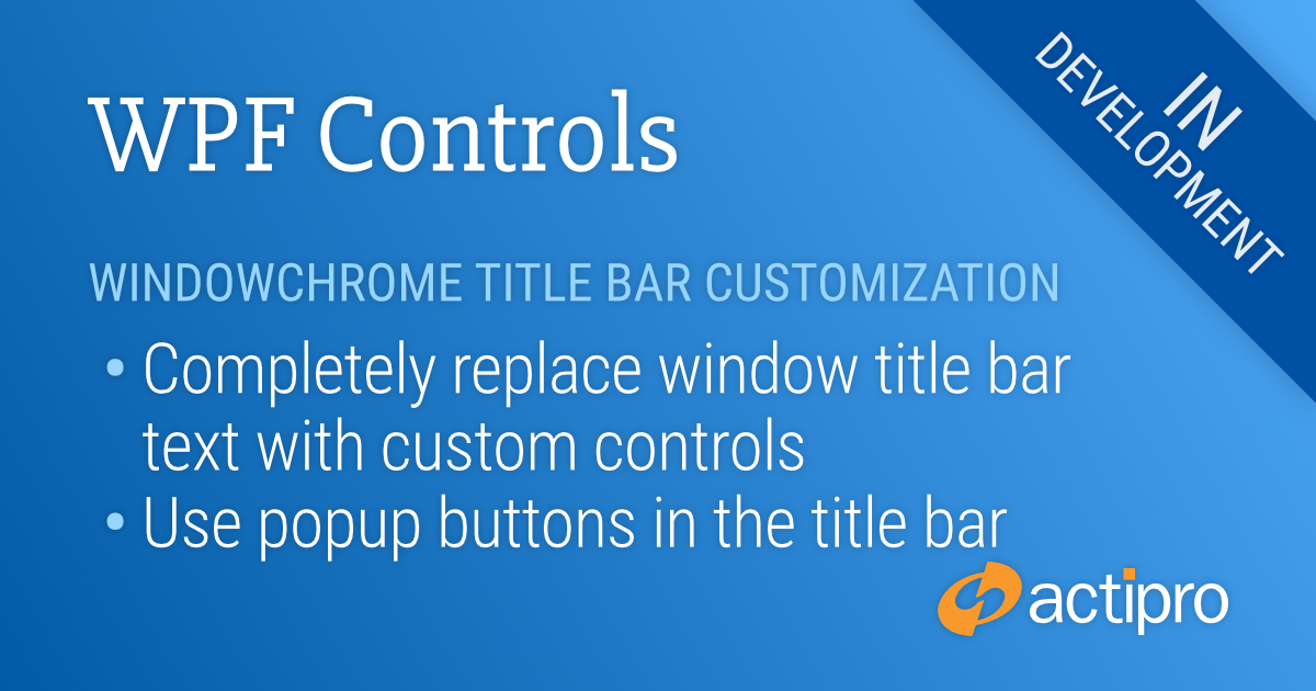
Title Bar Header Customization
While the Windows standard is to display a text title in the title bar, sometimes modern apps like to swap that out for other controls, or to completely remove it altogether.
In this example, we’ll show how a PopupButton from our Shared Library can be added to the title bar, using one of our title bar button styles to render it with title bar brushes.
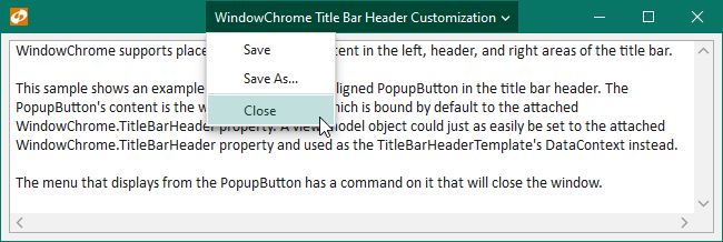
A PopupButton in the title bar header showing a menu
Here we see the text title is replaced by the PopupButton. When the button is clicked, it shows a menu with some options for managing the document open in the window. This kind of user interface configuration could be used for small apps that don’t have a menu.
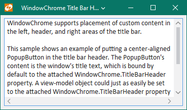
We’ve set up the button to have a maximum width of 300. Here’s a look at how the button resizes itself as available width descreases.
The same window with less available width showing how the PopupButton can trim its text
Summary
These and all the other recently-described WindowChrome features will be available in the 2020.1 version. We’ve got one more post describing new WindowChrome features before we move onto another area of what’s coming in 2020.1.
Post in the comments below if you have any feedback or questions about WindowChrome title bar customization.
Actipro WPF Controls v2020.1 development is in progress, and the new version’s main goals are to modernize our UI control features/themes, and make theme customization much easier.
In the previous post, we saw how WindowChrome supported placing a Menu in a Window title bar to maximize window real estate. In today’s post, we’ll look at an advanced concept of being able to extend Window.Content up into the title bar area.
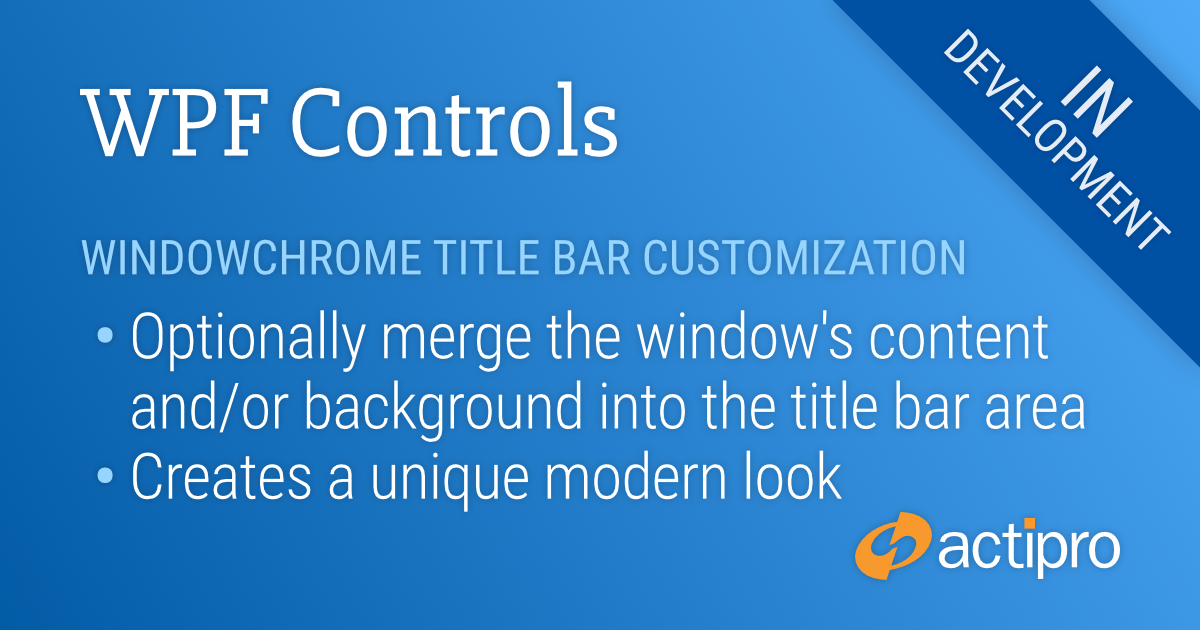
Title Bar Merge Kinds
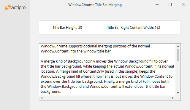
Some modern apps have a more stylized design for their windows and don’t wish to have a traditional window title bar appearance. This is often achieved by merging portions of the window’s content into the title bar area. New WindowChrome features offer three kinds of merge options.
A merge kind of BackgroundOnly moves the Window.Background fill to cover the title bar background, while keeping the actual Window.Content in its normal location. A merge kind of ContentOnly (used in the sample below) keeps the Window.Background fill where it normally is, but moves the Window.Content to extend over the title bar background. Finally, a merge kind of Full moves both the Window.Background and Window.Content will extend over the title bar background.
Title Bar Merge Example
A window with portions of its Content merged into the title bar area
In this sample, we've merged the content area of the window up into the title bar. The content area contains the left column and the Actipro logo that you see visible in the title bar area. A special property on WindowChrome prevents the centered title bar text from ever covering the left column.
This sample also shows off how new read-only attached WindowChrome properties can be examined on a window to return the height of the title bar, as well as the left and right title bar content widths. In this sample, there is nothing in the left title bar area since the icon is hidden. However the three title bar buttons (minimize, maximize, close) do contribute width in the right title bar area. The final resolved values for these widths and heights can be retrieved and used to help when positioning elements within the window that may overlap the title bar, or that may want to be lined up with elements in the title bar.
Hit Testing
When covering the title bar with Window.Content, it’s important that Windows can still hit test title bar regions in the window so that it can be dragged properly. We provide an attached property that allows non-client window hit testing to traverse through any WPF element, thereby allowing special elements to be designated as a “title bar” in Windows’ eyes.
In this sample, the left column background covers the left side of the normal title bar. Doing that would normally prevent window dragging when clicking on that part of the window. However we added and top-aligned a transparent Rectangle to the left column and set it to be the height of the title bar. We then used the special WindowChrome attached property to identify it as a “title bar” so that the upper left portion of the window can still be clicked to support window dragging.
Summary
All these features for merging window content into the title bar area will be available in the 2020.1 version. WindowChrome will provide everything you’ll need to build custom modernized window appearances.
Post in the comments below if you have any feedback or questions about WindowChrome title bar merging.
 Bill Henning (Actipro)