In the latest WPF and Silverlight controls maintenance releases, we've added some important functionality to our Charts product. In the initial release, we could chart quantifiable values (such as numerics and DateTime) on a Cartesian axis. Now we've added the ability to chart strings and other complex types using our new XYGroupedAxis.
Grouped Axis Example
Take this complex type as an example:
class Transaction {
    public double Price { get; set; }
    public string SalesPersonName { get; set; }
}
Given we have a collection of Transaction objects on our data context...
public ObservableCollection<Transaction> Transactions;...then we can bind our BarSeries.ItemsSource to the collection of Transactions. The primary axis is our numeric value (Price), and the secondary axis is our string (SalesPersonName). Those are specified using YPath and XPath, respectively.
<XYChart>
    <XYChart.Series>
        <BarSeries ItemsSource={Binding Transactions}
                    XPath="SalesPersonName" YPath="Price"/>
    </XYChart.Series>
</XYChart>
If our transaction data looks like this:
|
SalesPersonName |
Price |
|
Mary |
300 |
|
Marcus |
100 |
|
Steve |
250 |
|
Marcus |
200 |
|
Mary |
50 |
|
Mary |
100 |
|
Marcus |
50 |
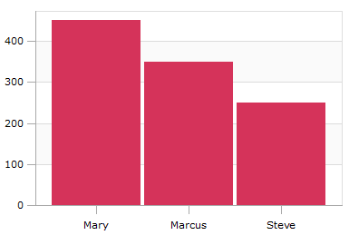
Now our chart will look like so:
Notice how on the x-axis, the strings are grouped by equality. So all transactions for Marcus, Mary, and Steve are grouped into single bars. Also notice how on the primary axis, the numeric values are summed together for each group. So for Mary, who had transactions of 300 + 50 + 100, the grouped value becomes 450.
Further Customization
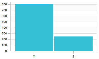
There are several customization options -- you can change how items are grouped by setting XYGroupedAxis.GroupingFunc. XYGroupedAxis.LabelFunc controls how groups are labeled, and XYGroupedAxis.SortingFunc controls how groups are sorted. Using these, we can take the data above and group by the first letter of the name:
Here, notice that grouping is done by comparing the first letter of the name, rather than equality of the entire string. LabelFunc has been specified to show the first letter. Note how the values for Mary and Marcus get summed together on the Y axis.
Summary
XYGroupedAxis allows you to provide custom logic to chart complex types easily. Download the free trials of our WPF or Silverlight controls and check it out!
This same functionality will also be coming to the WinRT XAML version of Charts in its next release.


