 Bill Henning (Actipro)
This massive release adds our new Docking/MDI control library that adds Visual Studio-like docking window and MDI functionality to your Avalonia apps. A commercial-quality docking window library for Avalonia like this has been heavily requested by customers, and we are proud to deliver it.
Alongside the addition of Docking/MDI is a host of other new controls and enhancements across the rest of our product line, and the migration to the recently-released Avalonia 11.3.0 version.
See the related announcement post for the detailed list of enhancements and updates.
Here’s a look at some of the new features.
Docking / MDI
The new control library allows end users to drag and dock windows wherever they please, and persist their layout customizations. It contains docking window and MDI capabilities found in popular IDEs, and extended functionality that you won't find anywhere else. The product is designed to fully support data-binding, allowing it to be used in MVVM applications.
Visual Studio-Like UI
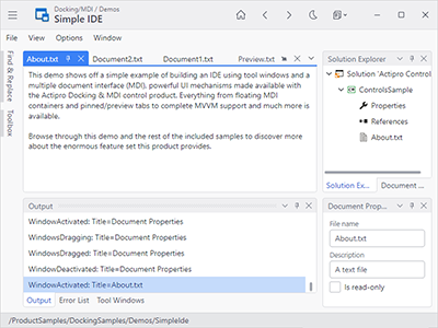
The appearance and run-time behavior of window dragging, tabs, auto-hide popups, context menus, resize splitters, dock guides, etc. is all inspired by the popular Visual Studio user interface.
Docking Windows
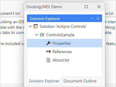
Windows can be docked, attached (to create a tab group), floated, auto-hidden, or moved to an optional MDI area. Complex resizable hierarchies of tool and document windows can be created.
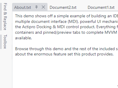
Tabbed MDI
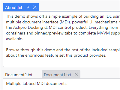
In tabbed MDI each tab represents a document that can be reordered or moved between tab groups. Tabbed MDI documents can be floated into their own full-featured floating dock host.
Standard MDI
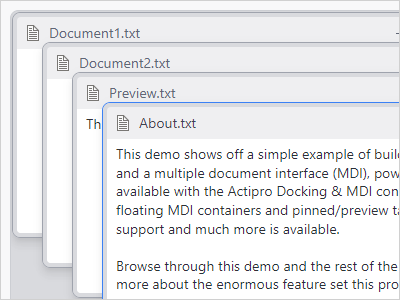
In Standard MDI each document is represented by a Window-like control that can be moved, resized, minimized, or maximized. Cascade and tile operations are built-in.
Auto-Hide
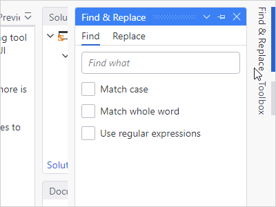
A tab group of tool windows that is docked can be unpinned to enter an auto-hide state. When in this state, tabs for each tool window appear on the outer edges of the layout.
Dock Guides
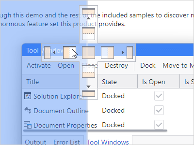
When dragging windows around, dock guides are displayed with the valid drop locations, and a drop target shows the resulting bounds. There is full control over which drop locations are allowed.
Switchers
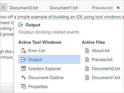
Switchers appear when pressing keys like Ctrl+Tab and allow you to quickly navigate to an open docking window via the keyboard. They can also display descriptions about each docking window.
Fluid Animated Effects
Quick subtle animations are used throughout the product. Tab dragging uses smooth animation, dock guides and drop targets pop into place, and auto-hide popups slide in and out.
Other Features
Layout Persistence
The docking layout and its windows can be set up in XAML or programmatically-created. In addition, the end user's layout customizations can be saved and later restored between app sessions.
MVVM Support
Docking windows can be specified explicitly, or automatically generated by binding to a list of custom view models.
Reusable Controls
Several controls are included that can be reused stand-alone in your apps, such as one that behaves like a resizable window, and an advanced tab control that has tons of features not found in standard tab controls.
Drag and Drop Tabs
Drag and drop tabs to quickly reorder them within their container. Drag them to any other location within the dock site to dock them, or keep them floating above it.
Workspace Content
While most applications have tool windows that surround a workspace with a MDI area, any kind of custom content can be inserted into the workspace in place of a MDI area.
Tool Window Inner-Fill
When there is no workspace within a dock site, the tool window hierarchy fills the entire docking layout. This mode is useful for apps that want their UI to be made completely of tool windows.
Nested Dock Sites
Dock sites can be nested in other dock sites, such as in document and tool windows. For example, a document window in the outer dock site can have its own inner dock site that contains tool windows.
Linked Dock Sites
One or more dock sites can be linked with other dock sites in your app, including ones in separate top-level windows. When dock sites are linked, docking windows can be interactively dragged between them.
Miscellaneous
This product is fully-loaded with additional advanced features like tabbed MDI display states (normal, pinned, preview), contextual content in tabs / title bars, new tab buttons, tab tinting, tab flashing, tab overflow behaviors, window move/resize magnetism, context menu customization, and much more.
Bars
Main Menu
A new main menu control makes it easy to support a modern menu system in your views.
Tag Properties
Tag properties were added to all viewmodel classes in the Bars MVVM library to allow for storage of custom data.
MVVM Updates
Numerous viewmodels in the Bars MVVM library were enhanced with new options to control appearance and behavior.
Fundamentals
WindowControl
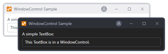
A new WindowControl class simulates the look and feel of a Window with a Control.
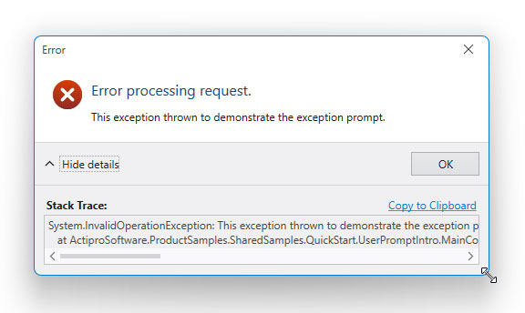
UserPrompt Resizing
User prompts now have a simple property that can configure the prompt to be resizable.
Themes
Immutable Resources
The hundreds of brushes defined for our themes are now created as immutable resources for optimal performance.
Native Control Theme Updates
All native control themes have been updated to correspond with changes made to Avalonia v11.3.0 themes.
Shared Library
Chromed Title Bar Context Menu
A default context menu has been added to chromed title bar.
Chromed Title Bar Rendering
Title bar caption buttons now render differently on Windows, Linux, and macOS to better match the native title bar appearance.
Window Title Bar Snap Guides
Our chromed window title bar on Windows system now supports non-client hit testing and works with Windows snap guides when hovering over the Maximize button.
Avalonia v11.3.0
The Actipro Avalonia Controls now require Avalonia v11.3.0 or later.