Bullet Graphs Part 1 - Introduction

by Avatar Bill Henning (Actipro) - 1 comment
Thursday, August 30, 2012 at 10:42pm

BlogPostBanner

In the previous post for our Micro Charts product (currently available for WPF, Silverlight, and WinRT XAML), we finished looking at our heat map control that is able to generate heat map markers that change both in size and color.  This allows for representations of two distinct data sets in the same heat map.

In today's post, we'll take a look at a new control called MicroBulletGraph coming to Micro Charts in the WPF and Silverlight controls in their 2012.2 versions.  This control is already available in the WinRT XAML 2012.2 version of Micro Charts.

UPDATE:  Version 2012.2 is live and available for download now.

What Are Bullet Graphs?

Bullet graphs were originally designed to replace meters and gauges in a more compact way while still being informative.  They are best suited to display a value that has other related values to be compared to, such as last year's mark, a goal or target, or a projected future value.  With the MicroBulletGraph's many parts, it is easy to provide contextual information about the data being displayed.

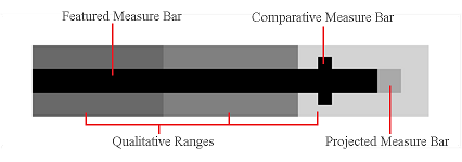
The actual value is represented by a featured measure bar, which is juxtaposed with a comparative value displayed as a bar perpendicular to it. The featured and comparative values are then placed in the context of specific ranges such as poor, average, and excellent. To give further meaning a projected bar can be used to display a future expected value of the featured bar.

BulletDiagram

In the example above all the parts of the MicroBulletGraph are displayed and labeled. Note that the only required value is the featured value, all others can be omitted, hiding the bar from view. An unlimited number of ranges can be used, or none at all, but bullet graphs most commonly utilize three qualitative ranges.

Summary

Bullet graphs are incredible tools to help the viewer grasp multiple points of information quickly without seeming cluttered or confusing.

In our next post of this series, we'll take a look at appearance customization features.

TaskDownload TaskLiveDemo TaskBuyNow

SyntaxEditor .NET Languages Add-on - Async/Await and Iterators

by Avatar Bill Henning (Actipro) - 1 comment
Wednesday, August 29, 2012 at 12:05pm

BlogPostBanner

The latest official C# 5.0 and Visual Basic 11.0 language specifications have added some new keywords and functionality to the languages.  Both languages add asynchronous procedure support (via async/await) and VB adds iterators.

Our upcoming 2012.2 versions of the SyntaxEditor .NET Languages Add-on (WPF and Silverlight versions) have been updated to fully parse the syntax changes and support automated IntelliPrompt on await expression results.

UPDATE:  Version 2012.2 is live and available for download now.

Automated IntelliPrompt for Await

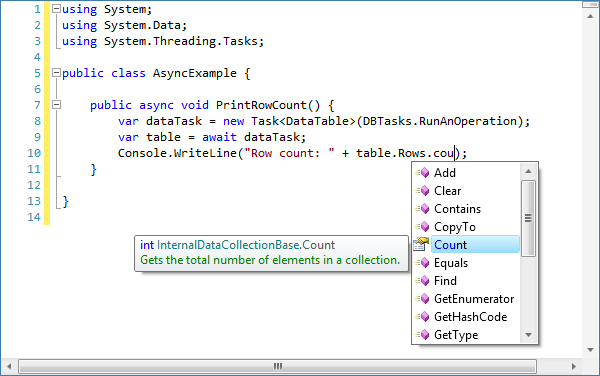
Let's take a look at a sample of async/await in action.  In this sample code snippet, we have a method that will print the row count of a table that is asynchronously returned.

Async

Note how all variables are implicitly declared with the var keyword.  First we declare a dataTask variable that is a Task<DataTable>.  Then we declare a table variable that is the result of an await of the task.

A lot of complicated code is going on behind the scenes here.  First, in order to determine task's type, the resolver has to search the awaited object (dataTask) for a GetAwaiter method (either explicitly declared or declared via an extension method).  If found, it examines that object for a GetResult method and the return value of that is task's type.

Finally you can see from the screenshot that it properly determined that table is of type DataTable since we are able to access the Rows collection on it.

Summary

Our .NET Languages Add-on continues to support the latest syntax innovations and has very impressive automated IntelliPrompt capabilities that can be added to your own applications.  The enhancements mentioned above will be included in the upcoming 2012.2 version.

TaskDownload TaskLiveDemo TaskBuyNow

Metro Theme Coming to WPF Controls

by Avatar Bill Henning (Actipro)
Tuesday, August 28, 2012 at 9:19am

BlogPostBanner

Now that we've released our first set of UI controls for Windows 8 apps, our next development priority is to finish off the new controls and features coming to our WPF controls in their 2012.2 version.

In today's post, we're going to take a first look at some major theme updates that are ready for 2012.2.  In the screenshot below you can see the new Metro Light theme combined with a new class that can convert any Window to render with this custom chrome:

MetroWindow

There are a lot of new specialized features attached to what you see above such as:

  • A complete new theme for the Metro style appearance, inspired by the latest Visual Studio and Office versions.
  • Ability to convert any Window to use a custom chrome like above when the Metro theme is active.
  • Window border color (when active) that matches the StatusBar color.
  • Semi-transparent outer glow effect for window border.
  • Window resizing via the outer glow effect area.
  • StatusBar background, window border, and glow effect colors can all be changed based on app state.
  • Full Aero snap support.
  • Ability to render interop (WinForms, etc.) controls properly, even though transparency is used.

We'll get into more details on how all this works in future posts.  But trust me, if you want your apps to take on the latest Metro-like appearance, you'll definitely want what's coming.  We're very excited for these updates.  They will be part of the 2012.2 versions, which should be available in the next several weeks.

UPDATE:  Version 2012.2 is live and available for download now.

TaskDownload TaskLiveDemo TaskBuyNow

Heat Maps Part 3 - Combining Effects

by Avatar Bill Henning (Actipro)
Thursday, July 26, 2012 at 10:35am

BlogPostBanner

In the previous Heat Maps post, we talked about the new MicroHeatMapPresenter control's size changing abilities. In today's post, we'll look at how the color and size changing abilities can be combined to display two sets of data in the same heat map.

Color and Size-Based Heat Maps

MicroHeatMapPresenter controls can change both color and size at the same time to display two different data values with each marker.  The sizing and color changing behaviors function independently, so they can represent two completely separate data sets.

MicroHeatMap

In the example above, fifteen separate MicroHeatMapPresenter controls have been customized to render as circles and change size and color in order to display both the number of items sold, and the profit per item for three products in five cities. 

The color and size of each control is calculated based on the position of their given color and size values in the range of color and size data respectively.  Note that the tooltip displayed can be customized to display the formatted color and size values, minimums, and maximums.

Summary

Combining the color and size changing behavior of the MicroHeatMapPresenter control allows you to combine multiple instances into an engaging heat map.  A heat map using color and size changing markers displays a lot of data while still being easy to understand and feeling intuitive.  The MicroHeatMapPresenter control allows for the customization of the color gradient to choose from, the maximum size to render at, the shape to render, and the tooltip to display.  These many options allow for the creation of unique and effective heat maps that are excellent at displaying many kinds of data.

Heat maps are now available as of the latest WPF and Silverlight maintenance releases.  Download an evaluation and try them out!

TaskDownload TaskLiveDemo TaskBuyNow

Silverlight Controls 2012.1 Build 132 Released

by Avatar Bill Henning (Actipro)
Friday, July 20, 2012 at 8:37am

BlogPostBanner

Silverlight Studio 2012.1 build 132 has been released and is now available for download.  Several very nice new controls and enhancements are part of this build.

This build has the following major new features:

  • Micro Charts: Added new MicroHeatMapPresenter control that facilitates the creation of heat maps where each cell renders color and/or size differences to reflect data values.
  • SyntaxEditor: Added a new NavigableSymbolSelector control, which can be used to provide type/member drop-down support for a language.
  • SyntaxEditor: Added a INavigableSymbolProvider language service, related types and samples.
  • SyntaxEditor .NET Languages Add-on: Implemented an INavigableSymbolProvider service on both the C# and VB languages, allowing for NavigableSymbolSelector support.
  • All: Improved designer support compatibility with VS 2012.

See the announcement post for the detailed list of enhancements and updates.

TaskDownload TaskLiveDemo TaskBuyNow