New Maintenance Releases of All Control Products

by Avatar Bill Henning (Actipro)
Thursday, December 20, 2012 at 12:55pm

Today we just published new maintenance releases of all our control products.  These maintenance releases contain a lot of minor updates and bug fixes.  For more details, see the related announcement post:

We highly recommend that if you are on the latest major versions, you upgrade to these maintenance releases.

Happy Holidays

We want to wish you all a very happy holiday season and new year.  We value our customers and your support for our products.  You allow us to continue doing what we love, and that is crafting great software.  We are excited to bring you more new products and features in 2013.  See you on the flip side!

Silverlight Controls 2012.2 Build 141 Released

by Avatar Bill Henning (Actipro)
Thursday, November 15, 2012 at 3:52pm

BlogPostBanner

Silverlight Studio 2012.2 build 141 has been released and is now available for download.  Several very nice new controls and enhancements are part of this build.

This build has the following major new features:

  • SyntaxEditor: Added a NavigableSymbolSelector.AreRootSymbolsSupported property, that can be set to false to only show the member drop-down.
  • SyntaxEditor: Added new SyntaxEditor.HorizontalScrollBarVisibilty and VerticalScrollBarVisibility properties that can be set to Hidden to hide scrollbars.
  • SyntaxEditor LL(*) Parser Framework: Added a new Grammar.AstLeftAssociativity tree constructor method that can provide left associativity on binary operator expressions.
  • SyntaxEditor .NET Languages Add-on: Improved the parser and resolver.

See the announcement post for the detailed list of enhancements and updates.

TaskDownload TaskLiveDemo TaskBuyNow

MicroBoxPlot Part 3: Appearance Customization

by Avatar Bill Henning (Actipro)
Wednesday, October 10, 2012 at 8:06am

BlogPostBanner

In the previous post for our Micro Charts product (currently available for WPF, Silverlight, and WinRT XAML), we talked about the minimum and maximum functionality of the new MicroBoxPlot control. In today's post, we'll look at the many ways to customize the control's appearance.

Orientation

The orientation of the graph can be set to vertical to effectively rotate the graph ninety degrees counter-clockwise. Several charts can be given a vertical orientation then placed side by side to create a report that flows horizontally.

Part Appearances

Each part of the MicroBoxPlot control has a style that can be set to customize the size and colors of the chart. The box is rendered as a rectangle and therefore a fill and stroke brush can be specified to alter the color. The median, mean, and whiskers are all rendered as paths, provide options for stroke color, stroke thickness, and other options, such as dashed lines.

Appearances

As mentioned in a previous post, the whisker extent is dependent upon the IQR multiplier. Whiskers can be removed entirely by setting the IQR multiplier to zero. The size of the perpendicular whisker end lines can be customized using the whisker ascent property, which commonly accepts percentage and pixel values. If the whisker ascent is set to zero then no end lines will be displayed. The examples above show a few of the many options for MicroBoxPlot appearance customization.

Tool Tips

Tool tips can also be used on MicroBoxPlots. They can be custom formatted and can display all the part values and the minimum and maximum properties.

ToolTips

The maximum and minimum values will display the actual minimum and maximum of the data, meaning the minimum and maximum of the chart can be custom set and the tool tip will still accurately represent the data.

Summary

The MicroBoxPlot control is currently available in the Micro Charts product, which ships in our WPF, Silverlight, and WinRT XAML control sets.  This concludes our series on the MicroBoxPlot control.  Watch for more micro chart-related posts soon.

TaskDownload TaskLiveDemo TaskBuyNow

MicroBoxPlot Part 2: Minimum and Maximum Display

by Avatar Bill Henning (Actipro)
Friday, October 5, 2012 at 2:17pm

BlogPostBanner

In the previous post for our Micro Charts product (currently available for WPF, Silverlight, and WinRT XAML), we introduced the new MicroBoxPlot control. In today's post, we'll look at the minimum and maximum functionality of the control.

Minimum and Maximum Display

The minimum and maximum of the chart are auto-calculated if they are not given a value. The minimum and maximum are set to the smallest and largest displayed values respectively.

If outliers are not displayed than the whisker values will be the minimum and maximum values. If outliers are displayed, then the minimum and maximum of the values given will be the minimum and maximum of the display. Alternatively, the minimum and maximum can also be set to specific values.

Use in Dashboards and Reports

As shown below, setting the minimum and maximum chart values can be useful for putting group of box plots into the same context.

MicroBoxPlotMinMax

This allows all the charts to display the same range and makes it easy to compare several data sets. The box plots can then be placed directly above each other, or side-by-side to produce a comprehensive, easy-to-read report.

Summary

The MicroBoxPlot control is currently available in the Micro Charts product, which ships in our WPF, Silverlight, and WinRT XAML control sets.

In our next post in this series, we'll take a look at the chart's appearance customization options.

TaskDownload TaskLiveDemo TaskBuyNow

MicroBoxPlot Part 1: Introduction

by Avatar Bill Henning (Actipro)
Wednesday, October 3, 2012 at 10:41am

BlogPostBanner

In the previous post for our Micro Charts product (currently available for WPF, Silverlight, and WinRT XAML), we looked at various features of the MicroBulletGraph control. In today's post, we'll introduce a different type of chart with the new MicroBoxPlot control.

Introduction

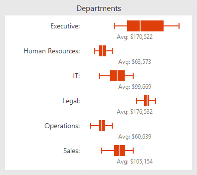
Box plots are excellent tools for creating charts that show statistical distribution in datasets. They are particularly useful for displaying distributions of a group in a compact way. This is good for creating charts that compare a group of data such as the performance of salespeople, heights of a group of people, temperatures along a latitude, and more.

BoxPlotExperience

This example shows how box plots can illustrate the distributions of salaries paid to employees based on how long the employee has been with the company.

Box Plot Parts

Box plots are designed to display the statistical distribution of a dataset. They display a set of data through five major values: the lower whisker value, the lower quartile value, the median, the upper quartile, and the upper whisker value.

The median is the value found directly in the center of the data when it is sorted, meaning half of the data lies above it, and half lies below it. The median is displayed as a perpendicular line to the chart. The lower quartile is the median of the lower half of data, resulting in a quarter of the data being less than it, and three-quarters being greater. The upper quartile is the median of the higher half of data, resulting in three-quarters of the data being less than it, and a quarter being greater. The upper and lower quartiles define the edges of a box drawn on the chart, resulting in the middle half of the data being contained within the box. The whiskers are displayed as "T" bars that extend from the edges of the box to their respective values and are designed to hold the majority of the remaining data, leaving only the outliers outside.

BoxPlotParts

In the example above all the parts of the control are displayed and labeled. The spacing between the different parts of the box plot help indicate the degree of spread in the data.

Inter-Quartile Range Calculation Logic

The difference between the upper and lower quartiles is known as the Interquartile Range (IQR). The product of the IQR and the IQR multiplier (normally a value of 1.5) is then subtracted from the lower quartile value to get the lower whisker value and added to the upper quartile value to get the upper whisker value. The IQR multiplier can be set to any value greater than or equal to zero to customize the extent of the whiskers.

Summary

The MicroBoxPlot control is currently available in the Micro Charts product, which ships in our WPF, Silverlight, and WinRT XAML control sets.

In our next post of this series, we'll take a look at the minimum and maximum display values.

TaskDownload TaskLiveDemo TaskBuyNow