This version implements a huge update in the SyntaxEditor Python Languages Add-on to support Python 3.11 syntax and makes other improvements to the Python and .NET Languages Add-ons.
See the related announcement post for the detailed list of enhancements and updates.
A new Avalonia Controls release is now available. This new version makes improvements across the entire product line. One particularly nice new feature is the ability to now use SVG images with our ImageProvider infrastructure and DynamicImage control.
See the related announcement post for the detailed list of enhancements and updates.
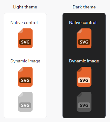
SVG images are not natively supported in Avalonia but can be used in Avalonia via a third-party "Svg.Controls.Skia.Avalonia" NuGet package. Since SVG images are external to Avalonia itself, the default implementation of our ImageProvider does not support their adaptation.
Our DynamicImage and image adaptation infrastructure can now make SVG images look great in dark themes and in disabled scenarios
For this version, we have enhanced our ImageProvider API to support extensibility for unknown image types and created an open source implementation in our sample project's "Shared Library / Dynamic Image" sample that works with SVG images. It can easily be copied to your own apps, allowing you to use SVG images in Actipro controls and themes with full adaptation support for things like adapting for dark themes, appearing in grayscale when in a disabled control, and much more.
This version implements a huge update in the SyntaxEditor Python Languages Add-on to support Python 3.11 syntax and makes other improvements to the Python and .NET Languages Add-ons.
See the related announcement post for the detailed list of enhancements and updates.
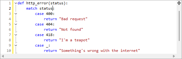
The Python Language Add-on's parser previously only supported Python v3.9 syntax, which will be end of life later this year. The updates in this version added all the syntax updates in v3.10 (like pattern matching) and v3.11. More updates are planned to further increase the supported Python version.
Source Location Display
Past versions have always displayed the source module path on IntelliPrompt popups. In some cases, customers didn't wish for this information to be available to end users. A new option can prevent its display.
Field and Variable Docstrings
Docstrings for fields and variables will now be displayed in IntelliPrompt popups.
 Bill Henning (Actipro)