 Bill Henning (Actipro)

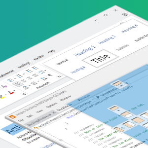
The 2016.1 version of our WPF Controls is now here and it's a whopper. It contains all of the extensive new feature development work we've done on Docking/MDI over the past several months and have blogged about under the codename Docking/MDI vNext. It also has 14 new Office-like themes that match the Colorful and White themes found in the various Office suite applications. Now you can make your own apps look just like Office 2016! SyntaxEditor adds new Metro light and dark image sets that can be used within IntelliPrompt for a more modern appearance. Many other minor tweaks and improvements have been made across the product range as well.
See the entire lengthy detailed update list in our announcement post.
Please note that 2016.1 does have several breaking changes to support better API design and features, so be sure to read the "Converting to 2016.1" topic in the documentation that comes with the controls. It walks through everything in detail.
We've been blogging about some of the major new features coming to Docking/MDI vNext, and those are now here, along with many others. We'll dig in deeper in future blog posts but here's a taste of what's new.
Completely Rebuilt
The Docking/MDI product has completely rebuilt product internals, which are optimized and now support next generation features found in Visual Studio 2015. All UI control styles/templates have been rebuilt from scratch to be simpler and easier to customize. All UI now works with all forms of pointer input: mouse, touch, and pen. We've refactored and centralized focus handling and setting logic. We've refactored magnetism handling. We rewrote UIA to ensure better compatibility with Coded UI Test. All samples have been updated/improved, and new samples added to concisely show features.
Even though much of the product internals have been rewritten, most of the public API remains the same as before other than some type member renamings. The "Converting to 2016.1" topic walks through any breaking changes you encounter.
We also include the "old" 2015.1 variation of Docking/MDI in the WPF Controls download as "ActiproSoftware.Docking.Legacy.dll". This 2016.1 version of the old assembly can be used while you transition to the newer API.
Subtle Animations
Quick subtle animations have been updated and added throughout the product to give it a more vibrant feel. Dragging tabs uses smooth animations, dock guides and drop targets pop into place, and auto-hide popups slide in and out. All of these animations are designed to be fast and pleasing.

AdvancedTabControl
We've created a new AdvancedTabControl control that extends the native TabControl while adding many new features (appearance customization, animation, multiple tab kinds, new tab buttons, etc.), and is used as the primary UI mechanism within the ToolWindowContainer and TabbedMdiContainer templates. It can be used independently of docking windows too, in your own normal windows.
Desired, Minimum, and Maximum Container Sizes
Layout logic has been updated to try to adhere to optional new desired, minimum, and maximum docked size hints on docking windows when space is available. For instance, you can say that you prefer to not let a tool window's container get smaller than 200px high. As long as space is available, the layout logic will do its best to adhere to that request. You can set minimum/maximum size hints the same to suggest a fixed size.

Also related to container sizes, when a layout is sized very small, then grows larger again, the original docking window sizes are restored.
Splitters Can Render Above Interop Content
A problem in the old version was the dragged splitter highlights didn't render above interop (WinForms, etc.) content due to WPF's airspace issue. This scenario now works as expected when interop support is enabled.
Default Locations
Several DockingWindow members have been added to designate preferences for initial dock location when opened, such as with other windows in a group, on a specific side, or at a dynamic location based on an event handler's logic. Best of all, the properties can all be bound to view-models, allowing you to fully designate initial locations for docking windows purely via MVVM.
Docking Window Tabs
A new optional property lets you specify alternate text to render on tabs, generally shorter than the Title text. This is useful in scenarios where your tool window titlebar might have contextual information "Error List - 7 Errors" but your tab should only show "Error List".
Flash effects were supported in the old version via an attached behavior found in the samples, but now tinting and flash effects are first-class citizens via easy-to-use properties right on DockingWindow. Strobe and smoothly animated flash options are both available.
A new property is available for setting a docking window's tab tooltip content. Tabs can now be set to display on any side of a container, not just top and bottom. All tabs can now be middle-clicked to close them.
Contextual Content
New properties have been added that allow custom content like buttons or status indicators to be easily injected into title bars and tabs.

Layout Serialization
A new property has been added that can uniquely identify a docking window with any string value, instead of using the Name property as before, which was limited to identifier syntax. A new properly can prevent a docking window from being included in layout serialization.
Floating Windows
Floating windows now support Aero snap when dragging, meaning you can drag to the top of the screen to maximize the window, etc. When dragging a tab to float, as long as the docking window can float, it will instantly detach and track in a floating window with the mouse. A new option allows you to indicate you want to only use float previews instead of live-dragging windows.
When documents are floated, they now enter a full-fidelity secondary MDI area where other documents can be attached, and even tool windows can be docked around. This is great for use with multiple monitors. Properties are available for setting the icon and title of these floating windows.

A new property has been added that determines what minimum amount a floating window must be visible to avoid being snapped to screen. Partially-visible floating windows will now snap to this minimum threshold as appropriate.
A new event allows you to later and limit a floating window's initial size.
Tabbed MDI
Tabbed MDI has three modes of tab display (normal, pinned, preview), which are similar to those found in Visual Studio 2015. New context menu options are availble such as "Close Others", "Close All Documents", "Pin Tab", etc.

A new tab button can optionally be shown and an event handled in response to add a new document. This allows for UIs like Google Chrome.

TabbedMdiHost now has a property for setting a DataTemplate that displays when there are no documents open.
Standard MDI
Dock guides now show over standard MDI so that dragged windows can be dropped into it. A context menu is now available when clicking a standard MDI window's icon or right-clicking its title bar.

An option is available to perform automatic size-to-content when adding a docking window to standard MDI.
All docking window standard MDI layout properties have been refactored and made more straightforward to access.
MVVM
Many improvements in the area of MVVM have been made. Properties like IsOpen, IsActive, IsSelected, and State are now fully settable and can be bound to view models. Default locations (see above) can be specified via new properties designed for MVVM compatibility.
MVVM implementation has been improved to be more straightforward since docking windows are now the actual container of their content, instead of being represented in UI as a tab.
In MVVM usage, unregistered windows will now automatically attempt to remove themselves from the appropriate DockSite items source property if a new related option property remains true.
Docking windows can be defined in XAML and have their IsOpen property set (or bound to a view model property) to false to close them on initial dock site load, but leave behind a breadcrumb for future restoration.
Switchers
The standard switcher UI has been improved to a new, more modern user interface that animates on display and supports scrolling when there is overflow.

Multiple new standard switcher properties have been added to allow for full customization of its appearance.
Prism 6.1 Support
The Prism sample has been updated to use Prism 6.1 and includes all source for Prism integration right in the sample instead of in a separate interop assembly.
14 New Office 2016-Like Themes
Seven new accent color variations of the MetroLight theme have been added that render similar to the Office 2016 Colorful theme. Seven new accent color variations of the MetroWhite theme have also been added that render similar to the Office 2016 White theme

Now your WPF apps can render exactly like Office 2016 apps.
Updated Metro Theme Title Bar Button Rendering
WindowChrome title bar buttons in Metro themes have been updated to use the larger, crisper Windows 10 style.

Metro and Luna (XP) Themes Swap Assemblies
In previous versions, Metro themes were shipped in their own assembly that required referencing and registration during app startup. In 2016.1, the Metro themes are built directly into the Shared library and no longer require registration. Further, MetroLight will be the default theme on Windows 8.x/10 systems.
Since Windows XP is past its support lifetime, we moved all Luna themes out of the Shared library and into their own separate library, similar to how Metro themes used to be. That library must be referenced and those themes specifically activated if you wish to continue using them.
The changes mentioned above are minor breaking changes (see our documentation for upgrade steps) but better support newer Windows versions and also reduce the overall size of the Shared library.
Automatic White Monochrome Image Conversion
The new accent color MetroLight themes that render similar to Office 2016 require the use of white monochrome icons in certain locations such as the upper QAT, tab panel, and status bar. Features have been built into the ribbon button themes to automatically do this conversion for you.

Simply use standard color Metro-styled icons and they should be automatically converted to pure white when appropriate for you without you needing to do anything. Note how this has occurred for the QAT buttons in the screenshot to the right.
New Metro Light and Dark Image Sets
New MetroLight and MetroDark image sets have been added for use with IntelliPrompt. The current set can be selected via the new static CommonImageSourceProvider.DefaultImageSet property.

Use the appropriate image set based on the current application theme. The screenshot above shows the Classic, MetroLight, and MetroDark image sets within a completion list.