 Bill Henning (Actipro)
-
Bill Henning (Actipro)
-
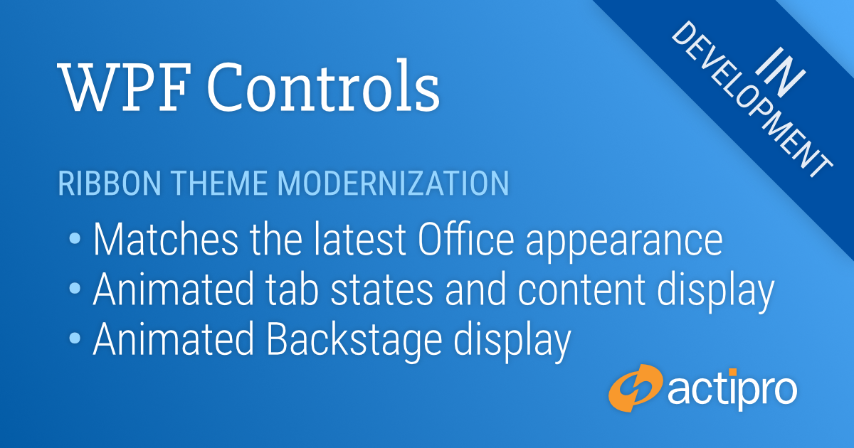
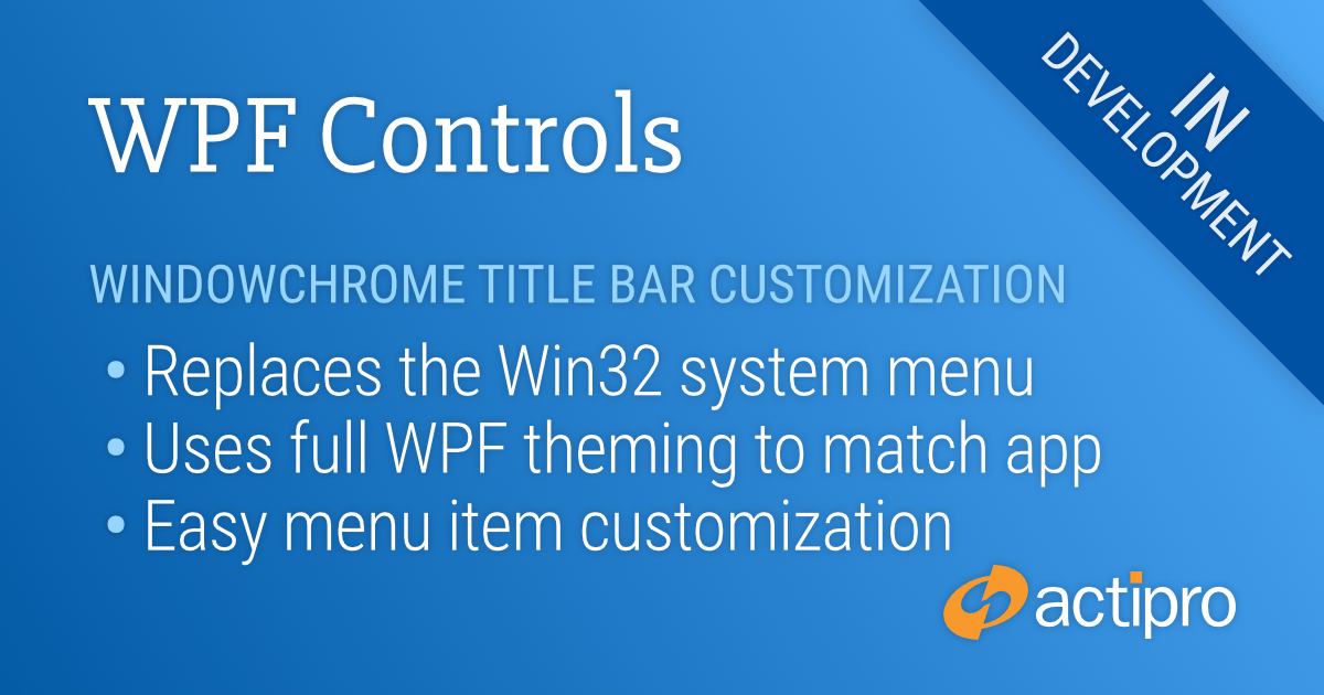
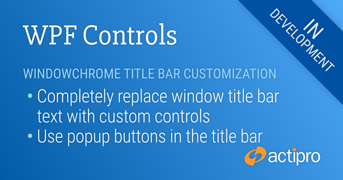
Actipro WPF Controls v2020.1 development is in progress, and the new version’s main goals are to modernize our UI control features/themes, and make theme customization much easier.
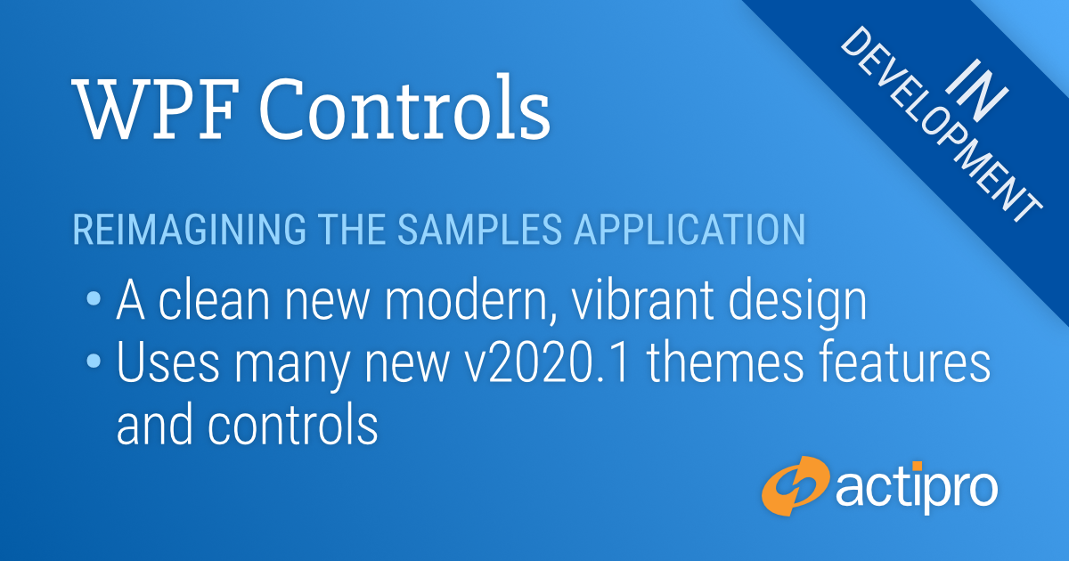
In the previous post, we took a look at the many updates made to modernize the appearance of our Ribbon product for v2020.1. Over the past several weeks, we've been hard at work completely redesigning the user interface of our WPF Controls samples application. This has been quite an effort since the application contains hundreds of samples in it. Let's dig in!
Reimagining the Samples Application Design
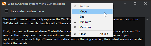
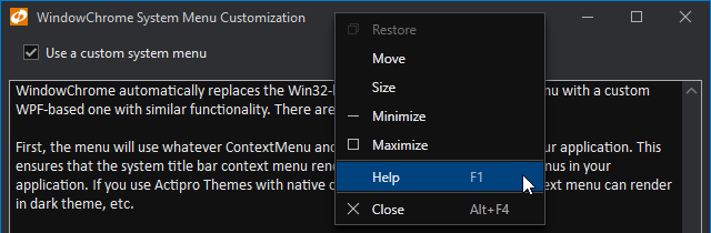
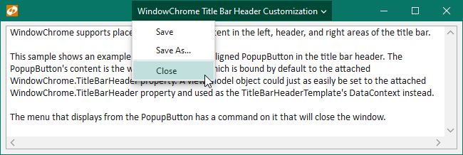
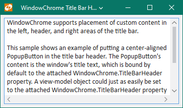
The new WPF Controls samples application design makes use of all our latest themes-related improvements in the 2020.1 version. Right from the start, you'll see our new WindowChrome title bar customization features in play. We've created a completely unique appearance for the title bar in this application, with the current location clearly listed on the left, and various other buttons (switching the app theme, quickly getting to the release history or other views, and so on) on the right side.
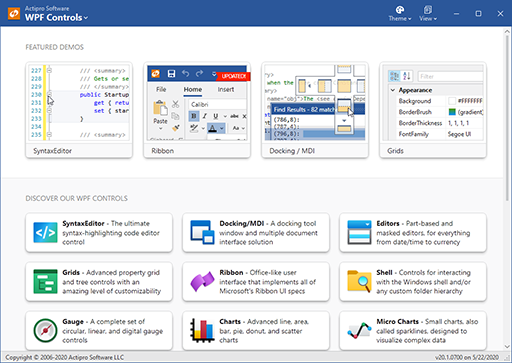
The home view features direct links to our most popular control demos at the very top. Or scroll down to click buttons that delve into each product, with many samples available for each.
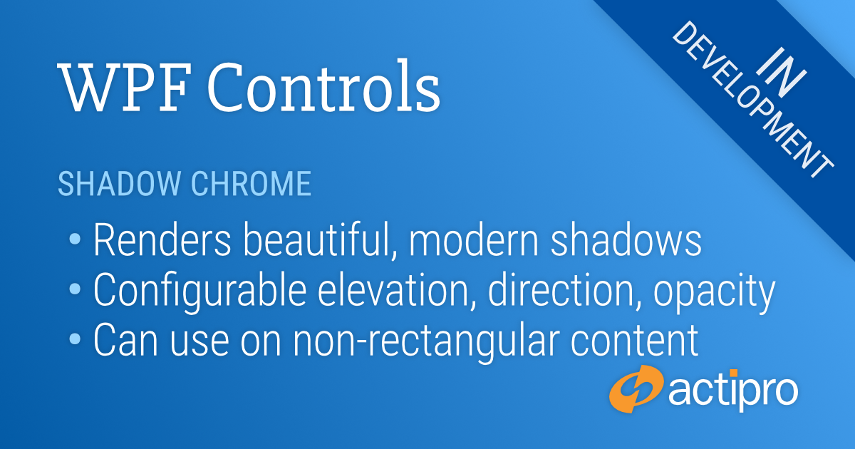
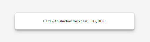
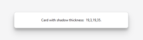
The buttons here make use of our new ShadowChrome control that is added in v2020.1. ShadowChrome renders modern drop shadows and can be easily animated. In this case, we draw the button "upward" to the mouse by altering the shadow as you mouse over a button.
Another thing to notice here is that we've built vivid new icons for each of our WPF Control products, all in the fluent design style.
Let's click the "Editors" product button...
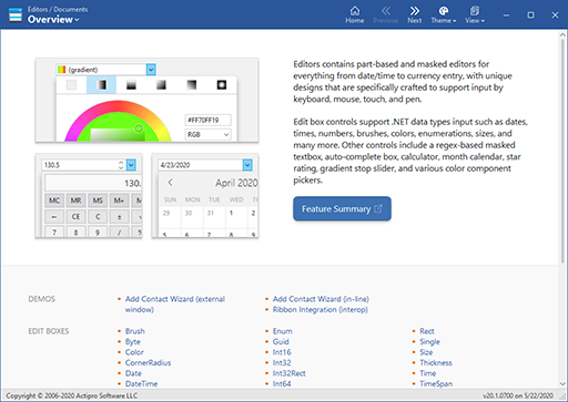
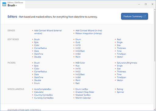
Each product overview provides one or more screenshot buttons that link directly to enticing samples of the product, and shows a brief description of the product. Scroll down to see the entire categorized list of links to available product samples.
We'll click on the "Brush" edit box link...
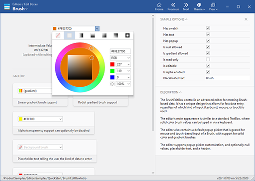
This screenshot is representative of what you'll find with many of our QuickStart samples. The control itself is displayed on the upper left. Various sample options to alter its appearance and behavior appear in the right sidebar, and a general description of the control is below that. We often show a gallery of example usage scenarios of controls as well.
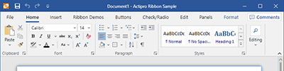
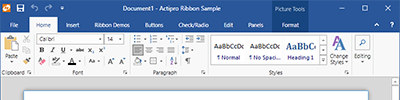
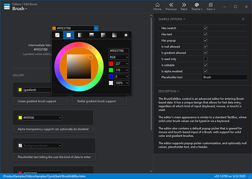
How does all this look if we change the application theme? Let's switch to a Metro dark theme:
Flipping back to the original theme, how can we quickly jump to another Editors sample or to another product's samples?
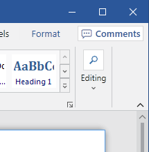
By clicking the button on the upper left that shows the current view location, a Backstage view is displayed. It lists all the samples for the current product in a categorized list. Or you can scroll down to see the list of products to easily jump to another product's samples. This Backstage feature is supported by our new WindowChrome overlay feature.
Summary
We've put a lot of effort into making a new clean, modern design for the samples application and we hope that you'll love using it once the 2020.1 version is released. It makes the entire presentation of the hundreds of samples in the application much more consistent and best of all, the XAML code-behind is now much easier to read.
Post in the comments below if you have any feedback or questions about the new samples application design.