WPF Controls 2012.1 Build 562 Released

by Avatar Bill Henning (Actipro)
Friday, July 20, 2012 at 12:41pm

BlogPostBanner

WPF Studio 2012.1 build 562 has been released and is now available for download. Several very nice new controls and enhancements are part of this build.

This build has the following major new features:

  • Micro Charts: Added new MicroHeatMapPresenter control that facilitates the creation of heat maps where each cell renders color and/or size differences to reflect data values.
  • SyntaxEditor: Added a new NavigableSymbolSelector control, which can be used to provide type/member drop-down support for a language.
  • SyntaxEditor: Added a INavigableSymbolProvider language service, related types and samples.
  • SyntaxEditor .NET Languages Add-on: Implemented an INavigableSymbolProvider service on both the C# and VB languages, allowing for NavigableSymbolSelector support.
  • All: Improved designer support compatibility with VS 2012.

See the announcement post for the detailed list of enhancements and updates.

TaskDownload TaskLiveDemo TaskBuyNow

Silverlight Controls 2012.1 Build 132 Released

by Avatar Bill Henning (Actipro)
Friday, July 20, 2012 at 8:37am

BlogPostBanner

Silverlight Studio 2012.1 build 132 has been released and is now available for download.  Several very nice new controls and enhancements are part of this build.

This build has the following major new features:

  • Micro Charts: Added new MicroHeatMapPresenter control that facilitates the creation of heat maps where each cell renders color and/or size differences to reflect data values.
  • SyntaxEditor: Added a new NavigableSymbolSelector control, which can be used to provide type/member drop-down support for a language.
  • SyntaxEditor: Added a INavigableSymbolProvider language service, related types and samples.
  • SyntaxEditor .NET Languages Add-on: Implemented an INavigableSymbolProvider service on both the C# and VB languages, allowing for NavigableSymbolSelector support.
  • All: Improved designer support compatibility with VS 2012.

See the announcement post for the detailed list of enhancements and updates.

TaskDownload TaskLiveDemo TaskBuyNow

Heat Maps Part 2 - Size Changing Behavior

by Avatar Bill Henning (Actipro)
Thursday, July 19, 2012 at 8:02am

BlogPostBanner

In the previous Heat Maps post, we introduced the MicroHeatMapPresenter control and talked about its color changing abilities. In today's post, we'll look at the MicroHeatMapPresenter's ability to change size to display data values.

Size-Based Heat Maps

As discussed in the previous post, the MicroHeatMapPresenter control is designed to be a single cell in a larger heat map.  Heat maps, in addition to cells that change color, can also use cells that change size to represent data.  MicroHeatMapPresenter controls can be customized to have a different shape and render at varying sizes in order to display smaller and larger values in a data set.

HeatMapSize
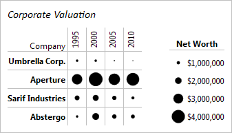
In the example above 16 separate MicroHeatMapPresenter controls have been customized to render as circles and change size in order to display the net worth of four companies over time.  Each control has been customized to be given the same maximum size, minimum, and maximum values.  Each control also has a unique value that it uses with the minimum and maximum values to find what percentage of the maximum size it should render as.

Summary

The size changing behavior provides a very intuitive way to display data values.  Larger values displayed with larger markers creates a chart that gets the information to the audience as fast and with as little confusion as possible.  In addition, many different built-in shapes are available for customization, giving even more options to specialize the chart to make it easier to understand and/or better display the data.

UPDATE:  Heat maps are now available as of the latest WPF and Silverlight maintenance releases.

In our next blog post, we'll take a look at combining color and size changing effects to render two sets of data.

TaskDownload TaskLiveDemo TaskBuyNow

Heat Maps Part 1 - Color Changing Behavior

by Avatar Bill Henning (Actipro)
Wednesday, July 18, 2012 at 8:21am

BlogPostBanner

In our previous multi-part series on our new Micro Charts product, we walked through all the features included in the product for the first WPF and Silverlight releases.  In today's post, we're going to start a new series on an additional control being added to the product in the next maintenance release, one for constructing great-looking heat maps.

Color-Based Heat Maps

The new MicroHeatMapPresenter control is designed to be a single cell in a larger heat map.  A heat map is a type of chart that displays data values through varying colors. The colors of the different cells change over a gradient with some colors representing higher values than others.  In our control you can completely customize this gradient to use whatever colors best suit your needs.

HeatMap

In the example above, fifteen separate MicroHeatMapPresenters have been organized in a grid layout to create a heat map displaying the temperatures of three servers over the course of a day.  Each control has been customized to be given the same color gradient, minimum, and maximum values.  Each control also has a unique value that it uses with the minimum and maximum values to find which color along the gradient it should render with as its background color.

Summary

Heat maps are a great way to visualize data in a way that is easy to understand. They can be used to highlight outliers with stronger colors and direct attention toward them, or to display changing trends with a flowing color scheme. With the freedom to choose any colors in any sequence to create a gradient, you can customize the MicroHeatMapPresenters to create a heat map that displays the data exactly how you want. Just bind some properties and our control takes care of the rest.

UPDATE: Heat maps are now available as of the latest WPF and Silverlight maintenance releases.

In the next post of this series, we'll take a look at the control's size changing abilities.

TaskDownload TaskLiveDemo TaskBuyNow

Micro Charts Part 15 - Series Visibility

by Avatar Bill Henning (Actipro)
Monday, June 25, 2012 at 8:02am

BlogPostBanner

In the previous post for our new Micro Charts product (currently available for WPF and Silverlight), we talked about live data display, such as for stock tickers.  In today's post, we'll look at how the series visibility can be used to have show or hide a series on a chart.

The visibility of a series is visible by default, but it can be set so that the series is not rendered on the chart. This property can be bound so that the series can be hidden or shown by user input. This feature can be very useful when displaying a chart that contains several different series. The series can then be shown or hidden in order to avoid a cluttered look and more closely compare specific series.

SeriesVisibility

Above is an example of a navy blue bar series with its visibility property bound to a checkbox.  It is displayed in the left screenshot and hidden in the right.

This concludes our introduction to our new Micro Charts product.  Please visit the first post to see the full blog post index of this series.