MicroBoxPlot Part 2: Minimum and Maximum Display

by Avatar Bill Henning (Actipro)
Friday, October 5, 2012 at 2:17pm

BlogPostBanner

In the previous post for our Micro Charts product (currently available for WPF, Silverlight, and WinRT XAML), we introduced the new MicroBoxPlot control. In today's post, we'll look at the minimum and maximum functionality of the control.

Minimum and Maximum Display

The minimum and maximum of the chart are auto-calculated if they are not given a value. The minimum and maximum are set to the smallest and largest displayed values respectively.

If outliers are not displayed than the whisker values will be the minimum and maximum values. If outliers are displayed, then the minimum and maximum of the values given will be the minimum and maximum of the display. Alternatively, the minimum and maximum can also be set to specific values.

Use in Dashboards and Reports

As shown below, setting the minimum and maximum chart values can be useful for putting group of box plots into the same context.

MicroBoxPlotMinMax

This allows all the charts to display the same range and makes it easy to compare several data sets. The box plots can then be placed directly above each other, or side-by-side to produce a comprehensive, easy-to-read report.

Summary

The MicroBoxPlot control is currently available in the Micro Charts product, which ships in our WPF, Silverlight, and WinRT XAML control sets.

In our next post in this series, we'll take a look at the chart's appearance customization options.

TaskDownload TaskLiveDemo TaskBuyNow

MicroBoxPlot Part 1: Introduction

by Avatar Bill Henning (Actipro)
Wednesday, October 3, 2012 at 10:41am

BlogPostBanner

In the previous post for our Micro Charts product (currently available for WPF, Silverlight, and WinRT XAML), we looked at various features of the MicroBulletGraph control. In today's post, we'll introduce a different type of chart with the new MicroBoxPlot control.

Introduction

Box plots are excellent tools for creating charts that show statistical distribution in datasets. They are particularly useful for displaying distributions of a group in a compact way. This is good for creating charts that compare a group of data such as the performance of salespeople, heights of a group of people, temperatures along a latitude, and more.

BoxPlotExperience

This example shows how box plots can illustrate the distributions of salaries paid to employees based on how long the employee has been with the company.

Box Plot Parts

Box plots are designed to display the statistical distribution of a dataset. They display a set of data through five major values: the lower whisker value, the lower quartile value, the median, the upper quartile, and the upper whisker value.

The median is the value found directly in the center of the data when it is sorted, meaning half of the data lies above it, and half lies below it. The median is displayed as a perpendicular line to the chart. The lower quartile is the median of the lower half of data, resulting in a quarter of the data being less than it, and three-quarters being greater. The upper quartile is the median of the higher half of data, resulting in three-quarters of the data being less than it, and a quarter being greater. The upper and lower quartiles define the edges of a box drawn on the chart, resulting in the middle half of the data being contained within the box. The whiskers are displayed as "T" bars that extend from the edges of the box to their respective values and are designed to hold the majority of the remaining data, leaving only the outliers outside.

BoxPlotParts

In the example above all the parts of the control are displayed and labeled. The spacing between the different parts of the box plot help indicate the degree of spread in the data.

Inter-Quartile Range Calculation Logic

The difference between the upper and lower quartiles is known as the Interquartile Range (IQR). The product of the IQR and the IQR multiplier (normally a value of 1.5) is then subtracted from the lower quartile value to get the lower whisker value and added to the upper quartile value to get the upper whisker value. The IQR multiplier can be set to any value greater than or equal to zero to customize the extent of the whiskers.

Summary

The MicroBoxPlot control is currently available in the Micro Charts product, which ships in our WPF, Silverlight, and WinRT XAML control sets.

In our next post of this series, we'll take a look at the minimum and maximum display values.

TaskDownload TaskLiveDemo TaskBuyNow

WPF Controls 2012.2 Released

by Avatar Bill Henning (Actipro)
Monday, September 10, 2012 at 10:24am

WPFBlogPostBanner

WPF Controls 2012.2 has been released and is now available for download!  This version adds a number of new controls, some great new SyntaxEditor functionality, a new Metro light theme, and other theme updates.

Major new features are described below.  See the announcement post for the detailed list of enhancements and updates.

ProductHeadingWPFMicroCharts

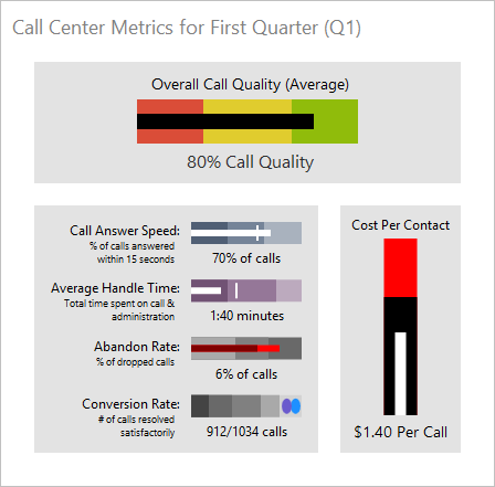
Bullet Graph

A bullet graph is a special kind of bar chart used to display a single value and make comparisons to one or more related values, such as last year's mark, a goal or target, or a projected future value. 
BulletGraph

Examples could include annual income or expenses data, sales data, and performance ratings data.

Box Plot

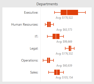
A box plot is a chart used to visualize major statistical values, such as the mean, median, and quartile values, of a data set. The mean and median can be shown as bars perpendicular to the chart. The upper and lower quartile values form the edges of a box that contains the middle half of the data.
BoxPlot

The spacing between the different parts of the box plot help indicate the degree of spread in the data. Box Plots are particularly useful for displaying distributions of a group in a compact way. This is good for creating charts that compare a group of data such as the performance of salespeople, heights of a group of people, temperatures along a latitude, and more.

Candlestick Chart

Candlestick charts are used to visualize price movements over time, such as changing stock or currency values.  The edges of the box define the opening and closing values, with the wicks extending to the highest and lowest values reached. 

CandlestickChart

The box is shaded differently depending on if the close was higher than the open.

ProductHeadingWPFSyntaxEditor

IntelliPrompt Code Snippet Selection Session

In the 2011.2 version, we added code snippet template session functionality where snippets of code can be inserted into the editor.  The snippets may contain editable fields that the end user can tab between and modify.

CodeSnippetTemplateSession

In 2012.2, we've added a new code snippet selection session that allows an end user to display a popup containing all the available code snippets. 

CodeSnippetSelectionSession

They can type in what they are looking for or can use the completion list as appropriate to locate a snippet.  Once a snippet is selected, a template session begins for it.

Structure Matchers

Structure matchers are a new language service added that allows a language to locate matching delimiter sets.  This is a feature that is harnessed by other SyntaxEditor editing functionality such as move/select to matching bracket and delimiter highlighting.  A built-in implementation is included that makes it easy to match common bracket pairs for a language.

Move/Select to Matching Bracket

SelectToMatchingBracket

When the caret is next to a delimiter that is part of a delimiter set (as identified by a structure matcher), the end user can choose to move or select the caret to the matching bracket via built-in edit actions.

Delimiter Highlighting

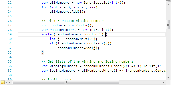
Delimiter highlighting checks the text next to the caret to see if it is part of a delimiter set (as identified by a structure matcher).  In cases where a delimiter is found, it and its related delimiters can be highlighted so that the end user can easily identify the code block.
DelimiterHighlighting

This highlighting commonly includes brackets (parentheses, curly braces, etc.) but can also include more advanced highlights such as #if…#else…#endif blocks.

.NET Languages Add-on Support for C# 5.0 / VB 11.0 Syntax

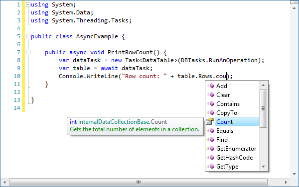
The latest official C# 5.0 and Visual Basic 11.0 language specifications have added some new keywords and functionality to the languages.  Both languages add asynchronous procedure support (via async/await) and VB adds iterators. 
Await

The latest .NET Languages Add-on parser is set up to properly parse the new syntax, and the resolver is able to work with async results for supporting automated IntelliPrompt.

.NET Languages Add-on Resolver Improvements for Anonymous Function Results

The .NET Languages Add-on's resolver can now examine anonymous functions to try and derive the Type of their result.

AnonymousFunctions

This helps further improve the resolver's ability to provide accurate automated IntelliPrompt when working with LINQ and other scenarios.

ProductHeadingWPFThemes

New Metro Light Theme

A complete new theme for the Metro style appearance, inspired by the latest Visual Studio and Office versions, is included in 2012.2.  It is optional and is shipped in its own assembly, similar to our Office themes.
MetroTheme

As with our other themes, you can activate native control theming so that all the controls in your app, whether they are the built-in Microsoft controls or Actipro controls, will render consistently and with a great new Metro-like appearance.

WindowChrome Class

We have a new chrome class that can be used to alter the appearance of any normal WPF window.  At the moment it's designed for use only when the new Metro Light theme is active, and has these features:

  • Ability to convert any Window to use a custom chrome like above when the Metro theme is active.
  • Window border color (when active) that matches the StatusBar color.
  • Semi-transparent outer glow effect for window border.
  • Window resizing via the outer glow effect area.
  • StatusBar background, window border, and glow effect colors can all be changed based on app state.
  • Full Aero snap support.
  • Ability to render interop (WinForms, etc.) controls properly, even though transparency is used.

We plan on expanding the chrome class with more features in the future too.

Assets Added for Making Rounded Editors

EditCorners

We've added several new resource assets and updated all our themes so that it's possible to achieve rounded corners on any edit-related control, such as TextBox, SyntaxEditor, DateTimeEditBox, etc.

TaskDownload TaskLiveDemo TaskBuyNow

Silverlight Controls 2012.2 Released

by Avatar Bill Henning (Actipro)
Monday, September 10, 2012 at 10:22am

SilverlightBlogPostBanner

Silverlight Studio 2012.2 has been released and is now available for download. This version adds a number of new controls and some great new SyntaxEditor functionality.

Major new features are described below.  See the announcement post for the detailed list of enhancements and updates.

ProductHeadingSilverlightMicroCharts

Bullet Graph

A bullet graph is a special kind of bar chart used to display a single value and make comparisons to one or more related values, such as last year's mark, a goal or target, or a projected future value. 

BulletGraph_thumb

Examples could include annual income or expenses data, sales data, and performance ratings data.

Box Plot

A box plot is a chart used to visualize major statistical values, such as the mean, median, and quartile values, of a data set. The mean and median can be shown as bars perpendicular to the chart. The upper and lower quartile values form the edges of a box that contains the middle half of the data.

BoxPlot_thumb

The spacing between the different parts of the box plot help indicate the degree of spread in the data. Box Plots are particularly useful for displaying distributions of a group in a compact way. This is good for creating charts that compare a group of data such as the performance of salespeople, heights of a group of people, temperatures along a latitude, and more.

Candlestick Chart

Candlestick charts are used to visualize price movements over time, such as changing stock or currency values.  The edges of the box define the opening and closing values, with the wicks extending to the highest and lowest values reached. 

CandlestickChart_thumb

The box is shaded differently depending on if the close was higher than the open.

ProductHeadingSilverlightSyntaxEditor

IntelliPrompt Code Snippet Selection Session

In the 2011.2 version, we added code snippet template session functionality where snippets of code can be inserted into the editor.  The snippets may contain editable fields that the end user can tab between and modify.

CodeSnippetTemplateSession_thumb

In 2012.2, we've added a new code snippet selection session that allows an end user to display a popup containing all the available code snippets. 

CodeSnippetSelectionSession_thumb

They can type in what they are looking for or can use the completion list as appropriate to locate a snippet.  Once a snippet is selected, a template session begins for it.

Structure Matchers

Structure matchers are a new language service added that allows a language to locate matching delimiter sets.  This is a feature that is harnessed by other SyntaxEditor editing functionality such as move/select to matching bracket and delimiter highlighting.  A built-in implementation is included that makes it easy to match common bracket pairs for a language.

Move/Select to Matching Bracket

SelectToMatchingBracket_thumb

When the caret is next to a delimiter that is part of a delimiter set (as identified by a structure matcher), the end user can choose to move or select the caret to the matching bracket via built-in edit actions.

Delimiter Highlighting

Delimiter highlighting checks the text next to the caret to see if it is part of a delimiter set (as identified by a structure matcher).  In cases where a delimiter is found, it and its related delimiters can be highlighted so that the end user can easily identify the code block.

DelimiterHighlighting_thumb

This highlighting commonly includes brackets (parentheses, curly braces, etc.) but can also include more advanced highlights such as #if…#else…#endif blocks.

.NET Languages Add-on Support for C# 5.0 / VB 11.0 Syntax

The latest official C# 5.0 and Visual Basic 11.0 language specifications have added some new keywords and functionality to the languages.  Both languages add asynchronous procedure support (via async/await) and VB adds iterators. 

Await_thumb

The latest .NET Languages Add-on parser is set up to properly parse the new syntax, and the resolver is able to work with async results for supporting automated IntelliPrompt.

.NET Languages Add-on Resolver Improvements for Anonymous Function Results

The .NET Languages Add-on's resolver can now examine anonymous functions to try and derive the Type of their result.

AnonymousFunctions_thumb

This helps further improve the resolver's ability to provide accurate automated IntelliPrompt when working with LINQ and other scenarios.

TaskDownload TaskLiveDemo TaskBuyNow

Bullet Graphs Part 3 - Other Features

by Avatar Bill Henning (Actipro)
Wednesday, September 5, 2012 at 4:04pm

BlogPostBanner

In the previous post for our Micro Charts product (currently available for WPF, Silverlight, and WinRT XAML), we showed appearance features off for the MicroBulletGraph control that is coming to Micro Charts' 2012.2 version (already available for WinRT XAML). In today's post, we'll showcase several other special features of the control.

UPDATE:  Version 2012.2 is live and available for download now.

Minimum and Maximum Values

The minimum and maximum values displayed on a MicroBulletGraph are automatically calculated if they are not given a value. The maximum value is then set to the largest part value, and the minimum is set to zero, or the smallest part less than zero, if one exists. 

BulletGraph

If the minimum is given a value greater that zero then the featured and projected values will display as ellipses centered on their value. An example of a graph with its minimum greater than zero is displayed above.

Negative Values

The MicroBulletGraph also supports negative values. If the featured or projected bar are given a negative value they will start at zero and extend in the opposite direction (left for horizontal orientation and down for vertical orientation). The comparative bar and ranges will function the same for negative and positive values.

Tool Tips

Tool tips can also be used on MicroBulletGraph controls. They can be custom formatted and can display all the part values and the minimum and maximum properties. An example of this is in the screenshot above.

Summary

The MicroBulletGraph control is an excellent and versatile tool for displaying data. It has numerous customization options for function and appearance that allow it to make a comprehensive and engaging graph that maximizes the end-user's understanding of the data in a small area.

It will be included in the 2012.2 versions of our Micro Charts product.

TaskDownload TaskLiveDemo TaskBuyNow