 Bill Henning (Actipro)
This version contains many updates and improvements for SyntaxEditor and its add-ons, along with including .NET 5 assemblies in the NuGet packages, validating .NET 6 compatibility, and adding VS 2022 designer support.
See the related announcement post for the detailed list of enhancements and updates.
Here's a look at some of the new features.
SyntaxEditor
Synchronization QuickStart
A new sample demonstrates synchronizing the scroller and splitter of one editor instance with another.
Drag and Drop
Improved drag/drop interaction and related scrolling in several scenarios, and enhanced the Drag and Drop QuickStart sample.
Single-Line Mode QuickStart
Added a formula example with alternate style for nested parentheses.

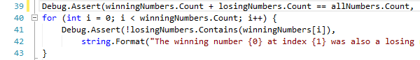
Editing and Caret Movement
Made many small improvements in the areas of editing and caret movement, especially in certain special contexts.
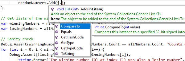
IntelliPrompt
Improved popups to reposition themselves as the editor is scrolled.
Vertical Scrolling
The vertical scrollbar has been updated to handle collapsed regions more smoothly.
SyntaxEditor .NET Languages Add-on
C# Parser
Updated to support C# 8.0 syntax.
Go To Definition QuickStart
A new sample that demonstrates using an IResolver to navigate to the source of a reference.
C# Outlining
The outliner will now create nodes for code-level constructs such as block statements by default.
SyntaxEditor Web Languages Add-on
JavaScript Parser
Updated to support ECMAScript 2021 (12 Edition) syntax.
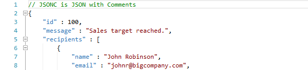
JSON Syntax Language
Added a constructor for whether the language should support JavaScript style comments, as in Microsoft’s JSONC variant.
SyntaxEditor Python Language Add-on
Python Parser
Updated to support Python v3.9.5 syntax.
Python Resolver
Updated to support namespace packages.
.NET 5 Assemblies Added to NuGet Packages
The WinForms Controls NuGet packages on nuget.org now contain compiled product assemblies that target:
- .NET 5
- .NET Core 3.1
- .NET Framework 4.0
Projects that target .NET 5 or later will use the .NET 5-based assemblies, and projects that target .NET Framework 4.0 or later will use the .NET Framework 4.0-based assemblies.
.NET 6 Support
We’ve also validated that our assemblies work great in .NET 6 applications.
Visual Studio 2022 Designer Support
.NET Core 3.1 and .NET 5+ designer support has been added for Visual Studio 2022.