 Bill Henning (Actipro)
-
Bill Henning (Actipro)
-
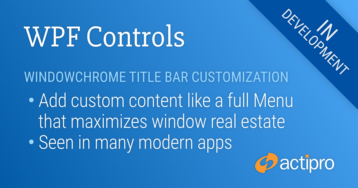
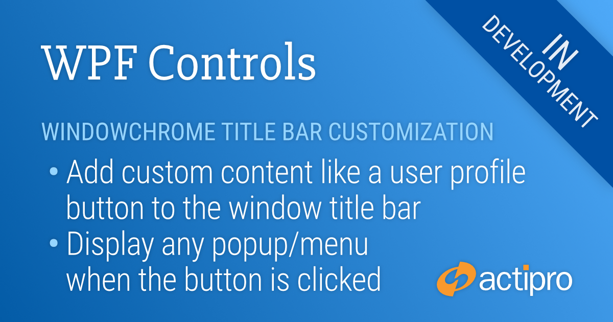
Actipro WPF Controls v2020.1 development is in progress, and the new version’s main goals are to modernize our UI control features/themes, and make theme customization much easier.
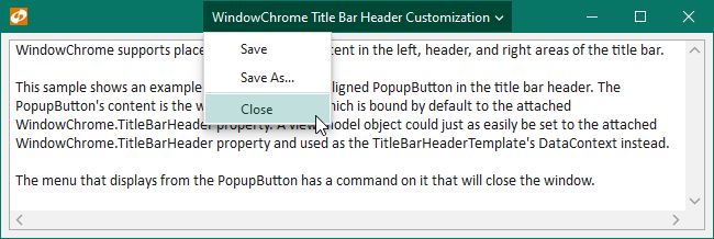
In the previous post, we saw how the window’s title bar header can be customized. In today’s post, we’ll look at how the window’s system menu can be customized.
WPF Windows and Win32 System Menus
WPF Windows have always used Win32 to provide their system menus, which are menus displayed when clicking the window’s title bar icon, or when right-clicking on the window title bar.
The Win32 system menu is not rendered by WPF, and therefore never matches the style of a WPF application. This is especially evident when using dark themes in your app.
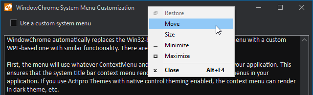
This light Win32 menu looks awful compared to dark-themed menus in the same application.
Customizing the System Menu
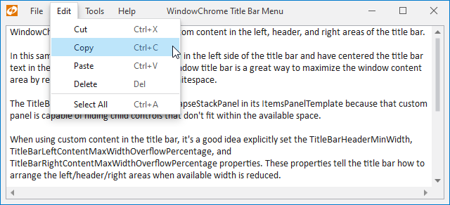
The latest WindowChrome updates automatically replace the Win32-based system title bar context menu with a custom WPF-based one with similar functionality. There are several benefit to this.
First, the menu will use whatever ContextMenu and MenuItem styles are active in your application. This ensures that the system title bar context menu renders in the same style as other menus in your application. If you use Actipro Themes with native control theming enabled, the context menu can render in dark theme, etc.
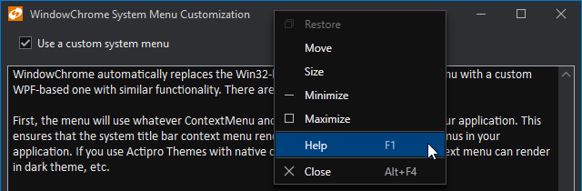
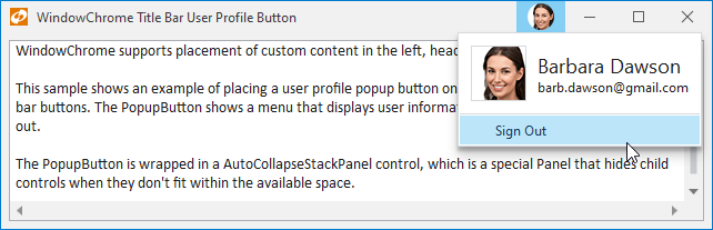
Second, since a custom WPF context menu is being created, the menu can be fully-customized via an event prior to being opened. This sample shows how a 'Help' menu item can be injected into the system title bar context menu.
Summary
Using WPF menus for the system menu ensures theme consistency and easily allows for complete customization of the menu’s contents.
Post in the comments below if you have any feedback or questions about WindowChrome system menu customization.