Actipro WPF Controls v2020.1 development is in progress, and the new version’s main goals are to modernize our themes and make theme customization much easier.
In today’s post, I’d like to provide some high-level information on some of the updates.
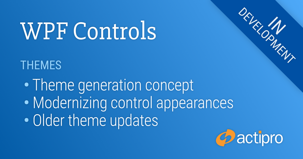
Theme Generation Concept
When an Actipro theme is activated, hundreds of brush and other resources are loaded and used throughout all our Actipro and native control templates. This allows our themes to provide a cohesive appearance throughout all controls in your app. Our WPF Controls ship with over 25 professionally-desired themes that match system, Office, and Metro themes.
In v2019.1 and earlier, all these theme resources are pre-defined by us in large XAML files and customers can customize individual resources or tint groups of them. While these themes look great, it can be tedious to customize them if you don’t like the out-of-the-box look.
A primary focus of the 2020.1 WPF Controls is to move from our previous pre-defined themes towards themes that are generated at run-time based on theme generator options you set. For instance, a main setting is the theme intent, which can be White, Light, Dark, Black, or HighContrast. This tells the theme generator how the theme is meant to be used in general. Then various grayscale and color ramps are generated based on configurable options. All the highlight colors are based on colors generated in the color ramps. There are options for things like the corner radius of tabs, whether the title bar uses an accent color (like in Office colorful themes), etc.
We are currently prototyping out this concept and so far, it’s working very well. We will provide some screenshots once we are further along. Please post your ideas on what kinds of options you’d like to have configurable in the comments below, as that will help guide us. Now is the time to think big!
Modernizing Control Appearances
We have numerous ideas for bringing more modern control appearances to our new WPF themes. Some of these, such as menu item checkmark updates, involve changes to our core control templates, both for Actipro and native controls. Other modernization features will be optionally activated via properties set when generating themes.
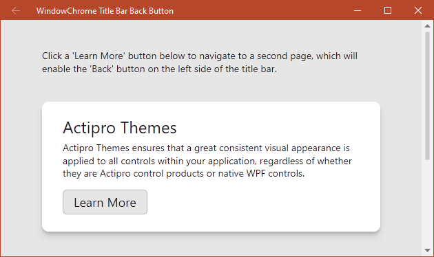
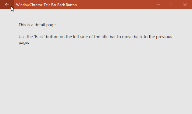
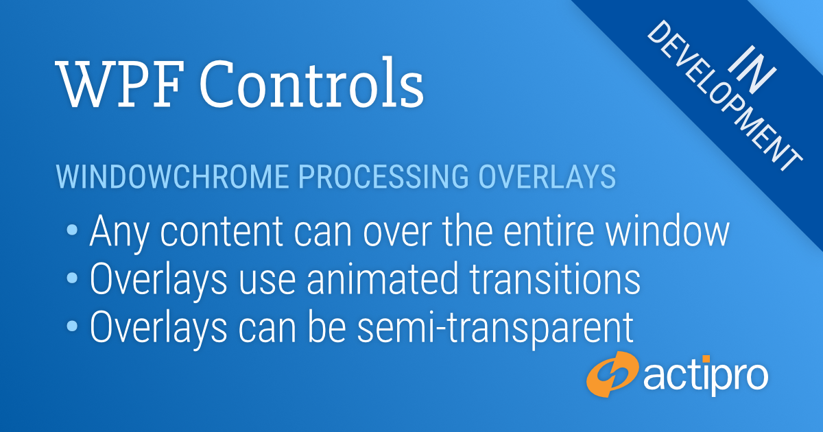
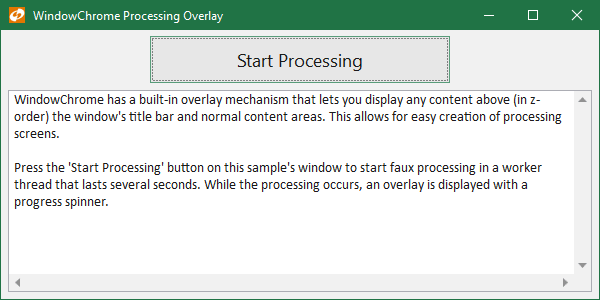
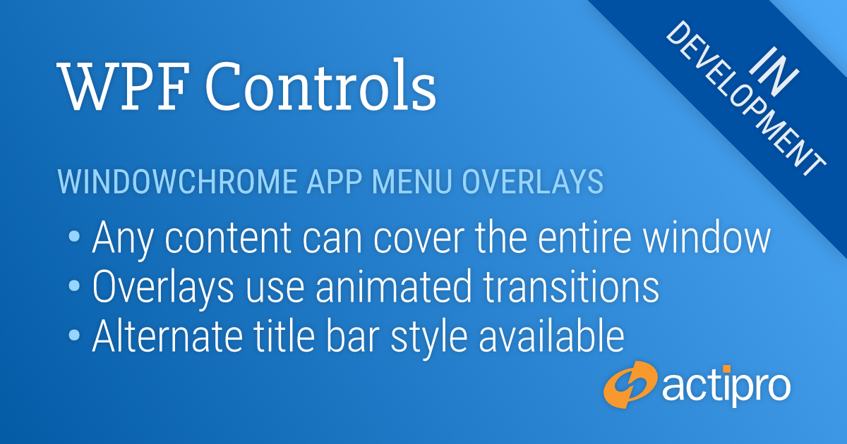
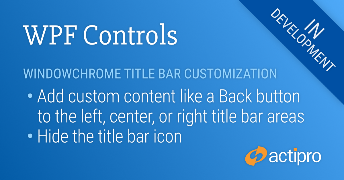
WindowChrome, which allows any WPF Window to have advanced chrome features, is also getting a lot of enhancements that will be described in a future post. These updates provide new functionality that wasn’t available before.
With several older themes being removed and other modernization template changes being made, we are finding that some of the brush and other resources used in our WPF themes are no longer needed. We are working on consolidating brush resources where possible and removing unnecessary resources.
Older Themes
Luna and Classic
As part of the themes updates, we are going to be removing several very old themes that are outdated at this point. These include the Luna themes (Windows XP appearance) and Classic theme (based on system colors and hasn’t been available in Windows 10 for years).
Aero and Office 2010
In a previous post, we had asked for feedback on whether customers still use Aero and/or Office 2010 themes. Aero theme provided the Windows 7/Vista appearance, but Windows 7 is going end-of-life this month by Microsoft. Office 2010 went mainstream end-of-life in 2015.
We received feedback from several customers who still wished to use those themes in the foreseeable future, and we will be retaining those themes as options. They are being consolidated into a separate optional Themes.Aero assembly that you will be able to reference and register at app startup. This will allow us to keep our Shared Library smaller while still allowing the pre-defined Aero-style themes to be available for customers who wish to use them.
Aero Glass
With Windows 7 going end-of-life, we are removing support for transparent Aero glass features in our WindowChrome. But as mentioned above, the Aero theme will still be fully available.
Feedback
We’d love to hear your comments, especially what kinds of options you’d like to see on our theme generator.
 Bill Henning (Actipro)