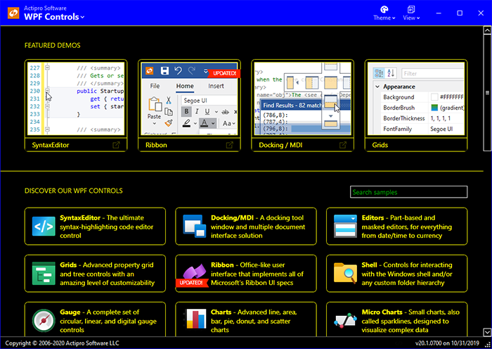
Our v2019.1 WPF controls have been updated with a new maintenance release that is now ready for download. This maintenance release focuses on bug fixes prior to our exciting upcoming release of v2020.1.
See this announcement post for the detailed list of enhancements and updates.
Actipro WPF Controls v2020.1 development is in progress, and the new version’s main goals are to modernize our UI control features/themes, and make theme customization much easier.
In our previous post, we showed how the Theme Designer application can display sample UI tabs, allowing you to instantly see how changes to the theme definition affect the rendering of various UI controls.
In today’s post, we’ll take a look at a new feature of ThemeManager that allows an application to automatically change themes based on Windows settings for light/dark and high contrast modes.
Theme Architecture
As a quick review, the Actipro ThemeManager supports dynamically swapping in of ResourceDictionaries containing control Styles and asset resources like Brushes, Thicknesses, etc. that can be used in WPF Styles/Templates. As seen in previous blog posts, v2020.1 will allow you to design and easily register custom theme definitions with ThemeManager.
Typically you indicate the theme you wish to load for your application by setting the ThemeManager.CurrentTheme property to the name of a pre-defined theme (created by us) or a custom theme definition that you registered.
Windows Settings for Colors
This all works great. Now what if we want to have our app’s theme match the current Windows settings for app colors and high-contrast?
Matching Windows Settings
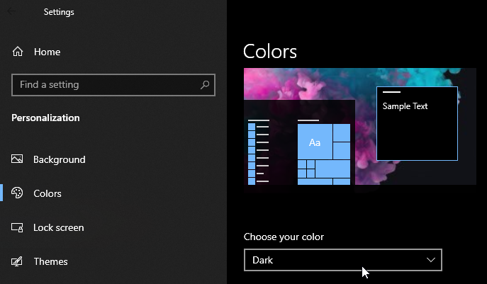
The Windows Settings’ Personalization section’s Colors tab allows the end user to choose whether apps should be light or dark themed. Some end users might also activate High-Contrast mode from within Windows Settings.
It is ideal for apps to listen to these end user settings to ensure a consistent user experience. New features in v2020.1’s ThemeManager allow you to respect these settings and automatically switch themes when appropriate, all with one line of code.
A new ThemeManager.RegisterAutomaticThemes method can be called in your app’s OnStartup logic in place of setting the ThemeManager.CurrentTheme property. This method allows you to specify the names of a light theme, dark theme, and high-contrast theme.
Here’s some sample code that uses our pre-defined “Light”, “Dark”, and “HighContrast” themes:
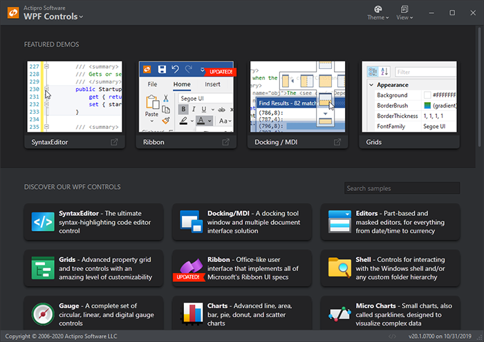
Now when the end user indicates via Windows Settings that apps should be in a dark theme, the app (our Sample Browser in this example) looks like:
Dark theme
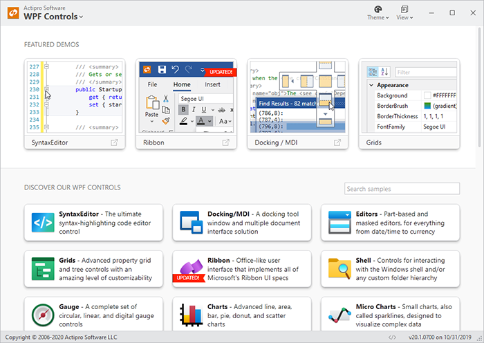
When the end user indicates via Windows Settings that apps should be in a light theme, the app looks like:
Light theme
And finally, with high-contrast mode activated via Windows Settings, the app looks like:
High-contrast theme
You can call RegisterAutomaticThemes with any registered theme name. If you use our Theme Designer application to build your own custom light and dark themes and have registered them with ThemeManager, simply pass those themes’ names to RegisterAutomaticThemes and ThemeManager will pull the correct theme based on the end user’s Windows Settings.
When using RegisterAutomaticThemes, the ThemeManager actively watches for changes to the Windows Settings and switches themes at run-time as appropriate based on new settings.
Summary
This handy one-line call takes all the work out of trying to match an end user’s app preferences. We’re very excited to deliver this in the upcoming 2020.1 version.
We are currently in final beta testing of v2020.1 and hope to have it released in the next week or two.
Post in the comments below with any questions or comments on our upcoming WPF themes features.
Actipro WPF Controls v2020.1 development is in progress, and the new version’s main goals are to modernize our UI control features/themes, and make theme customization much easier.
In our previous post, we showed how each theme definition has multiple options that control how a rich palette of colors is generated for a theme.
In today’s post, we’ll see how various sample UI tabs are built into the app that let you instantly see how changes to the theme definition affect the rendering of various UI controls.
Sample UI Documents
As we have shown in recent blog posts, the Theme Designer application provides a way to easily alter theme definition properties and it instantly shows a theme preview in the application itself. That’s great for the controls used in the application, but how can we also preview how the theme renders other controls that aren’t used in the normal application functionality?
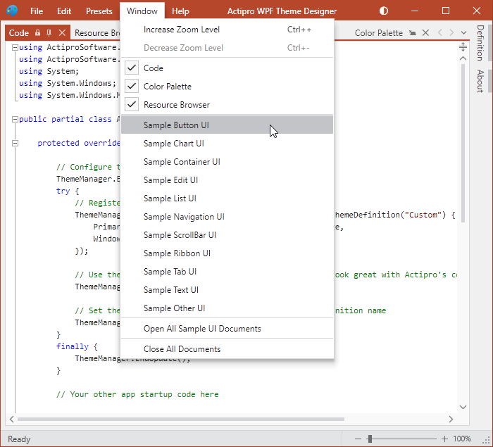
The Theme Designer's Window menu
The answer is sample UI documents. The Theme Designer provides numerous sample UI documents that can be displayed from the Window menu.
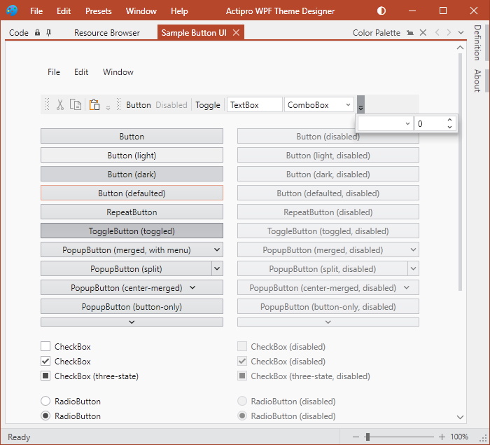
Sample UI for buttons
Each sample UI document focuses on displaying a variety of controls related to a certain area. For instance, in the screenshot above, we see a number of Button, CheckBox, and RadioButton style controls.
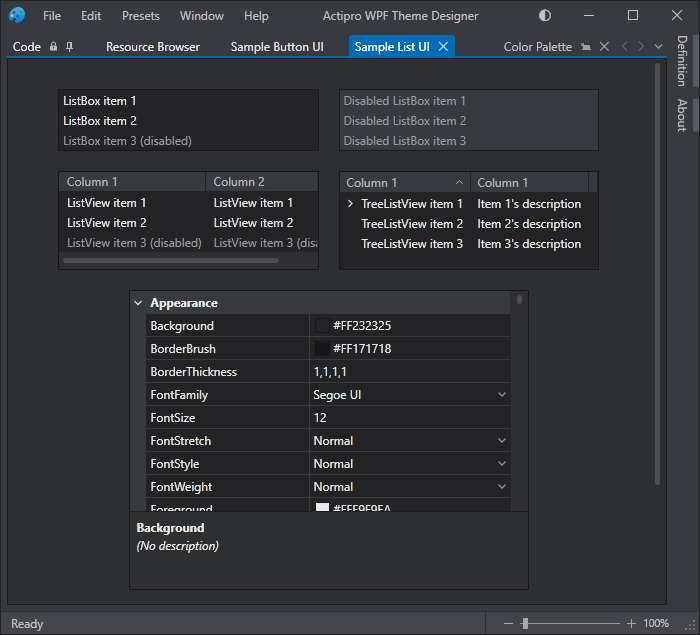
Or this screenshot shows another sample UI document for list and grid controls:
Sample UI for lists and grids, with the app theme changed to a Dark theme
By having all these sample UI documents accessible, you can see exactly how altering theme definition properties will affect the rendering of controls throughout your own applications.
The sample UI documents can even be dragged to other monitors for easier viewing.
Summary
It’s important to be able to see how theme definition changes affect UI control rendering, and having a wide variety of sample UI documents available right in the app makes it easy to visualize everything.
Post in the comments below with any questions or comments on the WPF Theme Designer application.
Beta Testers Wanted
We are currently beta testing v2020.1 and would love to have more customers involved. If you would like to assist us in testing, please write us at our support address. We would like individuals who are already licensed for the 2019.1 version, are willing to use beta versions of 2020.1 (.NET Core or .NET Framework), and who want to provide feedback, especially in the area of our themes updates.
Actipro WPF Controls v2020.1 development is in progress, and the new version’s main goals are to modernize our UI control features/themes, and make theme customization much easier.
In our previous post, we introduced the new WPF Theme Designer application that will come with the v2020.1 WPF Controls and provides a visual way to customize theme definitions.
In today’s post, we’ll take a look at the app’s visual representation of the generated color palette, and some theme definition settings that affect the colors that are generated.
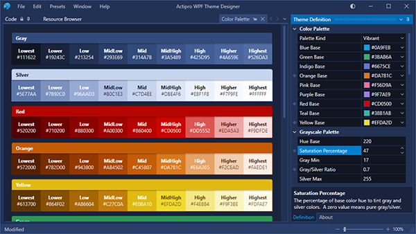
Color Palettes
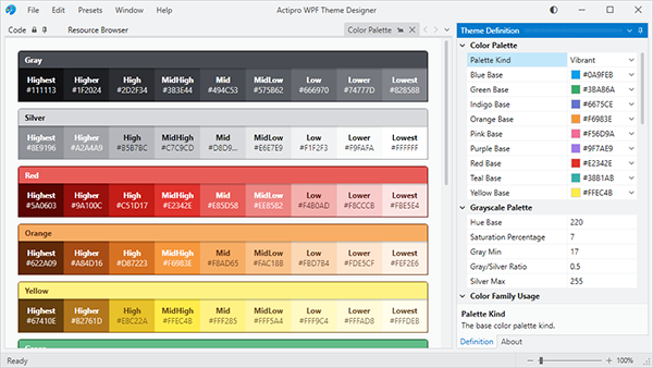
The Theme Designer app has a Color Palette tab that displays all of the colors that are generated as part of the theme generation process. Each one of these colors is accessible via Brush asset resources that you can reuse in your application. The colors in each ramp are named based on their contrast level relative to the theme intent (light/dark).
The Theme Definition tool window on the right is where we configure the theme definition. You can see it lists various base colors to use for each color ramp. Those base colors translate over to the MidHigh contrast colors in the each ramp. We use a specially-designed algorithm to generate a pleasing ramp of colors around each base color. You can adjust the base color to whatever you need so that the generated color ramp fits with your app’s own branding.
The default Light preset's color palette
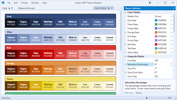
What you see in the screenshot above is the app with a default Light theme. Let’s change it a bit so that we crank up the saturation of the blue hue tint on the grayscale color ramps, and let’s also adjust several of the base colors. The small diamonds next to several theme definition properties indicate the properties that have been changed from the base Light theme preset.
Blue hue saturation applied and other base colors changed
Notice how there is now a blue tint throughout the UI and the color ramps for red, orange, and yellow have altered as well. Next, we’ll flip to a dark theme intent.
The same tinted hue settings, but applied to a Dark theme intent
Again, you see how the blue hue permeates through the grayscale portions of UI due to the hue saturation being turned up.
Summary
By changing several properties on the theme definition, we’ve completely altered and customized the look of our app. This same thing will work in your own app since the Theme Designer outputs the code to paste into your App.OnStartup logic to reproduce the same theme.
Post in the comments below with any questions or comments on the WPF Theme Designer application.
Beta Testers Wanted
We are currently beta testing v2020.1 and would love to have more customers involved. If you would like to assist us in testing, please write us at our support address. We would like individuals who are already licensed for the 2019.1 version, are willing to use beta versions of 2020.1 (.NET Core or .NET Framework), and who want to provide feedback, especially in the area of our themes updates.
While the version includes a wide number of small updates and bug fixes, let’s take a look at a handful of the larger updates. We are continuing to work on wrapping up the massive 2020.1 version that is currently in beta testing.
Docking/MDI
A new TabDragReordered was added to AdvancedTabControl that fires after a tab is reordered with internal drag/drop.
The UI automation peer tree was improved to better support auto-hidden tool windows.
A new Shift+Esc hotkey now closes the active tool window.
Editors
DatePicker, DateTimePicker, and TimePicker were updated to support null values and a new Clear button can appear on MonthCalendar when nulls are allowed.
Numeric edit boxes now parse whitespace within custom format string literals better.
Improved various portions of Calculator's logic.
Improved the MaskedTextBox caret-moving logic.
Grids
Improved the performance in PropertyGrid and tree controls in a couple scenarios.
Shell
Added new ShellListView properties that can control how the control is sorted.
Significantly improved the speed by which ShellListView can sort Windows shell objects by property.
SyntaxEditor
Improved the "Adornments - Squiggles Intro" Quickstart to show a more realistic scenario of tracking developer-specified tagged ranges.
Improved the performance of the CollectionTagger.Clear method when there are a small number of tags.
 Bill Henning (Actipro)