 Bill Henning (Actipro)
A new Avalonia UI Controls release is now available the adds several great new controls.
See the related announcement post for the detailed list of enhancements and updates.
Fundamentals
Avatar
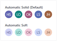
Avatar controls are used to represent people or objects. They can render a full-size image, a centered glyph, a person's initials, or text.
When text is provided, initials can automatically be derived. Large text-based content will scale down to try and fit within the circle as needed. A generic "empty" glyph will be displayed when no avatar content is provided.
An avatar is most distinctive when using image-based content, so text-based content can be harder to differentiate. While an avatar's foreground and background can be manually specified, there is built-in logic to automatically select color combinations based on the avatar's content and using either a solid or soft appearance.
Avatar derives from Button and supports the standard button command model and click events.
AvatarGroup
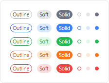
Use an AvatarGroup to render multiple Avatar controls. Avatars in a group can overlap with each other by a given size percentage, and you can expand the avatars on mouse hover. When the avatars don't fit in the available space, they can overflow to a popup.
Wrap the group in a chromeless button to make an actionable avatar group that executes a task when clicked.
Badge
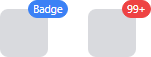
Badges can add contextual information to target elements, or even used on their own. Badges can display small content like text, counts, icons, or can render as a dot.
When a badge adorns an element, it shows and hides using an animated "pop" effect. It can be easily aligned to any anchor position on the target element.
NumericBadge
NumericBadge inherits Badge and supports binding to a numeric value, such as a count value. The badge automatically displays when the count increments to a positive number and hides when decrementing to zero.
The displayed numeric value has overflow support, meaning that a large value can be restricted to only show "99+" for example.
RingSpinner
The RingSpinner control renders an animated ring where the two ring segment ends chase each other around the circle.

It is used when some form of processing is occurring to tell the end user that something is happening.
Shared Library
RingSlice
The RingSlice shape renders a portion (or the entire circle) of a ring shape. Its start/end angles, radius, thickness, and other stroke properties can be set.
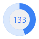
Ring slice shapes can be combined in many interesting ways within UI, primarily used to create progress indicators.