SyntaxEditor XML Add-on - Navigable Symbols

by Avatar Bill Henning (Actipro)
Thursday, May 8, 2014 at 10:00am

PostBannerSyntaxEditorDevNotes

Today I'd like announce a great new feature coming to the SyntaxEditor Web Languages Add-on (WPF, Silverlight, and WinRT/XAML versions): a XML navigable symbol provider

Features

If you are new to SyntaxEditor, you may be wondering what is a navigable symbol provider.  Navigable symbol providers allow SyntaxEditor to provide a set of drop-downs above it that indicate the current context of the caret.  They also allow an end user to select items in the drop-downs to move the caret directly to the related definition.

Our .NET Languages Add-on's C# and VB languages already support this feature and the two drop-downs above the editor show the current type and member context.

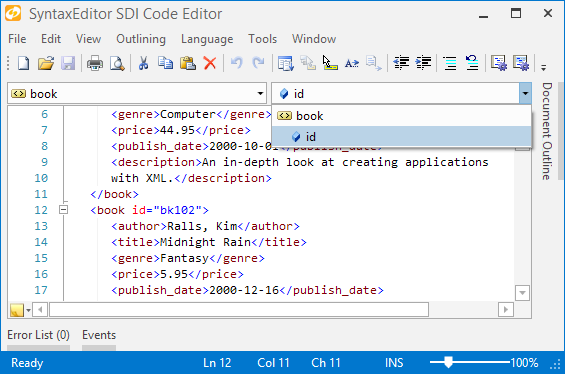
With the addition of this feature to XML, two drop-downs above the editor can show the current element and attribute context.  Let's see a screenshot:

XmlNavigableSymbolProvider1

In the screen above, the caret is on line 12 in the "id" attribute.  The attribute drop-down (top right) properly shows the "id" attribute as context.  If we would click the "book" element in that drop-down, the caret would move to the "book" tag's name.

XmlNavigableSymbolProvider2

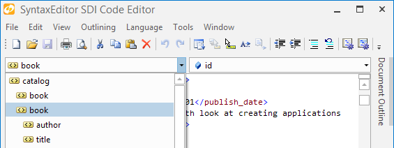
In this screenshot, we have displayed the element drop-down while still on the "book" start tag.  It has selected the current element for us and also shows the hierarchy of elements up to the root element ("catalog").  It also shows us the elements that are direct children of the current element.  In this case, elements like "author", "title", etc. are the direct children of "book".  Any of the items in the drop-down can be clicked and the caret will jump right to that element.  In this sense, it provides somewhat of a mini-document outline.

Summary

This great new feature will roll out in the upcoming 2014.1 WPF, Silverlight, and WinRT/XAML controls maintenance releases.

TaskDownload TaskLiveDemo TaskBuyNow

PropertyGrid Double-Clicking Enhancements

by Avatar Bill Henning (Actipro)
Monday, May 5, 2014 at 8:29am

PostBannerWPFControlsDevNotes

Our WPF PropertyGrid control allows you to embed an object editing interface into your applications that can make use of any type of custom editor, including our own powerful WPF Editors controls.

In today's post I wanted to review a new small, but very useful, enhancement coming to PropertyGrid in the next maintenance release: the ability to double click on a name cell and cycle through available standard values.

Example Usage

Let's have a look at how this works.

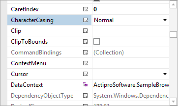
PropertyGridDoubleClick1

Here we have a PropertyGrid and you'll notice that the CharacterCasing property has standard values of Normal, Lower, etc.

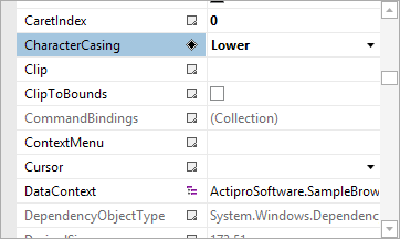
PropertyGridDoubleClick2

By double-clicking on the name cell, the value cycles to the next value in the standard values list. 

Summary

This new feature makes it quick and easy for end users to cycle through standard values without having to show a drop-down list.  It will appear in the next maintenance release of our WPF controls.

TaskDownload TaskLiveDemo TaskBuyNow

HorizontalListBox Control

by Avatar Bill Henning (Actipro)
Friday, May 2, 2014 at 7:08am

20141ProductNotesBlogPostBanner

Yesterday we posted about a UniformGrid panel control that was being added to our WinRT/XAML and Silverlight Shared Libraries.  This sort of panel is already available in native WPF so no implementation was necessary there.

In today's post, I'd like to show another new control coming to our WPF, Silverlight, and WinRT/XAML control platforms: HorizontalListBox.

Features

The HorizontalListBox control is… wait for it… a standard ListBox that uses a horizontal layout.  In fact it uses a UniformGrid panel with a single row specification to achieve its layout.  This has the benefit of ensuring that each item in the list has an equal width.

This sort of design is great for toggle sorts of controls where there are two or more values from which to choose.  In multi-selection mode, you can also toggle each item individually.

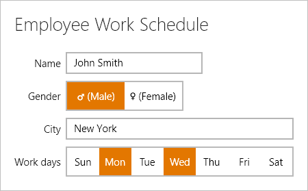
Let's have a look of the WinRT version:

HorizontalListBoxWinRT

Here we have a couple HorizontalListBox controls in place.  One for selecting gender and one for doing multiple selection of days of the week.  Everything is simple and touch-friendly.  Any content can be rendered in the list box items as well.

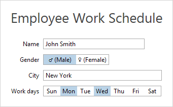
And here is the WPF version:

HorizontalListBoxWPF

It's the same exact control and API but here it renders in the current theme (in this case Metro Light) via our WPF Themes infrastructure.

Best of all, since this restyled control simply inherits the native ListBox, you have all the features available to you that come from the base native ListBox control.  Our control has some enhancements such as Left/Right arrow key navigation too.

Summary

The HorizontalListBox control will be available in the next 2014.1 maintenance releases of our WPF, Silverlight, and WinRT/XAML Shared Libraries, and will be licensed for use by any of our customers of those control platforms.

TaskDownload TaskLiveDemo TaskBuyNow

Windows Workflow Designer SyntaxEditor Integration Updates

by Avatar Bill Henning (Actipro)
Tuesday, April 22, 2014 at 7:07pm

WpfControlsTipsBlogPostBanner

Last year, we created a sample for showing how a hosted Windows Workflow Designer instance could be integrated with Actipro WPF controls within a custom WPF application to provide a very elegant interface for end users. 

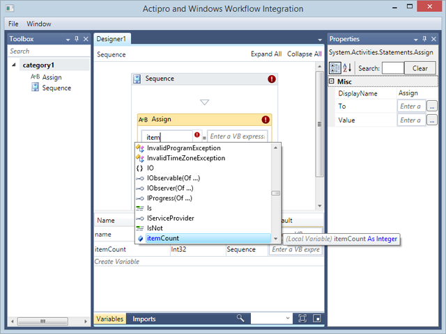
We have continued enhancing it and here's what it currently looks like:

WorkflowDesigner

Our Docking/MDI product is used to provide the tool window and multiple document interface.  Our SyntaxEditor code editor control, in single line edit mode, is injected as a custom expression editor.  When you combine SyntaxEditor with our .NET Languages Add-on, you are able to have it support powerful IntelliPrompt completion lists.  For instance, in the screenshot above, you can see the itemCount variable is showing up in the completion list since it was declared below.

In recent updates, we've:

  • Updated App.OnStartup code to theme native WPF controls using Actipro themes.
  • Added a Menu above the designer with options for closing the window, and toggling the tool window visibility.
  • Added a custom completion ListBox implementation to work around issue where ListBoxItem would steal focus on click and Workflow Designer thought that it then had to close the expression editor.

When you put it all together, it's very easy to integrate Actipro WPF controls with rehosted Windows Workflow Designer instances in your applications.  It only takes a few minutes to get up and running, and once you do, the result is well worth the time.

Summary

If you rehost the Windows Workflow Designer in your WPF apps and would like our example, please contact us and we'll be happy to share it with you!

For those customers who downloaded either of the prior versions, this update is at the same URL as before.

TaskDownload TaskLiveDemo TaskBuyNow

RadialSlider Control

by Avatar Bill Henning (Actipro)
Friday, March 21, 2014 at 9:08am

20141ProductNotesBlogPostBanner

The 2014.1 versions of our WPF, Silverlight, and WinRT/XAML controls were released last week and all contain several handy components in them, such as the RingSlice control we talked about several days ago.

In today's post, I'd like to show off the new RadialSlider control.

What is RadialSlider?

The RadialSlider control allows for quick selection of a degree value, which can easily be converted to some form of scalar value.  The control uses an embedded CircularThumb control, but is otherwise transparent.  It is meant to be used in conjunction with the RingSlice control and have that control render the slider's value UI.

RadialSliderBounds   RadialSliderCorner

Radial sliders function just like normal linear sliders however instead of moving the slider thumb in a straight line, the thumb can move in a circular fashion around the slider's center point.  This sort of UI allows for additional precision when compared to linear sliders, especially with touch interaction.

RadialSliderSegmented   RadialSliderWarningLevel

RadialSlider supports minimum/maximum ranges, infinite wrapping mode, customizable thumb styles, and more. 

RadialSliderRange   RadialSliderCustomStyle

Combine two RadialSlider controls on top of each other to enable range-based selection.

Real World Usage Scenario

RadialSlider and RingSlice controls can be used to create radial input controls such as in this sample (included in our download), which mimics a countdown timer in the Windows Alarms app:

RadialSlider

The end user simply grabs the thumbs, either via touch or mouse, and drags in a circular fashion to alter the values.  The RingSlice controls that render the current values track with the dragged thumb.

Summary

The RadialSlider control is available in our WPF, Silverlight, and WinRT/XAML Shared Libraries and is licensed for use by any of our customers of those control platforms.  Download v2014.1 and check it out!

TaskDownload TaskLiveDemo TaskBuyNow