WPF Controls 2012.2 Build 571 Released

by Avatar Bill Henning (Actipro) - 2 comments
Thursday, November 15, 2012 at 4:01pm

BlogPostBanner

WPF Studio 2012.2 build 571 has been released and is now available for download. This maintenance release contains some massive new features and updates for the WPF controls.

This build has the following major new features:

  • Docking: Updated the standard switcher to use current theme assets and updated dock guide appearances for the Metro themes.
  • Docking: Updated dock guides, previews, rafting windows, and the switcher to support LayoutTransform detection.
  • Editors: Updated EnumPart to implement ISpinnable and allow up/down arrow keys to change its value.
  • PropertyGrid: Added a new Custom Factory QuickStart that shows how to build a custom data factory.
  • Ribbon: Completely rearchitected RibbonWindow to use the powerful new WindowChrome class for providing its custom chrome.
  • Ribbon: Improved RibbonWindow's Metro themes to support outer glows.
  • Ribbon: Improved RibbonWindow to fully support Aero snap and dock.
  • Ribbon: Updated Backstage to have a more Office 2013-like appearance when in a Metro theme.
  • Ribbon: Updated Backstage so that it covers the RibbonWindow.StatusBar if present.
  • SyntaxEditor: Added a NavigableSymbolSelector.AreRootSymbolsSupported property, that can be set to false to only show the member drop-down.
  • SyntaxEditor: Added new SyntaxEditor.HorizontalScrollBarVisibilty and VerticalScrollBarVisibility properties that can be set to Hidden to hide scrollbars.
  • SyntaxEditor LL(*) Parser Framework: Added a new Grammar.AstLeftAssociativity tree constructor method that can provide left associativity on binary operator expressions.
  • SyntaxEditor .NET Languages Add-on: Improved the parser and resolver.
  • Themes: Added a new Metro White theme, that is similar to the Office 2013 appearance.
  • Themes: Updated WindowChrome to support the rendering of custom chrome for any current theme, not just the Metro themes.
  • Themes: Updated WindowChrome to support Aero glass via its new IsGlassEnabled and GlassThickness properties.
  • Themes: Added the WindowChrome.TitleBarContentTemplate property that allows for injecting custom content next to window title bar caption buttons.

See the announcement post for the detailed list of enhancements and updates.

TaskDownload TaskLiveDemo TaskBuyNow

Office 2013-Like Ribbon Backstage for Metro Themes

by Avatar Bill Henning (Actipro)
Tuesday, November 13, 2012 at 7:58am

PostBannerWPFStudioDevNotes

In our previous blog post we talked about how our WPF RibbonWindow has been completely rewritten from scratch using WindowChrome for the next 2012.2 maintenance release.  The post also showed off the new Metro White theme that will be included with our WPF controls, matching the visual appearance of Office 2013.

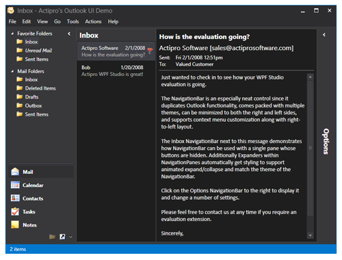
In today's post, we'll look at another new feature coming in the next maintenance release:  an updated Ribbon Backstage.  In the screenshot below, you can see the new Metro White theme in action along with the updated Backstage visuals.

Backstage

There are several things of note here.  First, the Backstage has been modified so that when it is open, it will fully cover the RibbonWindow's StatusBar.  This applies to all themes.  For the Metro themes, a large back arrow button has been added to the top left of the Backstage to allow returning to the normal document view.  The ribbon, QAT, etc. also automatically disappear in Metro themes while Backstage is open.

These enhancements will be in the upcoming WPF controls 2012.2 maintenance release build 571.

TaskDownload TaskLiveDemo TaskBuyNow

RibbonWindow Reimplemented and New Metro White Theme

by Avatar Bill Henning (Actipro) - 3 comments
Thursday, November 8, 2012 at 2:54pm

BlogPostBanner

WindowChrome Usage

In our previous post, we discussed all the great new feature additions coming to our WindowChrome implementation.  Another related item for the upcoming maintenance release is that we've completely reimplemented how RibbonWindow works and now have it using WindowChrome to manage all its custom chrome API calls.

This means that the same implementation of custom chromes will be used for both RibbonWindow and regular windows that use WindowChrome.  You'll get outer glow effects in Metro themes, full Aero snap/dock support, etc.  Everything described in our previous post.

New Metro White Theme

In the first 2012.2 version release, we added a new Metro Light theme that can be applied app-wide to all Actipro and native WPF Controls.  For the upcoming maintenance release, we've added a new Metro White theme that is similar to Metro Light but gives windows and toolbars more of an Office 2013 appearance.  Take a look:

RibbonMetro

If you are an Actipro customer, once you get the new features you'll be able to toggle the theme to Metro Light and instantly make your ribbon windows and other controls look like the above.  That's really slick!

Summary

These great new features will be part of the next WPF controls 2012.2 maintenance release build 571, due soon.  But that's not all… we have some more major announcements that we'll make for this version soon.

TaskDownload TaskLiveDemo TaskBuyNow

WPF WindowChrome Fully Themes Any Window

by Avatar Bill Henning (Actipro)
Wednesday, November 7, 2012 at 10:09am

BlogPostBanner

We've been hard at work the past several weeks on developing feature enhancements for the next maintenance releases of our products.  The next several blog posts will show off a number of them.  In today's post, I'd like to discuss our WindowChrome class that was added in the 2012.2 version of our WPF controls.

What is WindowChrome?

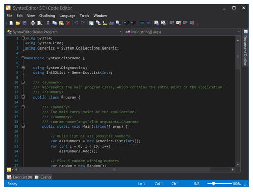
WindowChrome is a class that can be attached to any existing normal WPF Window.  Once attached, it takes over rendering of the Window.  In the first 2012.2 version, the chrome was just designed to work with the new Metro Light theme, also added in 2012.2.  Here's a screenshot of our SDI Code Editor sample with WindowChrome used to render the Window and the Metro Light theme in effect:

MetroWindow

It looks great… there is semi-transparent outer glow border support, Aero snap support, ability to update the window border and status bar backgrounds to reflect application states, and much more.  But we still had a lot of plans to make it even better.  And that's what we've done for the next maintenance release!

New Features

All Themes Supported

As mentioned above, the first release of WindowChrome only supported the Metro Light theme.  In our code updates, WindowChrome now supports any Actipro theme (all system themes, Office blue/black/silver, etc.).

OfficeBlueCodeEditor

This is an example of switching the application theme to Office Blue.  See how WindowChrome has fully taken over the rendering of the window?

You'll notice that the outer glow disappeared in this particular theme.  By default the outer glow will only show on themes that flag they want outer glows, which at the current time is only the Metro Light theme.  A property on WindowChrome also allows you indicate if you want outer glow or not.

Title Bar Content

A new property has been added to allow you to inject custom title bar area content.

TitleBarContent

For instance, in this screenshot, we've inserted a Search textbox and a button.

Aero Glass Support

This next version of WindowChrome also has full support for Aero glass.  By default, Aero Glass support is disabled but it can be enabled by toggling a simple boolean property.  There also is a property that determines how far into the window the Aero glass extends.  This becomes important for another major announcement we'll post soon.

Aero Snap and Dock Support

Any window that has a WindowChrome attached fully supports Aero snap and dock functionality.  Meaning you can drag the window up to the top of your desktop and release to maximize it.  Once maximized you can drag it back to a restored state.  You can double click borders (or the outer glow when present) to snap window edges to the desktop sides.  Everything works exactly as expected.

Interop Support

Even with the semi-transparent outer glow effects applied, WindowChrome still fully supports interop content like WinForms controls that aren't normally possible on windows that have transparency enabled.

Summary

All the new features described above will be included in the upcoming WPF controls 2012.2 build 571 maintenance release, which is due soon.

TaskDownload TaskLiveDemo TaskBuyNow

MicroBoxPlot Part 3: Appearance Customization

by Avatar Bill Henning (Actipro)
Wednesday, October 10, 2012 at 8:06am

BlogPostBanner

In the previous post for our Micro Charts product (currently available for WPF, Silverlight, and WinRT XAML), we talked about the minimum and maximum functionality of the new MicroBoxPlot control. In today's post, we'll look at the many ways to customize the control's appearance.

Orientation

The orientation of the graph can be set to vertical to effectively rotate the graph ninety degrees counter-clockwise. Several charts can be given a vertical orientation then placed side by side to create a report that flows horizontally.

Part Appearances

Each part of the MicroBoxPlot control has a style that can be set to customize the size and colors of the chart. The box is rendered as a rectangle and therefore a fill and stroke brush can be specified to alter the color. The median, mean, and whiskers are all rendered as paths, provide options for stroke color, stroke thickness, and other options, such as dashed lines.

Appearances

As mentioned in a previous post, the whisker extent is dependent upon the IQR multiplier. Whiskers can be removed entirely by setting the IQR multiplier to zero. The size of the perpendicular whisker end lines can be customized using the whisker ascent property, which commonly accepts percentage and pixel values. If the whisker ascent is set to zero then no end lines will be displayed. The examples above show a few of the many options for MicroBoxPlot appearance customization.

Tool Tips

Tool tips can also be used on MicroBoxPlots. They can be custom formatted and can display all the part values and the minimum and maximum properties.

ToolTips

The maximum and minimum values will display the actual minimum and maximum of the data, meaning the minimum and maximum of the chart can be custom set and the tool tip will still accurately represent the data.

Summary

The MicroBoxPlot control is currently available in the Micro Charts product, which ships in our WPF, Silverlight, and WinRT XAML control sets.  This concludes our series on the MicroBoxPlot control.  Watch for more micro chart-related posts soon.

TaskDownload TaskLiveDemo TaskBuyNow