In the previous post for our Micro Charts product (currently available for WPF, Silverlight, and WinRT XAML), we revealed the MicroBulletGraph control that is coming to Micro Charts' 2012.2 version (already available for WinRT XAML). In today's post, we'll talk about how you can customize the appearance of the MicroBulletGraph to create visually stimulating graphs.
UPDATE: Version 2012.2 is live and available for download now.
Customization Options
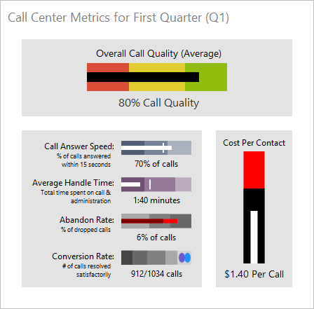
There are many ways to customize the look of a MicroBulletGraph, including customizable color schemes, changing part sizes, and graph orientation. The color of the graph can be set with a single base color that applies to all the parts to quickly create a unified color scheme, or the brush on each part can be set to create custom color schemes. A combination of the methods can also be used to efficiently create a graph that has a base color with highlighted parts.
Various examples of MicroBulletGraph appearance customizations, from the upcoming WPF demo
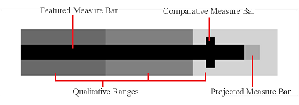
In addition to a different color, the featured bar, comparative bar, and projected bar can also be set to a different size. The height of bars can be set to a specific number of pixels, or to a percentage of the graph to fill. The width of the comparative bar can also be set to a different number of pixels to alter how large of a range it covers.
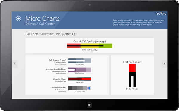
The same bullet graph demo as above, displayed in our Windows 8 WinRT XAML controls demo - available now!
Summary
The many customization options provided by the MicroBulletGraph control allow for virtually unlimited opportunities to create a unique and engaging graph. Using the appearance customization abilities graphs can be color-coded and highlight key data points while being visually appealing and easy to understand.
In our final post of this series, we'll look at some other features of the control.

