Our v21.1 WPF controls have been updated with a new maintenance release that is now ready for download. This version has many updates for SyntaxEditor along with improvements for Ribbon, Docking/MDI, and other products.
See this announcement post for the detailed list of enhancements and updates.
A release candidate version of our WinForms Controls v21.1 is now available. This version makes a lot of minor updates to the controls, better aligns its API namespaces, and modernizes many aspects of our WinForms Controls infrastructure in the same way as a our recent WPF Controls updates.
Downloading the Release Candidate
Since this is just a Release Candidate version, the installer is not available on our download page, and licenses cannot yet be purchased on our web site. If you'd like to help us test it out, please contact us at our support address and we'll be happy to send you the download URL. For customers with active WinForms Controls subscriptions, let us know in your e-mail and we'll get you v21.1 license information.
Let’s take a look at some of the largest changes.
.NET Core 3.1 and .NET 5 Support
First, we updated our products to include a target for .NET Core 3.1. This included a major update to our designer functionality for proper integration with the new design tools Microsoft is still actively developing for Visual Studio.
Next, we validated that .NET 5 applications can successfully reference our NuGet packages and work as expected. .NET 5 applications will use our .NET Core 3.1 assembly variations, since .NET 5 is effectively the next version of .NET Core 3.1, just under a more concise name.
Visual Studio WinForms Designer for .NET Core Support
Visual Studio is built on .NET Framework, so that presents a unique challenge to supporting WinForms designers for .NET Core since the related types cannot be loaded directly by Visual Studio. Microsoft implemented an elegant solution where .NET Core types are loaded in a remote process. Then .NET Framework types are loaded in Visual Studio that communicate with the remote process. The remote process may one day run on a separate machine from Visual Studio, so all user-facing dialogs must be implemented on the .NET Framework side of the stack.
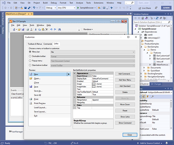
Moving all dialogs to the .NET Framework client was particularly challenging for products like Bars which historically have relied heavily on drag-and-drop operations on the control surface combined with dynamic popup content. We completely rebuilt the Bars design-time experience for .NET Core around a single dialog which exposes the capabilities previously only available through drag-and-drop.
New Bars design-time functionality for the Visual Studio .NET Core designer
For example, the Links tab provides access to all the menus defined by a BarManager: menus, toolbars, popups, and even menus nested within other menus. From here links can be added/removed, customized, or rearranged. We have even included productivity shortcuts like double-clicking a popup button link will automatically jump to the links of that popup menu to continue customization.
Microsoft is still actively developing WinForms designer support for Visual Studio with breaking changes between releases, so be sure to check our Visual Studio Designer documentation for requirements.
NuGet Packages
Speaking of NuGet packages, v21.1 is available on nuget.org. This is the quickest way to reference our WinForms Controls from any project type: .NET 5, .NET Core 3.1, or .NET Framework 4.0 or later.
Documentation Updates
We have ported all our WinForms Controls product documentation from an older Sandcastle-based configuration to a newer DocFX-based configuration. All our documentation topics are now written in Markdown and DocFX generates the API-related topics.
The offline documentation that used to ship in our product installer as a CHM (compiled HTML Help) file is now distributed in HTML files that can be opened in your favorite browser.
Online Documentation
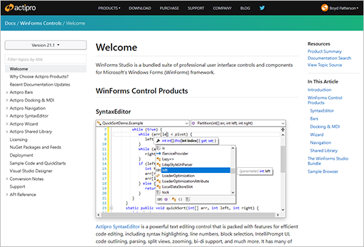
Part of the modernization efforts in this version have been geared towards removing the requirement for customers to download and run our product installer to work with our WinForms Controls. The NuGet packages allow you to access the assembly binaries from any project, but how do you access documentation?
WinForms Controls online documentation
We have added online product documentation for the WinForms Controls on our web site. Full documentation is now always at your fingertips, available from anywhere, even your phone. The online documentation includes the entire API reference and deep links into Microsoft Docs where appropriate for base CLR types.
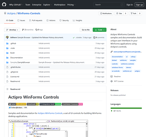
GitHub Repository
Assemblies are accessible via nuget.org and product documentation can be viewed on our web site. How about getting product samples without an installer?
We have solved this by creating a new “WinForms-Controls” GitHub repository that contains the full source of our sample project and even our documentation topics. You can view the sample project source directly in the GitHub repository, or if you prefer to run the samples, you can clone the repo to your machine and run them there.
Actipro's WinForms-Controls GitHub repository
These samples are also the fastest way to evaluate WinForms Controls with .NET Core 3.1 or .NET 5 since the sample project is configured to multi-target both .NET Framework and .NET Core.
By having our samples and documentation source now available to the public, we hope that customers may be willing to contribute where they see opportunities for enhancements in those areas.
Backend Build Infrastructure
While not directly affecting customers, we have internally moved from a build infrastructure that was based on PowerShell scripts to a newer one based on the NUKE project. NUKE allows you to build a console-based app that is pure C# and has tons of functionality already baked into it. We have been so happy with the build framework that we now sponsor its author on GitHub.
In addition, we have moved our internal builds for the WinForms Controls off Azure DevOps and over to GitHub Actions. Having source, issue-tracking, and builds (via Actions) all in one place on GitHub has been a win for us internally and should allow us to be more agile moving forward.
Summary
We are really pleased with the results of our efforts to move to a more open, modern infrastructure. Customers can continue to download our product installer (once v21.1 is officially released) to easily get everything they need. During the Release Candidate period, please e-mail our support team to get access to the v21.1 product installer.
Our v21.1 WPF controls have been updated with a new maintenance release that is now ready for download. This version has a fun new SyntaxEditor feature, and fixes a problem in the previous release's nuget.org packages that was triggering design-time assemblies to get referenced when using packages.config files.
See this announcement post for the detailed list of enhancements and updates.
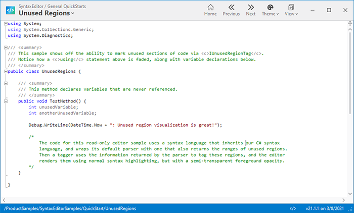
A new unused region tag is available that allows you to mark regions of code that are "unused". This is commonly seen in the Visual Studio code editor when no types from an imported namespace are used, or a variable is declared but never used.
A new sample demonstrating unused regions
The result of tagging text ranges as unused regions is that they will render with partial transparency. This helps visually separate unused code from other code, while still maintaining the syntax highlighting.
We are pleased to announce the release of the 21.1 version of our WPF Controls. For this version, we have modernized many aspects of our WPF Controls infrastructure. A number of these changes will allow us to be more agile moving forward, while at the same time allowing for collaboration with customers.
First, we have updated our minimum .NET platform versions to versions that are still supported by Microsoft:
Updated .NET Core assemblies to target .NET Core 3.1 instead of .NET Core 3.0.
Updated .NET Framework assemblies to target .NET Framework 4.5.2 instead of .NET Framework 4.0.
Next, we validated that .NET 5 applications can successfully reference our NuGet packages and work as expected. .NET 5 applications will use our .NET Core 3.1 assembly variations, since .NET 5 is effectively the next version of .NET Core 3.1, just under a more concise name.
NuGet Packages
Speaking of NuGet packages, v21.1 is available on nuget.org. This is the quickest way to reference our WPF Controls from any project type: .NET 5, .NET Core 3.1, or .NET Framework 4.5.2 or later.
Documentation Updates
We have ported all our WPF Controls product documentation from an older Sandcastle-based configuration to a newer DocFX-based configuration. All our documentation topics are now written in Markdown and DocFX generates the API-related topics.
The offline documentation that used to ship in our product installer as a CHM (compiled HTML Help) file is now distributed in HTML files that can be opened in your favorite browser.
Online Documentation
Part of the modernization efforts in this version have been geared towards removing the requirement for customers to download and run our product installer to work with our WPF Controls. The NuGet packages allow you to access the assembly binaries from any project, but how do you access documentation?
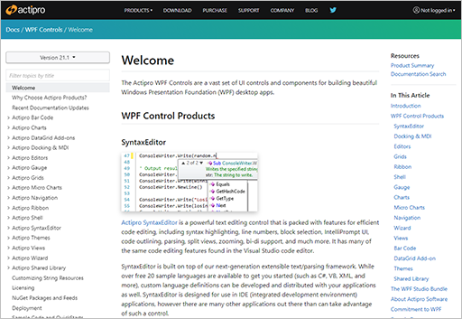
WPF Controls online documentation
We have added online product documentation for the WPF Controls on our web site. Full documentation is now always at your fingertips, available from anywhere, even your phone. The online documentation includes the entire API reference and deep links into Microsoft Docs where appropriate for base CLR types.
GitHub Repository
Assemblies are accessible via nuget.org and product documentation can be viewed on our web site. How about getting product sample without an installer?
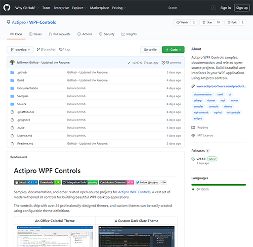
We have solved this by creating a new “WPF-Controls” GitHub repository that contains the full source of our sample projects, and even our documentation topics. You can view the sample project source directly in the GitHub repository, or if you prefer to run the samples, you can clone the repo to your machine and run them there.
Actipro's WPF-Controls GitHub repository
By having our samples and documentation source now available to the public, we hope that customers may be willing to contribute where they see opportunities for enhancements in those areas.
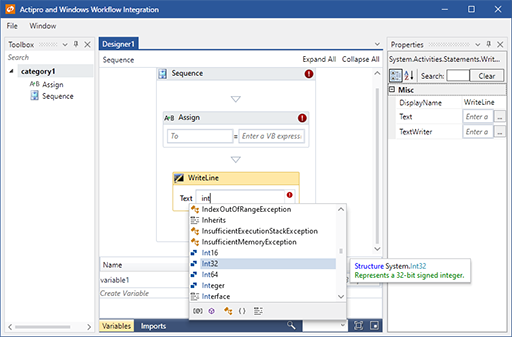
Windows Workflow Designer Integration Sample
Our sample project that shows off integration of a rehosted Windows Workflow Designer with SyntaxEditor (as an expression editor) using the .NET Languages Add-on, along with Docking/MDI and Themes has been refactored into a single project with improved code organization and commenting.
The Windows Workflow Integration sample
The sample is now included as an option in our product installer, as well as within the GitHub repository.
Backend Build Infrastructure
While not directly affecting customers, we have internally moved from a build infrastructure that was based on PowerShell scripts to a newer one based on the NUKE project. NUKE allows you to build a console-based app that is pure C# and has tons of functionality already baked into it. We have been so happy with the build framework that we now sponsor its author on GitHub.
In addition, we have moved our internal builds for the WPF Controls off Azure DevOps and over to GitHub Actions. Having source, issue-tracking, and builds (via Actions) all in one place on GitHub has been a win for us internally and should allow us to be more agile moving forward.
Summary
We are really pleased with the results of our efforts to move to a more open, modern infrastructure. Customers can continue to download our product installer to easily get everything they need.
 Bill Henning (Actipro)