The 2014.1 versions of our WPF, Silverlight, and WinRT/XAML controls have been released and are now available for download.
Major new features are described below. See the announcement posts for the detailed list of enhancements and updates, including many items not listed below:
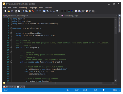
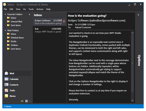
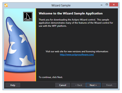
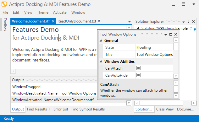
Metro themes have been dramatically refined and updated in this version, mostly in the area of Docking/MDI. Updated UI includes subtle border lines, new auto-hide tab appearance, title bar gripper decorations, and more.
Metro themes will now not show images on tabs by default, and have changed auto-hide tabs to require a click (instead of hover) to open. These updates match Visual Studio 2013 behavior.
We've added new events for the auto-hide popup (flyout) that fire when it is opened or closed. The popup is also now displayed using a faster default animation speed.
When the DockSite.AutoHidePopupOpensOnMouseHover property is false, clicks on auto-hide tabs are required to toggle the auto-hide popup opened and closed.
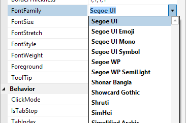
New built-in property editors for FontFamily, FontStretch, FontStyle, and FontWeight type properties have been added.
New key tip specific theme resources have been added and key tips in Metro themes now render more like Office 2013.
CheckBox-based menu items now are capable of supporting tri-state display.
Delimiter auto-completion logic for insertion and subsequent scope tracking has been greatly improved. Delimiter indent provider can now optionally support square braces.
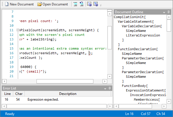
Added a new property that allows SyntaxEditor to measure itself based on text contents. This works great for smaller documents in both multi-line and single-line modes.
Updated single-line mode to support word wrap, which is very useful when combined with the new view line measuring option.
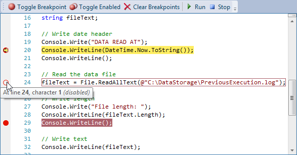
Bookmark indicators now support an IsEnabled state.
LipsumGenerator class added to support generation of "lorem ipsum" placeholder text.
Changed block indent mode to retain whitespace after the caret when Enter is pressed.
.NET Languages Add-on
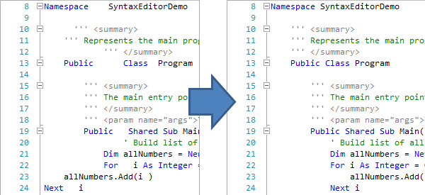
Numerous improvements to the VB language's handling of identifiers and variable declarations that don't include a type.
Web Languages Add-on
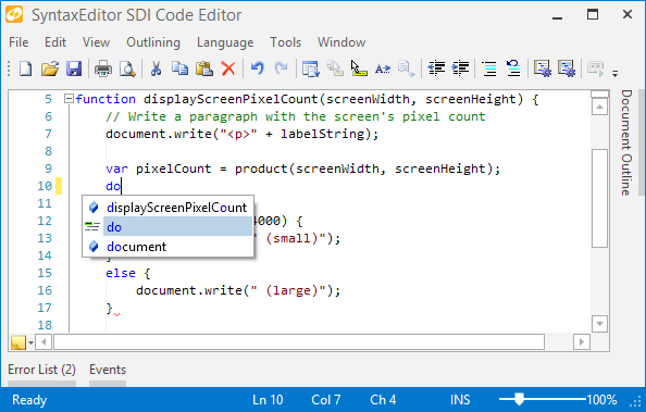
Added IntelliPrompt completion for keywords and symbols to the JavaScript language.
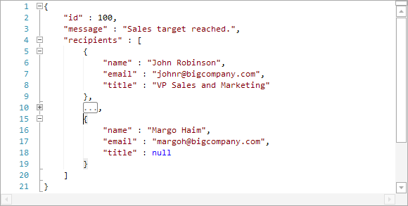
Added a new advanced JSON language that can be used to view/edit JSON files, along with a new related QuickStart.
Updated JavaScript language to support multi-line strings via backslash continuation.
Many improvements to Metro themes (mostly in the Docking/MDI area described above), and improved WindowChrome (and RibbonWindow) rendering when maximized.
WPF/Silverlight Only
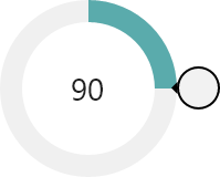
Added the RadialSlider control, which is a circular slider that can be used to input any scalar value.
Added the RingSlice control, which renders a portion of a ring at designated angles and radius.
Added the CircularThumb control, which is a thumb gripper with a circular shape and arrow adornment.
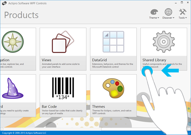
Added three samples for new Shared Library controls.
WinRT/XAML Only
Added the AppBarHint control, which is a visual hint to users that app bars exist on a page, and can be tapped to toggle them open.
Added a related QuickStart.
Sample Browser (WPF/Silverlight only)
Added the ability to toggle description sidebar on some samples.








![LineChartType_thumb[1] LineChartType_thumb[1]](https://files.actiprosoftware.com/images/blog-legacy/LineChartType_thumb1_thumb.png)
![ScatterChartType_thumb[1] ScatterChartType_thumb[1]](https://files.actiprosoftware.com/images/blog-legacy/ScatterChartType_thumb1_thumb.png)
![AreaStackedChartType_thumb[1] AreaStackedChartType_thumb[1]](https://files.actiprosoftware.com/images/blog-legacy/AreaStackedChartType_thumb1_thumb.png)
![BarStackedChartType_thumb[1] BarStackedChartType_thumb[1]](https://files.actiprosoftware.com/images/blog-legacy/BarStackedChartType_thumb1_thumb.png)
![AttributeIntelliPrompt_thumb[1] AttributeIntelliPrompt_thumb[1]](https://files.actiprosoftware.com/images/blog-legacy/AttributeIntelliPrompt_thumb1_thumb.png)

