 Bill Henning (Actipro)
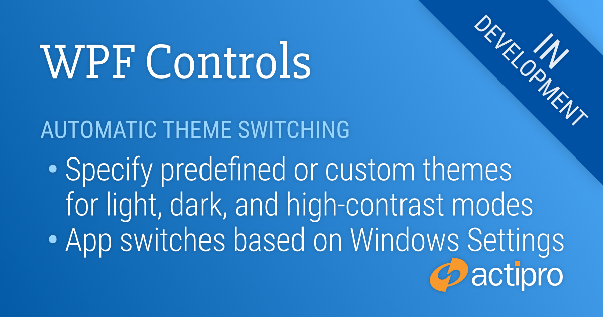
Actipro WPF Controls v2020.1 development is in progress, and the new version’s main goals are to modernize our UI control features/themes, and make theme customization much easier.
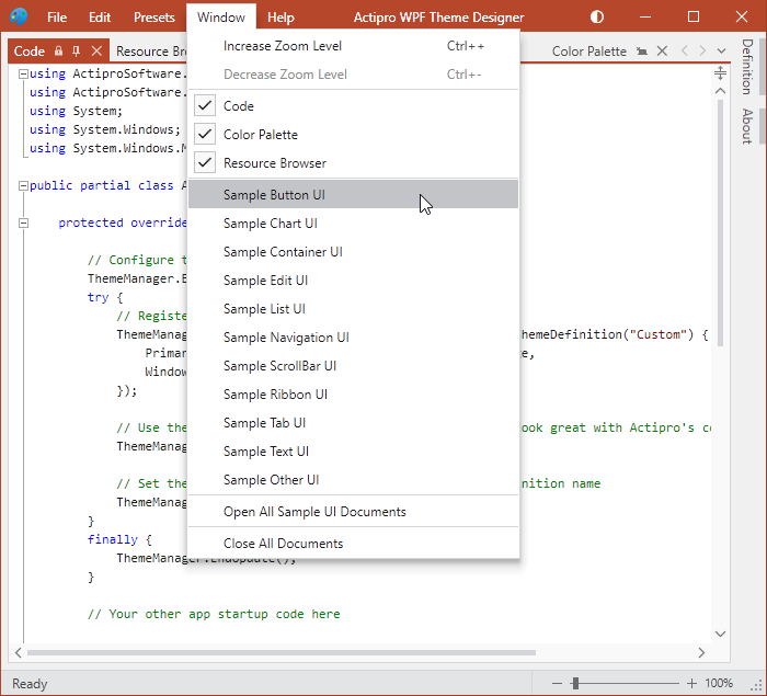
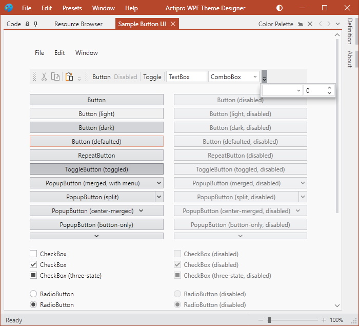
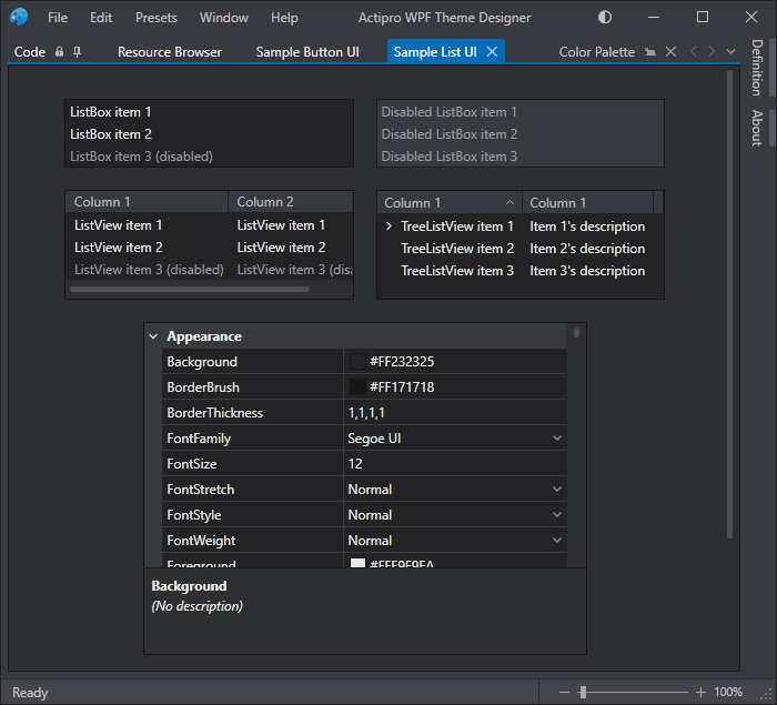
In our previous post, we showed how the Theme Designer application can display sample UI tabs, allowing you to instantly see how changes to the theme definition affect the rendering of various UI controls.
In today’s post, we’ll take a look at a new feature of ThemeManager that allows an application to automatically change themes based on Windows settings for light/dark and high contrast modes.
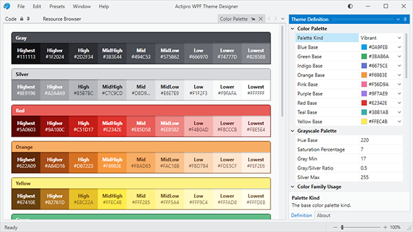
Theme Architecture
As a quick review, the Actipro ThemeManager supports dynamically swapping in of ResourceDictionaries containing control Styles and asset resources like Brushes, Thicknesses, etc. that can be used in WPF Styles/Templates. As seen in previous blog posts, v2020.1 will allow you to design and easily register custom theme definitions with ThemeManager.
Typically you indicate the theme you wish to load for your application by setting the ThemeManager.CurrentTheme property to the name of a pre-defined theme (created by us) or a custom theme definition that you registered.
This all works great. Now what if we want to have our app’s theme match the current Windows settings for app colors and high-contrast?
Matching Windows Settings
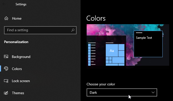
The Windows Settings’ Personalization section’s Colors tab allows the end user to choose whether apps should be light or dark themed. Some end users might also activate High-Contrast mode from within Windows Settings.
It is ideal for apps to listen to these end user settings to ensure a consistent user experience. New features in v2020.1’s ThemeManager allow you to respect these settings and automatically switch themes when appropriate, all with one line of code.
A new ThemeManager.RegisterAutomaticThemes method can be called in your app’s OnStartup logic in place of setting the ThemeManager.CurrentTheme property. This method allows you to specify the names of a light theme, dark theme, and high-contrast theme.
Here’s some sample code that uses our pre-defined “Light”, “Dark”, and “HighContrast” themes:
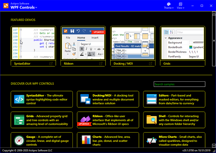
ThemeManager.RegisterAutomaticThemes(ThemeNames.Light, ThemeNames.Dark, ThemeNames.HighContrast);Now when the end user indicates via Windows Settings that apps should be in a dark theme, the app (our Sample Browser in this example) looks like:
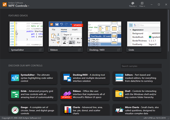
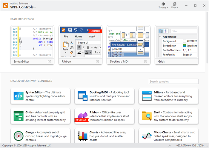
When the end user indicates via Windows Settings that apps should be in a light theme, the app looks like:
And finally, with high-contrast mode activated via Windows Settings, the app looks like:
You can call RegisterAutomaticThemes with any registered theme name. If you use our Theme Designer application to build your own custom light and dark themes and have registered them with ThemeManager, simply pass those themes’ names to RegisterAutomaticThemes and ThemeManager will pull the correct theme based on the end user’s Windows Settings.
When using RegisterAutomaticThemes, the ThemeManager actively watches for changes to the Windows Settings and switches themes at run-time as appropriate based on new settings.
Summary
This handy one-line call takes all the work out of trying to match an end user’s app preferences. We’re very excited to deliver this in the upcoming 2020.1 version.
We are currently in final beta testing of v2020.1 and hope to have it released in the next week or two.
Post in the comments below with any questions or comments on our upcoming WPF themes features.