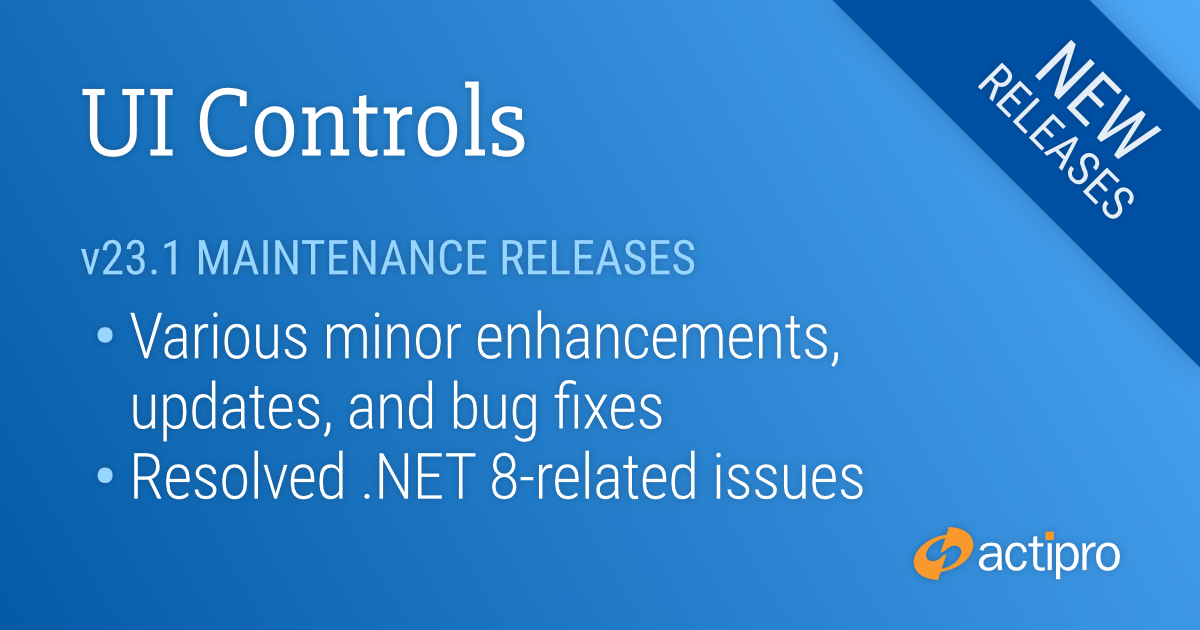
New maintenance releases are now available for our WPF and WinForms Controls. Numerous new minor features and updates are included, and known issues with the recently-released .NET 8 have been resolved.
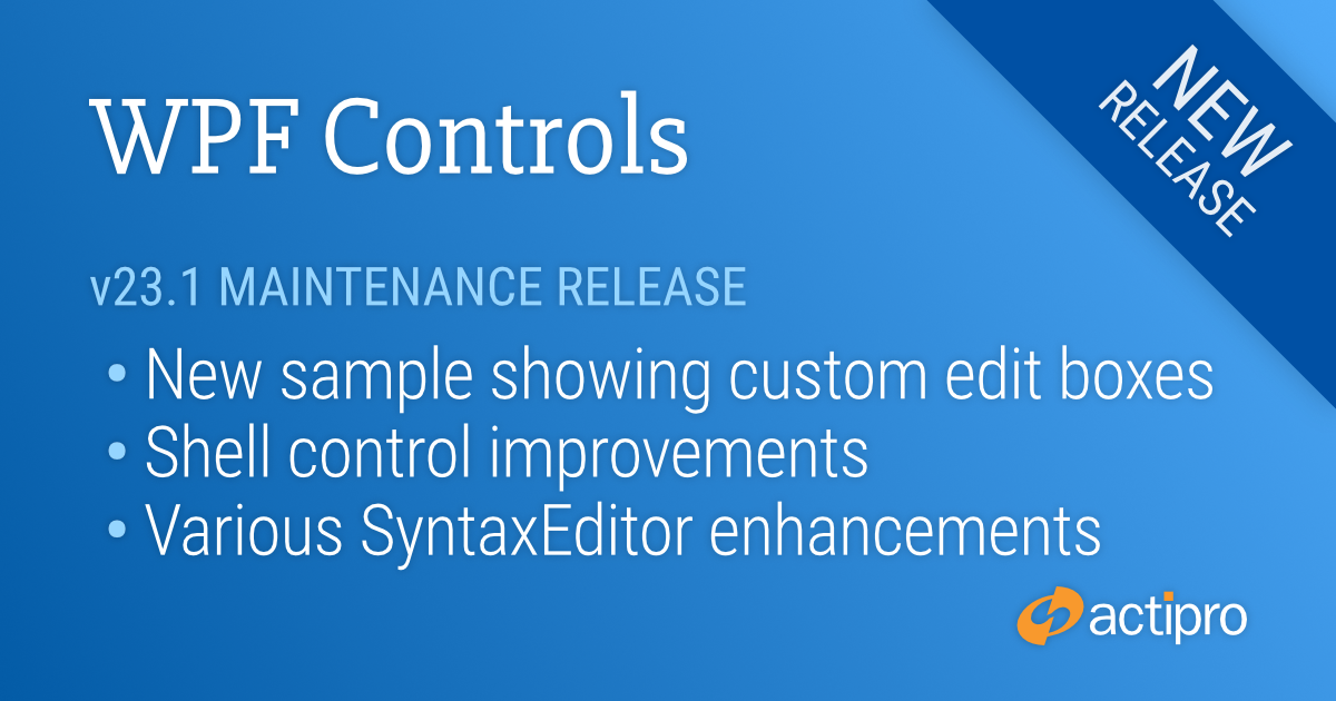
This version makes a number of minor updates across the WPF control product line. A new Custom Edit Box QuickStart sample has been added that demonstrates how to build an edit box for a custom type.
See the related announcement post for the detailed list of enhancements and updates.
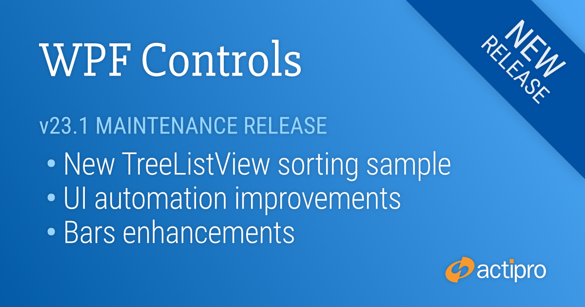
This version makes a number of minor updates across the WPF control product line. A new TreeListView sample shows how to sort columns when their header is clicked, various UI automation improvements were made, and numerous Bars enhancements were implemented.
See the related announcement post for the detailed list of enhancements and updates.
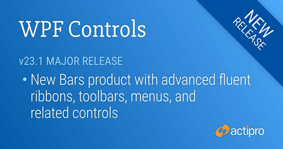
While this major new version focuses on the introduction of the new Bars product beta, it also has a number of other minor updates across other products that are described in the related announcement post, which contains a detailed list of enhancements and updates.
v23.1 takes the wraps off a new Bars product that implements advanced fluent ribbons, toolbars, menus, and related controls.
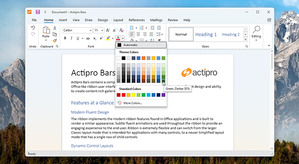
Ribbon in Classic layout mode with a color gallery displayed
The new fluent Ribbon has the latest Office appearance and includes the use of subtle animations throughout all controls.
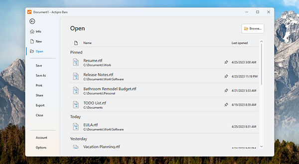
Ribbon's backstage showing an included recent document list control
Ribbon can instantly switch between Classic (taller) and Simplified (single-row) layout modes, allowing for configuration of the variant resizing behavior in both modes.
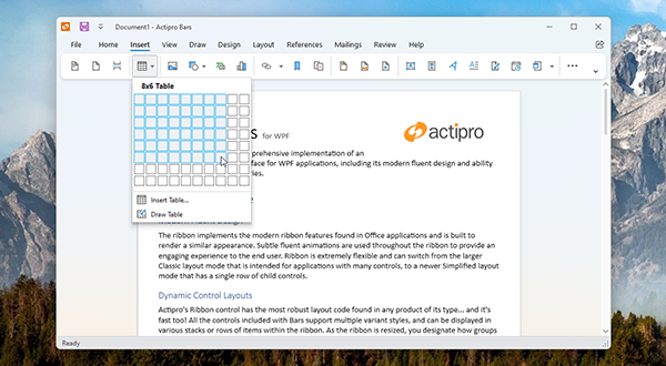
Ribbon in Simplified layout mode with an Insert Table gallery displayed
Complex galleries can appear in the Ribbon, as well as in any popup and context menu. It's simple to create new galleries with rich visualizations for any need.
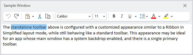
A standalone toolbar can display many of the same controls that Ribbon can, including popups with galleries
The StandaloneToolBar control can alternatively be used as an app's primary toolbar, or alternatively within tool windows. It can host any control that can be used in Ribbon and overflows items to a popup as needed.
Three user interface density options can be chosen, letting your application select whether to better support a large number of controls, or focus more on touch-friendliness.
The entire control hierarchy can be built using MVVM (preferred), or alternatively directly in XAML. An optional open source MVVM library is available that makes it easy to configure the Bars controls with MVVM techniques. In fact, the main Ribbon demo seen in earlier screenshots above is completely constructed from code-behind view models!
.NET Target and Code Signing Updates
Since .NET 5 is now out of support by Microsoft, we updated our .NET 5 targets to .NET 6. .NET 5-based apps can still use .NET Core 3.1 targets.
We’ve also moved our .NET Framework target to use 4.6.2 minimum, as it’s the most recent supported version of .NET Framework.
Finally, we now automatically code sign all our assemblies instead of shipping both non-signed and signed variations.
 Bill Henning (Actipro)
-
Bill Henning (Actipro)
-