Windows Workflow Designer SyntaxEditor Integration - Generics Support

by Avatar Bill Henning (Actipro)
Friday, September 28, 2018 at 2:52pm

WpfControlsTipsBlogPostBanner

Several years ago, we created a sample for showing how a hosted Windows Workflow Designer instance could be integrated with Actipro WPF controls within a custom WPF application to provide a very elegant interface for end users.

We've been updating the sample over time and are have just released another updated version.  This one demonstrates how generics (like List<T>) can be supported as variable types.

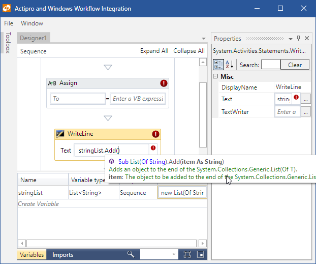
Here's a screenshot showing a "stringList" variable defined as "List<string>".  We then can access the list variable's IntelliPrompt completion and parameter info (pictured) in any expression.

SyntaxEditorWorkflowGenerics_thumb

About the Windows Workflow Integration

Our Docking/MDI product is used to provide the tool window and multiple document interface.  Our SyntaxEditor code editor control, in single line edit mode, is injected as a custom expression editor.  When you combine SyntaxEditor with our .NET Languages Add-on, you are able to have it support powerful IntelliPrompt completion lists, quick info, and parameter info.

It's very easy to integrate Actipro WPF controls with rehosted Windows Workflow Designer instances in your applications.  It only takes a few minutes to get up and running, and once you do, the result is well worth the time.

Downloading the Sample

If you rehost the Windows Workflow Designer in your WPF apps and would like our example, please contact us and we'll be happy to share it with you!

For those customers who downloaded either of the prior versions, this update is at the same URL as before.

SyntaxEditor vNext Multiple Selection Pasting

by Avatar Bill Henning (Actipro) - 2 comments
Thursday, August 2, 2018 at 3:34pm

BlogPostBanner-SyntaxEditor-DevNotes

As mentioned in a previous post, we have been working on refactoring the core internal implementation of our SyntaxEditor code editor control on the WPF, UWP, and WinForms platforms.  This effort (codenamed vNext) is being made to bring all three platforms onto the same codebase for easier updating moving forward, and to enhance features wherever possible.

As described in recent blog posts, we've been working on adding multiple caret/selection support to SyntaxEditor in vNext.  In this post, I'd like to show off a neat new feature related to copying/pasting text when there are multiple selections.

Pasting Demo

At the start of this animation, I do a line copy, which occurs when there is no selection and you press Ctrl+C.  Then I paste that line in three times.

Next I select the text "Actipro," then Ctrl+select the text "SyntaxEditor," and finally Ctrl+select the text "vNext."  The Ctrl+selections have allowed me to create three selections.  At this point I could type and it would replace each of those selections with what I typed.  Instead, I'm going to press Ctrl+C again to copy the selected text.

2018-08-02_11-15-36

When I copy multiple selections, each selection's text is appended together and delimited by a line terminator.  So if you would paste what I copied into Notepad, it would paste as:

Actipro
SyntaxEditor
vNext

In the animation, the next thing I do is put a caret in each of the three empty strings by Ctrl+clicking in them.  We just added some new vNext logic that will compare the number of selections with the number of lines in the pasted text.  When they are equal, as they are in this demo, each line in the pasted text will get pasted into the related selection.  The end result is you can see how each of the three selections I originally copied end up in a separate target selection.

Summary

Multiple caret/selection support touches many portions of the editor and we are continuing to work through updating all feature areas to support it.

Let us know what you think in the comments.

SyntaxEditor vNext Multiple Caret/Selection Progress

by Avatar Bill Henning (Actipro) - 3 comments
Wednesday, July 18, 2018 at 3:56pm

BlogPostBanner-SyntaxEditor-DevNotes

As mentioned in a previous post, we have been working on refactoring the core internal implementation of our SyntaxEditor code editor control on the WPF, UWP, and WinForms platforms.  This effort is being made to bring all three platforms onto the same codebase for easier updating moving forward, and to enhance features wherever possible.

We are continuing development on our SyntaxEditor control, adding many modern features under a unified API design.  One enormous feature area getting added is multiple carets/selections.  We briefly proposed adding this feature several months ago in this blog post to gather feedback.

Now that we've had time to iterate on development of it, I wanted to share a demo so you can see how it works.

Multiple Carets/Selections Demo

In this screen capture animation, we show how SyntaxEditor vNext will support multiple carets/selections.

2018-07-18_11-41-52

I first select a word using my mouse and click/dragging like normal.  Then I select text under it while holding the Ctrl key and click/dragging.  Afterward I notice I accidentally selected too many characters.  I hold Ctrl and click the second selection to collapse it.  Then I hold Ctrl and click/drag to make the correct selection.

Next I hold Ctrl and click in another word to add a third caret.  I remove that same third caret by Ctrl+clicking on it again.  This is a nice feature for when you accidentally add a caret/selection you didn't mean to add.

Finally, edit actions like typing will affect all selections.  You can see in the animation how typing "Foo" affects the two selections.  Pressing Ctrl+Z for undo applies to all the selections.

Summary

Adding multiple caret/selection support is a massive feature area that touches many portions of the product.  While it's taken a while to implement, we're very pleased with the progress thus far and think it will really be exciting for end users.

Let us know what you think of this feature area in the comments.

ShellListView Layout Modes Added

by Avatar Bill Henning (Actipro)
Friday, June 15, 2018 at 5:17pm

BlogPostBanner.Shell.DevNotes

Earlier this week, we published a WPF Controls 2018.1 build 671 maintenance release that added some major new features for our WPF Shell controls.  It also made some minor updates and bug fixes in other WPF controls, so it is a highly recommended update.

Actipro's WPF Shell controls allow for easy folder and file browsing. While the product comes packed with a pre-built implementation for the Windows shell that mimics Windows Explorer, the controls are fully customizable, allowing you to filter or change the folders/files presented. Or build your own shell service to support other files systems, such the remote side for a FTP client.

ShellListView Layout Modes

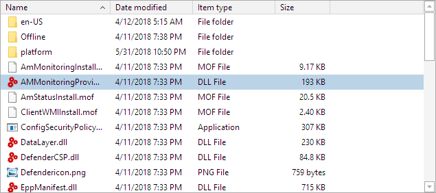
The initial 2018.1 release of the Shell controls first introduced the ShellTreeListBox control (presents a shell folder hierarchy in a tree structure) and the ShellListView control (shows the contents of a selected folder).  This first build only supported the Details layout mode in ShellListView, which is the one most commonly-used, and has multiple columns of shell object information display. 

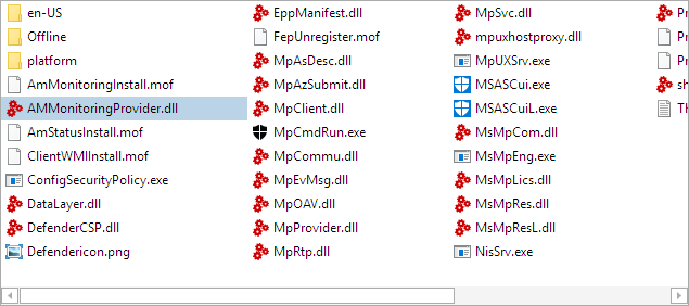
In this latest maintenance release, we've added multiple new layout mode options:  List, Small Icons, Medium Icons, Large Icons, and Extra Large Icons.  Let's see a comparison of the new modes.

List

ShellListView-List

Small Icons

ShellListView-SmallIcons

Medium Icons

ShellListView-MediumIcons

Large Icons

ShellListView-LargeIcons

Extra Large Icons

ShellListView-ExtraLargeIcons

Details (default)

ShellListView-Details

Thumbnails

This latest maintenance release also can display thumbnails that represent shell object content in place of the standard file type icons in several of the new layout modes.

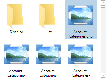
Let's take a look at a folder that has the thumbnails feature off:

ShellListView-NoThumbnails

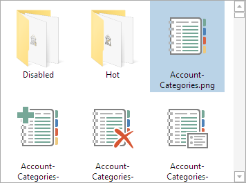
You can see that the folders don't show any content and the images display a standard icon.  Now let's compare the same folder with the new thumbnails feature on:

ShellListView-Thumbnails

That's quite an improvement and really helps users get a feel for the content.  The thumbnails displayed are provided by the system, so the thumbnails should support generation from any shell extension that supports thumbnails.

Summary

The features described above are available today.  Please download our latest WPF controls build to get them.

The next feature we're working on for ShellListView is adding a virtualizing panel for these new layout modes that will allow folders with many shell objects to display quicker.  If you'd like to help us beta test new features like the virtualizing panel, please write our support address.  And "Chat With Us" about our shell controls on Slack.

TaskDownload TaskBuyNow TaskWideChatWithUs

WPF, UWP, and Silverlight Controls 2018.1 Released

by Avatar Bill Henning (Actipro)
Tuesday, May 22, 2018 at 2:54pm

BlogPostBanner-18.1

We're happy to announce that the 2018.1 versions of our WPF, Universal Windows, and Silverlight controls have been released.  These versions include a new WPF Shell product, new features, and a lot of minor updates and bug fixes throughout the control sets.

See all the details on the 2018.1 releases in the various announcement posts:

TaskDownload TaskBuyNow

Introducing Shell Controls (WPF only)

The 2018.1 version of the WPF Controls introduces a beta of a new Shell controls product that we've been developing the past several months.

Actipro Shell controls allow for easy folder and file browsing. While the product comes packed with a pre-built implementation for the Windows shell that mimics Windows Explorer, the controls are fully customizable, allowing you to filter or change the folders/files presented. Or build your own shell service to support other files systems, such the remote side for a FTP client.

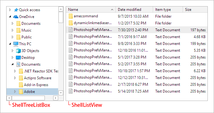
ShellControls

The ShellTreeListBox control presents a shell folder hierarchy in a tree structure. It is often paired with a ShellListView control, which shows the contents of a selected folder using column-based property display. Both controls support customizable tool tips, context menus, multiple image sizes that account for high-DPI scenarios, and in-line renaming.

All of the UI found in the Shell controls is native WPF, even the context menus. Unlike competitive products with interop-based user interfaces, the Actipro Shell controls don't have any airspace or focus issues, and every bit of UI can be fully-themed or even customized with XAML data templates.

Although these controls are still in beta, they should be stable for usage in production.  If you would like to submit suggestions for improvement, please post them in our Shell discussion forum or join our Slack workspace.  We've done a lot of planning with beta testers in the Slack #uicontrols channel.

TaskLearnMore TaskWideChatWithUs