 Bill Henning (Actipro)
-
Bill Henning (Actipro)
-
This version includes new controls, new WindowChrome features for Windows 11, many improvements for SyntaxEditor and its add-ons, updates to nearly all WPF products, and now includes .NET 5 assemblies in the NuGet packages with validated .NET 6 compatibility.
See the related announcement post for the detailed list of enhancements and updates.
Here's a look at some of the new features.
Shared Library
User Prompts
Added a rich API that can create modern, themed dialogs for anything from simple messages and confirmations, to more advanced scenarios like exception notification dialogs or file copy dialogs.
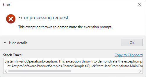
We even include a ThemedMessageBox object with static methods that match the native WPF MessageBox API. Our themed version of the MessageBox uses a chromed WPF Window instead of Win32 dialogs (as the default WPF MessageBox does), along with fluent icons. This is important when your app is in a dark theme because it allows all message/confirmation dialogs to match the theme. You can instantly modernize all message box display in your app to our implementation with a single line of code too.
ToggleSwitch
Added a new control that is often seen as a replacement for a traditional CheckBox in modern user interfaces.
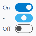
It's easy to customize the appearance of ToggleSwitch to support other styles as well.
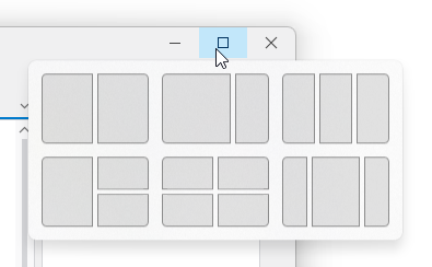
PopupButton
Made numerous updates to PopupButton to improve focus handling, tooltip display, key handling, and knowing when to close itself.
Themes
WindowChrome Windows 11 Support
WindowChrome has added support for Windows 11 where it will use rounded corners and system-rendered drop shadows. In addition, hovering over the title bar's Maximize or Restore buttons will show the Windows 11 Snap Layout menu.
SyntaxEditor
Synchronization QuickStart
A new sample demonstrates synchronizing the scroller and splitter of one editor instance with another.
Drag and Drop
Improved drag/drop interaction and related scrolling in several scenarios, and add a new Drag and Drop QuickStart sample.
Single-Line Mode QuickStart
Added a formula example with alternate style for nested parentheses.

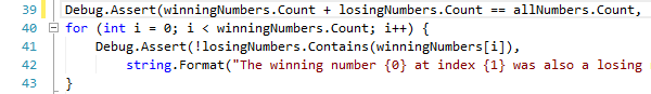
Editing and Caret Movement
Made many small improvements in the areas of editing and caret movement, especially in certain special contexts.
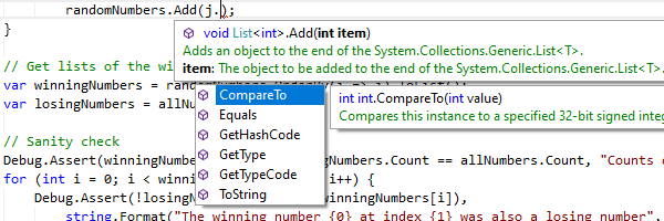
IntelliPrompt
Improved popups to reposition themselves as the editor is scrolled.
Vertical Scrolling
The vertical scrollbar has been updated to handle collapsed regions more smoothly.
SyntaxEditor .NET Languages Add-on
C# Parser
Updated to support C# 8.0 syntax.
Go To Definition QuickStart
A new sample that demonstrates using an IResolver to navigate to the source of a reference.
C# Outlining
The outliner will now create nodes for code-level constructs such as block statements by default.
SyntaxEditor Web Languages Add-on
JavaScript Parser
Updated to support ECMAScript 2021 (12 Edition) syntax.
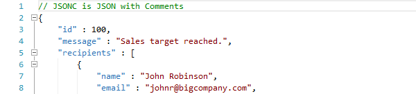
JSON Syntax Language
Added a constructor for whether the language should support JavaScript style comments, as in Microsoft’s JSONC variant.
SyntaxEditor Python Language Add-on
Python Parser
Updated to support Python v3.9.5 syntax.
Python Resolver
Updated to support namespace packages.
Grids
FilterApplied Event
Added a FilterApplied event that is raised after the current filtering state has been applied to all of the control's items, generally occurring when DataFilter is changed, or filtering is enabled or disabled
TreeListBox Updates
Added a new item adapter method that can improve performance in large trees when searching for a tree node, and improved focus tracking and filtering.
Editors
Commit Trigger Changes
Updated edit box commit triggers so that commit on focus loss is now optional.
Improved Cultural Support
Updated the numeric edit boxes to support input of Full-width and Arabic-Indic digits.
Charts and Micro Charts
New Aggregation Kinds
Added SignedMaximum and SignedMinimum aggregation options that compare against absolute values while retaining the sign of the original value; e.g., -5 is greater than 4.
.NET 5 Assemblies Added to NuGet Packages
The WPF Controls NuGet packages on nuget.org now contain compiled product assemblies that target:
- .NET 5
- .NET Core 3.1
- .NET Framework 4.5.2
Projects that target .NET 5 or later will use the .NET 5-based assemblies, and projects that target .NET Framework 4.5.2 or later will use the .NET Framework 4.5.2-based assemblies.
.NET 6 Support
We’ve also validated that our assemblies work great in .NET 6 applications.