 Bill Henning (Actipro)
This version contains an enormous number of updates across the WPF control product line.
See the related announcement post for the detailed list of enhancements and updates.
Here’s a look at some of the major new features.
Bar Code
QR Code ECI Support
The QR Code symbology has been updated to support Extended Channel Interpretation (ECI), which allows encoding of all UTF-8 characters.
Bars
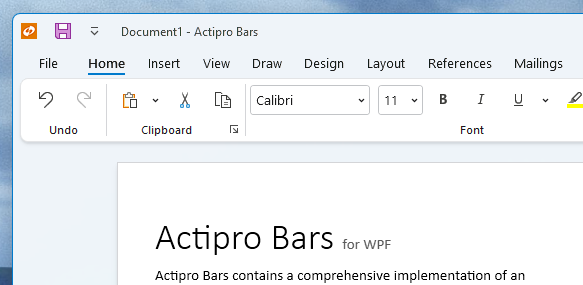
Ribbon Group Labels
Ribbon group labels are always visible in Classic layout mode and in the past have always been hidden in Simplified layout mode. A new option allows for keeping group labels visible in Simplified layout mode, which provides an interesting new appearance option.
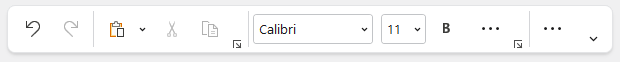
Hiding Ribbon Tabs
For small ribbons with a single tab and no need of an application button, tabs and the app button can be hidden, saving a row of space.
ComboBox Inline Images
The combobox control can now optionally show inline images next to the text.
Many Other Enhancements
A massive number of updates have been made to various Bars controls and features.
Docking/MDI
Bars Integration Sample
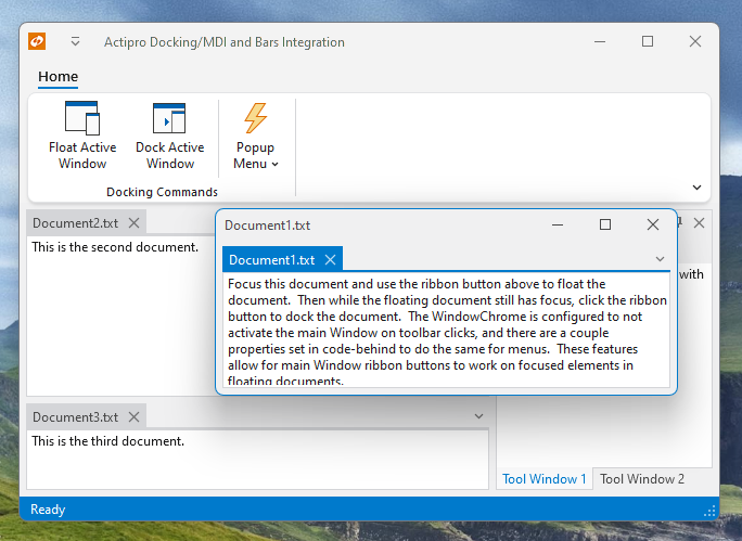
A new Bars Integration sample shows how Ribbon and StandaloneToolBar can be used on a main Window without changing the active docking window when there are floating docking windows.
MDI Always On Top
A new option allows for any floating windows with MDI to always remain on top of the main window.
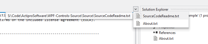
Open Documents Menu Path Tips
The tabbed MDI open documents menu now includes the document’s path as a tooltip on menu items.
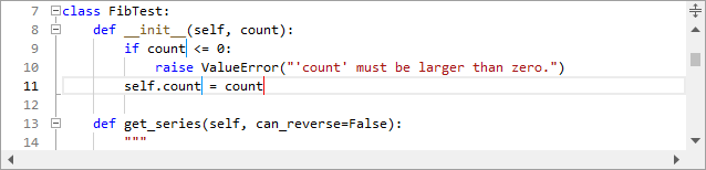
SyntaxEditor .NET Languages Add-on
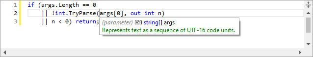
Doc Comment Remarks
IntelliPrompt tips now include documentation comment remarks sections, if available.
Themes
WindowChrome Mouse Activation Over Toolbars
A new WindowChrome option can prevent the containing Window from being activated on click over any toolbar control.

