
The 2017.1 versions of our WPF Controls, Universal Windows Controls, and Silverlight Controls were recently released, with the WPF and UWP controls getting some enormous updates in these versions.
The primary focus of the 2017.1 version in WPF and UWP was to add an improved PropertyGrid control and tree controls (TreeListBox and TreeListView) in our new Grids product, and to update Editors to be more modern/lightweight, and share a codebase between the two platforms. Another focus was on maximizing the performance of all the controls. The new PropertyGrid for instance shows a massive speed increase over the older WPF v2016.1 PropertyGrid.
See the entire lengthy detailed update list in these announcement posts:
If you want to discuss the new controls added in 2017.1 or have suggestions for additional features, please join our #UIControls channel in our Slack team. It's free and you can chat with us and other customers.
Please note that the v2017.1 WPF Controls have PropertyGrid, Editors, and licensing breaking changes to support better API design and features, so be sure to read the "Converting to 2017.1" topic in the documentation that comes with the controls. It walks through everything in detail.

Grids is a new product added to the WPF and Universal Windows Controls in v2017.1. It features three primary controls: TreeListBox, TreeListView, and PropertyGrid.
TreeListBox
TreeListBox is a single-column control that renders a tree structure. It is designed to mimic the features found in the Visual Studio Solution Explorer. You have full control over the appearance of each node, and can easily wire up any tree data model for rendering via the use of our adapter pattern.
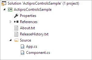
The UI tree is virtualized for optimal performance. Unlike the standard WPF TreeView, TreeListBox is a single ItemsControl that is far less resource intensive and doesn't experience odd vertical scroll jumpiness.
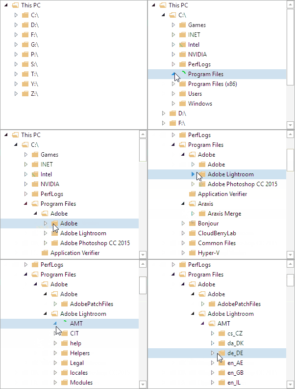
You have full control over whether nodes are expandable, when they load children (and with optional use of async loading with a busy indicator as seen above), and selection modes (single/multiple). A powerful filtering mechanism is included that allows you to add type-to-filter support. F2 can initiate inline editing of node text. Drag and drop can be enabled and you determine what is dragged/dropped. This just scratches the surface, and there are many other features included.
TreeListView
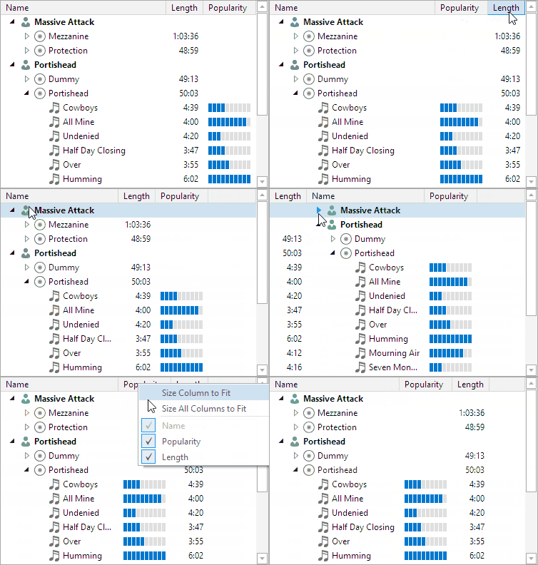
The TreeListView control builds on top of the foundation provided by TreeListBox and adds multiple columns with an optional header, similar to a standard WPF ListView.

Columns can be sized using several algorithms, resized/reordered by the end user, or certain columns frozen such that they don't scroll horizontally. Grid lines can be optionally displayed.
PropertyGrid
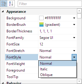
The PropertyGrid control is based on TreeListView and renders a grid of all the properties of one or more objects and their values. Properties can be displayed by category, alphabetically, or using a custom sort.
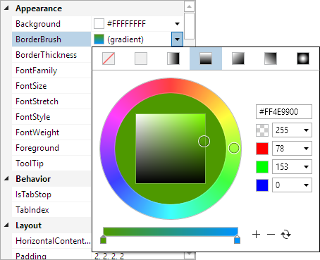
A PropertyGrid control was available in older versions of our WPF Controls, but we rewrote much of the internals for v2017.1 and optimized the object model to focus on maximizing speed and ease of use. The new PropertyGrid can load large complex objects almost instantly. It's simpler than ever to customize how properties are edited via the use of property editor DataTemplates. You have full control over which properties are presented and how.

The 2017.1 version ported the Universal Windows Editors back to WPF so that they now share a codebase. This decision was made because the newer Editors designs are much more lightweight in terms of UI elements used in each control, and the number of bindings involved. This improves UI performance when using many Editors controls in grids like PropertyGrid.
You'll still find many great editing features such as the ability to use arrow keys when typing in edit boxes to increment or decrement part values.
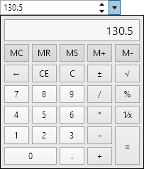
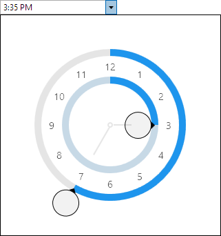
Each edit box now has an optional dedicated picker control that is used in the drop-down, like the calculator shown above. The picker can be easily styled if a custom appearance is needed.
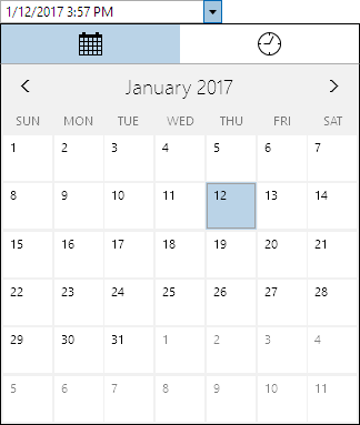
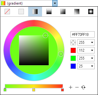
In addition to porting the UWP Editors to WPF, we also added a number of new editor controls. Editors in both platforms feature specialized edit boxes and pickers for these .NET types: Brush, Byte (WPF only), Color, CornerRadius, Date, DateTime, Double, Enum, Guid, Int16, Int32, Int32Rect (WPF only), Int64, Point, Rect, Single, Size, Thickness, Time, TimeSpan, and Vector (WPF only).

Editors also has these other various miscellaneous controls: Calculator, CountryComboBox, CurrencyComboBox, EnumListBox, GradientStopSlider, HsbColorPicker, MonthCalendar, RadialHuePicker, Rating, SaturationBrightnessPicker, and Spinner.

The licensing mechanism was updated for the WPF Controls in v2017.1 to be simpler. Regardless of which WPF products you've licensed from us, your apps will only need a single line in the licenses.licx file going forward. Please read the Converting to 2017.1 topic in the documentation for details on these updates.
Enjoy the new version!





![PostBannerWPFControlsTipsAndTricks[4] PostBannerWPFControlsTipsAndTricks[4]](https://files.actiprosoftware.com/images/blog-legacy/PostBannerWPFControlsTipsAndTricks%5B4%5D.png)
![StandardMDIPopIn_thumb[1] StandardMDIPopIn_thumb[1]](https://files.actiprosoftware.com/images/blog-legacy/StandardMDIPopIn_thumb%5B1%5D_thumb.gif)