 Bill Henning (Actipro)
-
Bill Henning (Actipro)
-
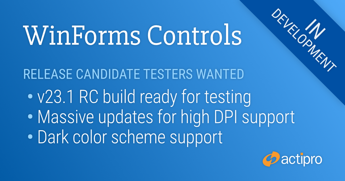
The WinForms Controls v23.1 release is close to ready, and includes sweeping changes across all products to support high DPI environments and new dark color schemes. We have extensively tested this release internally and have already received positive feedback from beta testers, but we know every customer’s implementation of DPI support can vary greatly and would like to get more exposure before full release.
If you would like to assist with evaluating the release (especially DPI awareness) in your own application and provide feedback on changes before release, please email our support address for access to a release candidate.
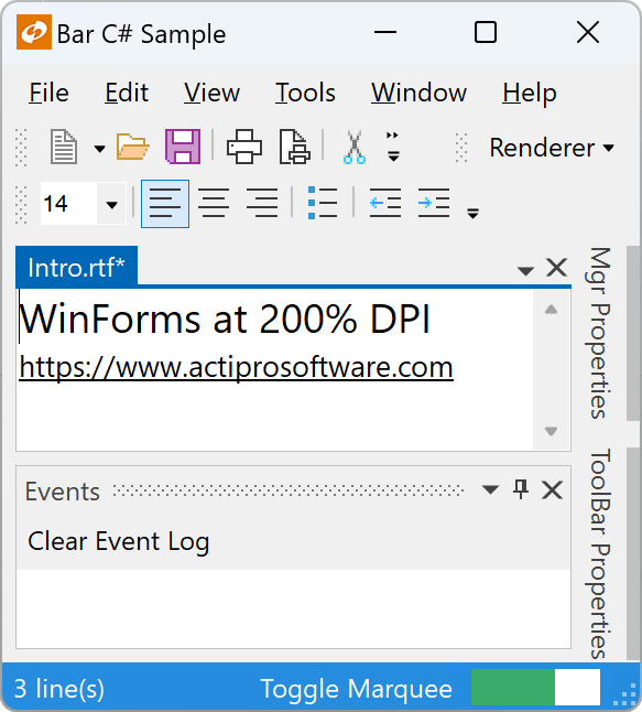
DPI Awareness
Historically, high DPI support in WinForms has been a mixed bag. Newer Windows API’s and recent updates to .NET have greatly improved the scenario, but high DPI support is still not free and developers must put in the effort to ensure proper DPI awareness.
With our WinForms Controls v23.1 updates, we’ve done our part to make sure our controls can render correctly in high DPI environments. Some of the changes coming in the next release include:
- Scale font sizes.
- Scale control dimensions.
- Scale glyphs.
- Scale raster images using optimal technique for the scale factor (e.g., pixel doubling at 200% dpi).
- Scale built-in dialogs.
- New vector-based common images for SyntaxEditor IntelliPrompt.
- New DPI-friendly dock guides for Docking.
- New DpiHelper class to simplify scaling based on DPI.
- Updated Sample Browser to be DPI-aware.
Dark Color Scheme
We’ve also revamped how all renderers determine which colors are being used so we can better support a dark color scheme. New “Metro Dark” renderers are available for all our products and can be used to better integrate with dark-themed applications.