WPF, Silverlight, and WinRT/XAML v2015.1 Released

by Avatar Bill Henning (Actipro)
Friday, April 3, 2015 at 2:31am

BlogPostBanner20151

The 2015.1 versions of our WPF, Silverlight, and WinRT/XAML controls have been released and are now available for download.

Major new features are described below.  See the announcement posts for the large detailed list of enhancements and updates, including many items not listed below:

ProductHeadingWinRTBarCodes

Our Bar Codes product has been ported to the WinRT XAML platform.  This product, which already exists on WPF and Silverlight, allows your apps to render vector-based bar codes using many common 2D and linear bar code symbologies.

BarCodes

A full set of demos and QuickStarts are included to help you get going.

ProductHeadingWPFDocking

The interop assembly that makes it easy to use Docking/MDI with the Prism framework has been updated to reference the latest Prism v5.0.

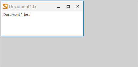
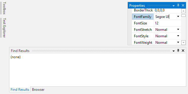
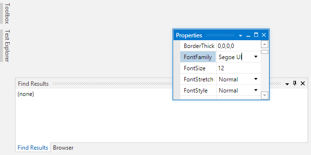
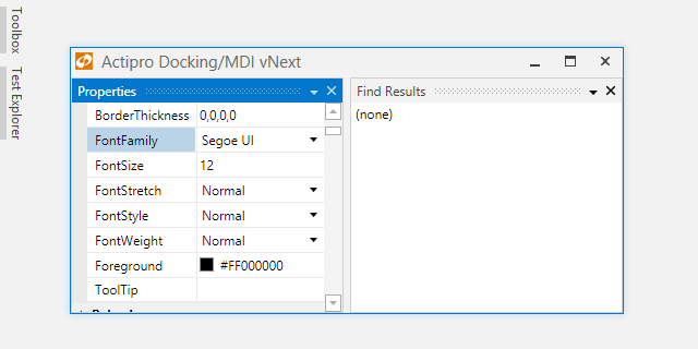
DockingMetro

We've made numerous layout and performance updates to further improve the product. 

We also have been working hard on building a completely new internal engine for the Docking/MDI product, which will be available sometime later this year.  Keep an eye on our blog for posts detailing the advanced features that are coming with those updates.

ProductHeadingWinRTEditors

All of our edit box controls in the WinRT Editors now have an IsEditable property.  When set to false, the edit box behaves more like a ComboBox, while still retaining the rich popups that make the editors unique.  This is an ideal option for apps whose primary mode of interaction is expected to be touch.

ColorEditBoxNoAlpha

The CornerRadiusEditBox, PointEditBox, RectEditBox, SizeEditBox, and ThicknessEditBox controls have been updated to support text parsing one and/or two number entries where appropriate, which is useful for easy uniform value entry.

ThicknessEditBox

In the above ThicknessEditBox, a 2 is typed and then Enter is pressed.  The value is converted to a uniform thickness of 2.

A ValueChanged event has been added to all edit boxes, which fires when a value change is committed.

Finally, edit box padding has been adjusted so that more content is visible in the same amount of space.

ProductHeadingWPFGauge

A new DigitalGauge.CharacterSegmentThickness property allows for segment thickness adjustments.  This gives you even finer control over the presentation of your digital characters.

DigitGaugeSegmentThickness

We've enhanced the 'Linear Gauge Rolling Scale' QuickStart with a new infinite rolling scale example for navigation headings.

HeadingGauge

ProductHeadingGenericSyntaxEditor

The EditorSearchView control now supports an optional "Find All" button.

EditorSearchView

The RTF export logic has been updated to support extended ASCII characters.

The free CSS language definition now supports the syntax highlighting of media queries.

We've dramatically improved the speed of large completion list display.

Several other performance improvements have been made, such as optimized the scenarios for which the TokenTagger raises its TagsChanged event, and refining of the automatic outlining update logic.

In the WinRT version, we added the SyntaxEditor.AreSelectionGrippersEnabled property, which determines whether the selection grippers show after touch within a view.

.NET Languages Add-on

The C# parser has been improved to recover better when encountering open block statements so that its AST node structure remains better in tact.

DotNetPropertyAccessor

The IntelliPrompt quick info for properties now includes accessors, making it possible to see whether a property is read-only.

Python Language Add-on

The Python language has received an enormous amount of updates, that in sum really improve the entire automated IntelliPrompt feature set.

PythonAddon

Check out all these enhancements:

  • Added IntelliPrompt for private members and updated the completion list to have Public and All filter tabs.
  • Added reflection data for private methods/fields of built-in primitive types.
  • Added IntelliPrompt for built-in exception types.
  • Improved IntelliPrompt for numerous built-in modules.
  • Greatly improved IntelliPrompt for package and module imports.
  • Improved IntelliPrompt for function parameters by examining available assert statement isinstance calls.
  • Added IntelliPrompt for static fields on classes.
  • Improved the resolution of base types for classes.
  • Added the optional IResolver.UnknownReturnTypeReferenceCallback callback that can be used to provide return type references for unknown types.
  • Updated the resolver to recognize where 'cls()' in a class method can create a new instance of the related class.
  • Updated the IntelliPrompt completion list to filter unmatched items.
  • Updated the IntelliPrompt docstring display to retain presentation of line feeds.

ProductHeadingGenericViews

The Views product has a new TaskBoard control added, available in all three (WPF, Silverlight, and WinRT) platforms.  TaskBoard can be used to create a board of reorderable columns and cards.  All of the drags use smooth animations to give you the feel that you are really interacting with the object.

RepairShopScheduling

The first full-source sample that comes with the control is a Repair Shop Scheduling demo, which shows how a TaskBoard can be used to interactively schedule work to resources, such as employees. TaskBoard excels at providing a visual way of representing work/tasks (displayed as cards) within a queue of some sort (displayed as a column).

PageBannerDefault

The second sample is a Task Planning demo, which shows how a TaskBoard can visually organize a project's tasks.

ProductHeadingGenericShared

We've added another new primitive SemiEllipse shape, which renders half of an ellipse.

SemiEllipseShape

The existing Triangle shape has a new IsClosed property that when set to false will create a triangle with only two of the sides rendered.

TriangleShape

Finally, in the WPF Shared Library, we added GradientBrushSlider.CanAddStops and CanRemoveStops properties that determine whether stops can be added and removed from a GradientBrushSlider.

TaskDownload TaskLiveDemo TaskBuyNow

Docking/MDI vNext - Tool Window Title Bar

by Avatar Bill Henning (Actipro)
Friday, March 6, 2015 at 1:02pm

PostBannerWPFControlsDevNotes

As mentioned in this previous post, we've been looking for ideas to further improve our WPF Docking/MDI product, which already is the market leader for docking tool window and MDI functionality.  We've committed to working on a complete internal restructuring of the product that we will call Docking/MDI vNext.  We're doing our best to keep the same general API surface, while providing even more advanced features in every area of the product.  We've collected suggestions from our customers over the past several years and are working to meet them as best we can with Docking/MDI vNext.

In today's post, I'd like to discuss a feature that has been requested by customers: tool window container title bar customizations.

Feature Description

There have been certain scenarios where a customer has wanted to add custom buttons or content into the tool window container title bar.  In the past, you could achieve this by making a clone of the ToolWindowContainer style/template and altering it to include your custom UI in the title bar area.  This works but is tedious and we wanted to make this sort of thing very easy to do for vNext.

In vNext, each ToolWindow now has a ContainerTitleBarContentTemplate property that can be set to a DataTemplate to show in the tool window container title bars.  This can be a button, a label, or any other UI element you can think of.

Usage Example

In this animated example, we show three auto-hide windows.  Each has custom content in the title bar.  The "Preview" tool window has a search button that renders with the same style as the other buttons.  The "Label" tool window has a status label in the title bar that currently says "Status" but could be data bound to a property. 

ToolWindowTitleBars

The "Status" tool window shows a custom circle indicator that says whether the "Is Approved" CheckBox is checked.  When the CheckBox is toggled, it updates a value in the tool window's data context and the indicator changes to another color.

As a bonus, we're also showing how custom content can be injected into auto-hide tabs.  The indicator for the "Status" tool window also appears there and updates live as well.

Summary

These are just some of the really advanced features we're adding to the product for vNext.

Docking/MDI vNext is currently still in early development stages but is progressing very well.  Please contact us via email if you are an existing customer and would like to sign up as a beta tester for vNext.  If you have any other suggestions for improving Docking/MDI, now is the time to get them in.  We'll post more updates on our vNext improvements soon.

In the meantime, please download our current Docking/MDI control product and give it a spin.

TaskDownload TaskLiveDemo TaskBuyNow

Docking/MDI vNext - Docked Size Constraints

by Avatar Bill Henning (Actipro)
Friday, February 27, 2015 at 10:13am

PostBannerWPFControlsDevNotes

As mentioned in this previous post, we've been looking for ideas to further improve our WPF Docking/MDI product, which already is the market leader for docking tool window and MDI functionality.  We've committed to working on a complete internal restructuring of the product that we will call Docking/MDI vNext.  We're doing our best to keep the same general API surface, while providing even more advanced features in every area of the product.  We've collected suggestions from our customers over the past several years and are working to meet them as best we can with Docking/MDI vNext.

In today's post, I'd like to discuss a feature that has been heavily requested by customers over the years: docked size constraints.

Feature Description

In the current Docking/MDI product, there is a minimum size that docked tool windows can become but it is hardcoded.  We've had customers request the ability to configure a minimum size for certain tool windows.  Other customers have also requested the ability to set a maximum size.  Yet others would like to see fixed size tool windows.  None of those scenarios are currently supported.  Docking/MDI vNext changes that.

In Docking/MDI vNext, you're able to optionally specify minimum and maximum docked sizes for each tool window.  We've written a lot of complex logic to support this feature in our layouts.  As the DockSite changes size, the tool windows all reflow and do their best to adhere to the docked size constraints that have been given.  It works very nicely.

Want to have a fixed size tool window?  This can be achieved by simply setting the minimum docked size to be the same as the maximum docked size.

Best of all, splitting (also reimplemented for vNext) is fully aware of the constraints and won't let you drag splitters beyond what the the size constraints allow.

Usage Example

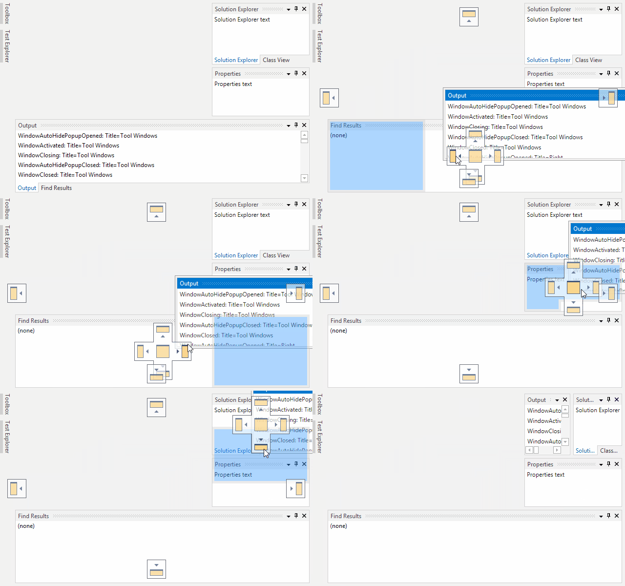
Let's have a look at how constraints work with splitters.  In the screenshot below, I've turned off live splitting so that we can see the splitter drag highlights.  In this layout, the Properties tool window has a minimum docked size constraint set.

DockedSizeConstraints

As the mouse drags the splitter upward, you can see how the class view is allowed to become very short and the splitter is still tracking with the mouse.

Later, the mouse is dragging downward but the splitter has reached the point where the minimum constraint of the Properties tool window is.  Thus the mouse cursor is down below the splitter (I kept moving the mouse down), showing that the splitter can't go any further in that direction.

Summary

This is a great feature that we've spent a lot of time on for Docking/MDI vNext.  vNext is currently still in early development stages but is progressing very well.  Please contact us via email if you are an existing customer and would like to sign up as a beta tester for vNext.

If you have any other suggestions for improving Docking/MDI, now is the time to get them in.  We'll post more updates on our vNext improvements soon.

In the meantime, please download our current Docking/MDI control product and give it a spin.
TaskDownload TaskLiveDemo TaskBuyNow

How Can We Improve Docking/MDI?

by Avatar Bill Henning (Actipro) - 8 comments
Tuesday, October 28, 2014 at 12:55pm

PostBannerWPFControlsDevNotes

Our WPF Docking/MDI product, which provides docking tool window and multiple document interface functionality for WPF applications, is already about the most polished and full-featured product of its type on the market for the WPF platform.

DockingMetro

It supports multiple professional themes, complex hierarchies of tool windows, auto-hide, multiple MDI modes, Prism/MVVM support, nested and side-by-side dock sites, layout serialization and much more.

Looking for Your Valued Feedback

As great of a product as it is, there are a few areas we are possibly looking to improve and make the product even better.  Some of this may involve a refactoring of a lot of internal code, and as such, we wanted to come to you our users and get some feedback on what improvements you would like to see made.

The feedback could be anything from simple UI and docking functionality ideas to suggestions on improving interaction with our API.  For instance, perhaps you would like to see "pin" buttons added to tabbed documents, which is a newer feature found in Visual Studio 2013.

We would love to hear what you would like to see implemented in our WPF Docking/MDI product that isn't already in place today.

Please send your comments and thoughts to our support address with as much detail as possible and screenshots/mockups where appropriate.

Thanks for your help!

WPF, Silverlight, and WinRT/XAML v2014.2 Released

by Avatar Bill Henning (Actipro)
Friday, September 12, 2014 at 8:08am

Major142ReleasesBlogPostBanner

The 2014.4 versions of our WPF, Silverlight, and WinRT/XAML controls have been released and are now available for download.

Major new features are described below.  See the announcement posts for the large detailed list of enhancements and updates, including many items not listed below:

Note that the 2014.2 version of the WinRT/XAML controls came out last month, introducing our Editors controls, but a new maintenance release is available today adding other new features.

ProductHeadingGenericCharts

We've added six new built-in chart palette options, including Retro and Sand:

ChartPalettes

ProductHeadingWPFDocking

Docking/MDI received numerous updates, including a new option for rafting windows to not hide when in scenario where their owner DockSite is hidden, such as if it's nested in tabs itself.  Many updates to focus handling were made, especially in relation to interop controls like WinForms/ActiveX.

ProductHeadingGenericEditors

Updated the Country and Currency classes with the latest ISO data.

WinRT/XAML Only

As announced in recent blog posts, our WinRT/XAML controls now have some really unique and universal (Windows Store / Windows Phone) controls for accepting input of common data types.

ColorEditBoxOpened
See our Edit Boxes Overview for a summary of the controls and some links to additional posts describing their functionality.

ProductHeadingGenericMicroCharts

A new segment chart has been added that allows for visual display of an integer value within a total..

SegmentChartType

This sort of chart is great for use on dashboards, and also as an indicator of steps or progress achieved.

Another new control is the arrow indicator displayed on the left side of the stock chart below.  It's called a trend indicator and alters its UI to reflect whether a numeric value is greater than, the same as, or less than an origin value.

StockChart

Six new built-in chart palettes have been added as well, including IceCream and Melon.

MicroChartPalettes
ProductHeadingWPFPropertyGrid

We've created a new custom property editor sample that shows how to easily add a custom property editor for a certain Type. 

PropertyGridCustomEditor


Double-clicking a property name has been improved such that if the property doesn't support standard values, it will attempt to focus the related editor instead and select all text.

ProductHeadingGenericSyntaxEditor

Quote auto-completion support has been added to the DelimiterAutoCompleter class, with double quote completion enabled by default.  As the user types a start quote, the related end quote will be auto-entered after the caret.  The C#, VB, Python, JavaScript, and JSON languages in our premium add-ons have been updated to support quote auto-completion.  It can easily be added to any custom languages as well.

We've added some nice new features like a ScrollIntoView method that can ensure that a text position is visible within the view, improved caret/selection movement around and delete/backspace of multi-byte characters, and improved backspace to move to the previous tab stop when auto-convert tabs to spaces is active and the caret is before the first non-whitespace character on the line.

.NET Languages Add-on

We've had a lot of requests for showing how to support ASP-style server tags, where the C# within the tags has automated IntelliPrompt.

SyntaxEditorServerTags
We're happy to deliver a new full source sample (seen above) that shows how to harness our .NET Languages Add-on within server tags.

Python Language Add-on

Today's releases contain the first version of our Python Language Add-on, a new premium add-on that supports both v2.x and v3.x syntax.

PythonIntelliPrompt
We'll blog about the language in more detail soon, but you can download and start using it today.

ProductHeadingGenericShared

A new triangle shape can be used in UI such as breadcrumbs, tabs, etc. 

Triangle
This shape can auto-size to its container and supports strokes and fills.

WPF Only

We've added a ZoomLevelToTextFormattingModeConverter class, which can switch from Display to Ideal text formatting mode when the zoom level is increased, thereby keeping text clear in any scenario.

TaskDownload TaskLiveDemo TaskBuyNow